Vizbi 2014
During Vizbi 2014 I saw some stuff that I already knew but also a lot of stuff that was new to me. Especially the talk from Jeffrey Heer gave a nice overview of design principles.
“Resemblance, order and proportion are the three sign fields in graphics” said Jacques Bertin. But we need to ask ourselves what makes a visualisation good.
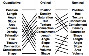
There are several visions on design principles. A first one is by Mackinlay (‘86) that talks about expressiveness and effectiveness. The expressiveness means that the visualisation needs to express the facts in the data and nothing more than the facts. Effectiveness means that some visualisations may be easier to interpret and transfer the message. Also Tversky (‘02) has two design principles called congruence and apprehension. If we translate those design principles to everyday words you could state:
- Tell the truth and nothing but the truth
- Use encodings that people decode better
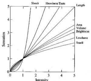
When designing visualisations you have to take Steven’s Power Law into account. This law states S = I^p where S is the perceived sensation, I is the physical intensity, and p is an empirically determined exponent. When you look at the graph you can see that a small increase in elektroshock intensity gives a much higher perceived sensation than the same increase in loudness.
For the graphical perception we see that some encodings are better for certain kinds of data than others. Redoing the experiments from Cleveland & McGill (‘84) by the group of Jeffrey Heer but now with computers instead of paper and pencils show that position is more effective than length, which is more effective than angle, … This corresponds to the Mackinlay effectiveness ranking shown in the figure below.
More to the software side, there are some examples of visualisations that can be very useful. ReVision performs automated chart interpretation (Savva et al. 2011). For instance, it automatically creates a bar chart from a pie chart. Borkin et al. (2011) created an artery visualisation where choosing a diverging palette instead of a rainbow and 2D instead of 3D, dramatically increases the effectiveness of the visualisation.
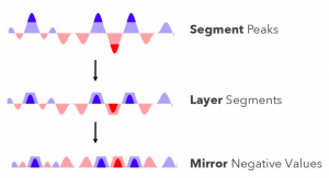
Tufte talks about data density which is defined as # entries / area of graphic. Essentially it says that you have to show the most amount of data with the least amount of ink. But this gives problems when you follow it naively (e.g. print massive amounts of data on a post stamp). Possible solutions for displaying e.g. stock performance: 1. flip the negatives, 2. segment and layer the peaks (= cut the peaks of and show them as a darker colour mirror negative values. To see whether this visualisation works better, they performed several experiments and the conclusion is that ordering tasks are ok up to many segments but quantitative analysis became difficult at 3 and almost impossible at 4 layers. Also, mirroring doesn’t hamper interoperation and layered bands are beneficial for smaller charts.
During the Great Browse-Off (CHI ‘97) they compared Microsoft File Explorer vs. Xerox PARC Hyperbolic Tree and Xerox won. Afterwards research (Pirolli et al. 2000) showed that there was no difference in performance across tasks and conditions. There were differences when the labels were good queues to the solution of the problem compared to bad queues.. When the text labels are good queues the hyperbolic method wins, when they are bad the explorer wins. Also with bad queues, more nodes are read in the hyperbolic compared to the Microsoft File Explorer. What they learned from this can be combined in the following design guidelines:
- people don’t read in circles
- showing more is not always better
- navigation cues critical to search (e.g. informative landmarks needed)
An observation I made during Vizbi was that everyone seems to be making their own genome browsers. Justin Paschall presented the Genome Maps software where you have two zoom windows. This can be useful if you want to look at SNPs at a certain position but also want to zoom out to see e.g. structural variation while still keeping a view locked on the SNPs.
Another funny thing to notice was that there were a number of presentations and posters that had almost nothing to do with visualisation except that they use figures to present the data. Mihaela Zavolan for instance had a completely other talk prepared until she heard that the conference was about visualisation. She changed her presentation a bit but still she only had the standard figures there even one where the probability of base-pairing was coded with a rainbow scale. In the poster session there was a poster about the insertion of HIV-genes in the genome that only had a figure that showed the genetic location.
Nuria Lopez-Bigas had an interesting talk about visualising cancer genomics data. She showed a number of challenges that she faced but that can easily be said about different other subjects:
- how to visually represent multiple dimension of the data
- how to create interactive tools that the user can use to go through the data
- interoperability between the tools
- compression of the massive amount of data
They developed a software tool that tries to tackle all these challenges and this tool is called Gitools. For the interoperability, the tools works best together with IGV.
In the poster session there was an interesting poster about visualising phylogenetic trees with D3. Details of this can be found at http://phylod3.herokuapp.com/
During the unconference breakout we had an interesting discussion on the challenges that visualisation has to overcome in the next 5 years. In our group we decided that the most important challenge would be how we ensure that the scientific community will be receptive to novel visualisation schemes. Because it is often difficult to shift the paradigms of computational biology, possibly due to most of the users not being computational biologists, or the fact that people keep using the software that they see used most in publications. Another challenge will be to scale the different methods that we are using now. The amount of data grows exponentially and many of the current methods don’t scale that well. Because the tool we used to enter our challenges was down the morning after during the lightning session, we were only shown a picture of Aiden’s cat instead of our challenge
The second day of Vizbi started with an interesting talk of Andreas Prlic about the challenge of visualising structures across different scales. He showed an animation from http://learn.genetics.utah.edu/content/cells/scale/ where you can scroll to the different levels of scaling. He had some nice images of an HIV particle where zooming in would reveal the smaller structures. Also the metabolic pathways poster or at least the citric acid cycle that was represented by the molecules and proteins looked very nice. He also talked about using different colours to represent different things. A nice and well known tool for this is Colorbrewer (http://colorbrewer2.org) but if you also want to see which effect the colours have for colourblind people you can also use http://colorfilter.wickline.org or Color Oracle (http://colororacle.org).
Marc Marti-Renom showed a visualisation of the 3D structure of DNA. They want to bridge the gap in knowledge about the structure of DNA between the molecular scale and the scale of an entire cell. For interactivity they used OBLONG’s Greenhouse (http://greenhouse.oblong.com) which looked really nice (cfr. Minority Report) but is supposedly very hard to program.
Bang Wong gave a great keynote talk about Thinking, Seeing and Understanding where he presented three different tools that are developed at Broad. The first tool CURSOR is made to enable people to extract broad patterns from the data. To accomplish this, you can select several tracks in the genome, pick a main one and cut out everything from the genome that does not have a peak in the main track. Once you did that, you can sort on any of the tracks you already selected. The second tool is called Connectivity Map which links diseases to genes and drugs. There currently are 1.3M experiments on all 20k genes available. Connectivity Map gets the experiments from the data that have a similar gene expression profile (or inverted) compared to the one you are interested in. The last tool is called GeNets where they try to prevent interaction networks from becoming hairballs by using the Gestalt psychology of perception. For example, in a node-link diagram you can remove the middle part of a link and your mind will still see the connection. Another thing they did was to collapse the subnetworks that are not of interest so the overview becomes a lot clearer. At the end he gave three guidelines that you can use when developing apps for visualisation. First, biological data sets are too large to get an overview so it is better to start with slices of data. Second, it is best to design simple apps that do one thing well than it is to start with a large software package. Finally, you should close the inspection-speculation loop.
Bang also gave us a puzzle to solve which can be found at http://vizbi.org/Posters/Images/2014/Y05.png. During the gala dinner we solved the puzzle first so we won a certificate to use for a F1000 publication. All the information you need to solve the puzzle is in the puzzle itself.
Sheelagh Carpendale gave a talk that was mostly based on her talk that is available on Vimeo i.e. Towards Personal Visual Analytics (http://vimeo.com/58204643). Something not in her video talk were Bubble Sets that are actually an overlay that encloses all similar points (of a certain category) in a moving graph. Another thing not in her video talk was about the visualization of a gps tracker that focusses on the place you stayed at and not the fast journeys over longer distances between those places. One final thing is the Sketchinsight from Microsoft which allows you to easily create graphs using an interactive whiteboard (http://research.microsoft.com/en-us/um/redmond/groups/cue/sketchinsight/).
Carpendale approaches visualization questions are from a HCI perspective. Some interesting videos shown in the presentation. It was interesting to see some speakers address their ways to tackle the hairball challenge of visualizing networks. Bang reduces the number of links by fading the middle part of linking lines. Carpendale showed interactive edge legend to select and manipulate selected edges. Heer also published a paper on directed edge bundling here. Bill from ISB tackles hairballs using his BioTapestry. Overall, I really enjoyed Vizbi. It is rare for a conference where you actually get to talk with keynote speakers. Compared to the one from last year in Boston, I definitely had more opportunity to speak with many keynote speakers, perhaps an advantage of the remote location of EMBL.