EuroVis 2015 recap
As expected, the EuroVis 2015 conference in Cagliari (Sicily) was really worth attending. In this blog post, I’ll record some of the highlights or things relevant to what our lab does. That’ll help me to jog my memory, but might also be interesting to you. (Admitted: it’s mainly for myself…)
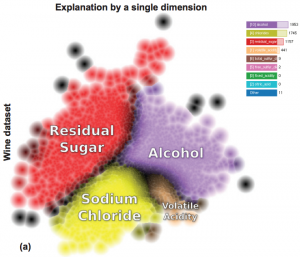
In “Attribute-based Visual Explanation of Multidimensional Projections”, Renato da Silva et al (refDaSilva) presented a method at EuroVA for helping the user to make sense of multidimensional projections: to show not only which points are similar, but also why that is. His pipeline start with ranking the most important dimensions. For each point, he computes the similarities to all points within radius r on the projected plane, takes the average, and ranks every point separately. Next, he performs visual splatting to create a histogram with the top dimensions. Finally, for each point he esablishes which dimension is the most important. For points that are at face intersections (and whose explanation by a single dimension is less confident) are darkly coloured, which gives clear indication of the different groups.
My notes on Claudio Silva’s EuroVis keynote on visualization of big urban data also take up quite a few pages of my notebook. Some quotes that are worth remembering: “Scalability of computation is easy; scalability of people is hard.” and “The dependency on data experts creates a distance between the domain experts and their own data.” He also went in-depth into his favourite project on NYC taxis - TaxiVis (presented as a paper at VAST 2013) These cars are all GPS-tracked and simple visualizations already indicate interesting questions (you can also see clear signals at Valentine’s day, or when there’s a strike). Claudio also discussed vector field k-means clustering in order to cluster trajectories: do cabs drive together, etc. Finally, he discussed the NYC metagenome project, where environmental swabs were taken in the sewers, in subways, on ATM machines, etc.
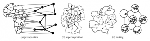
The state-of-the-art session on graph visualization ended up being very interesting as well. Hadlak et al presented a framework to think about multi-faceted graph visualization (refHadlak): how can we combine graphs with other types of data? He distinguishes between composition in display space, and in time space. In display space, the graph and the associated data can be nested, superimposed, or juxtaposed. Much here depends on which is the base representation: are the associated data nested into the graph (e.g. each node in the graph is a pie chart), is the graph nested in the associated data (e.g. small gene interaction networks combined into a phylogenetic tree, as below), or is there no real base representation?
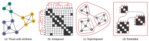
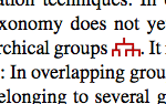
Corinna Vehlow (from Daniel Weiskopf’s group at the University of Stuttgart) presented the state of the art in visualization of group structures in graphs, including a taxonomy to organize these (refVehlow). They provide a comprehensive overview at their website. I also particularly liked how they included glyphs in the main text of their article like this:
One talk I particularly liked was that from Jagoda Walny from Sheelah Carpendale’s group. They investigated the role of data sketching for visual representation (refWalny), and how the way we sketch impacts what we learn. Users generated a wide range of data reports, including both information intrinsic and extrinsic to the dataset. Also, the more abstract the visualization, the more complex the hypotheses they think of. I will definitely add this exercise to my data visualization lectures in the future. They kindly made the data available at http://j.mp/datasketching.
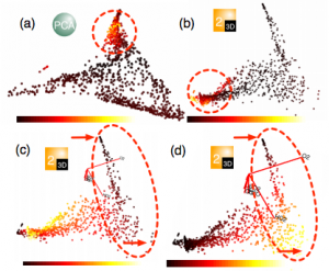
Liu et al (refLiu) delivered an interesting approach for visualization of high-dimensional data through subspace analysis and dynamic projections, in which they cluster high-dimensional datapoints to create lower-dimensional subspaces, rather than clustering dimensions (e.g. like in PCA).
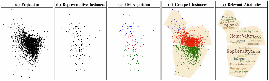
Joia et al (refJoia) presented a method for using representative instances in the data (using SVD) to define clusters in visual space. Waiting for him to make his slides available… :)
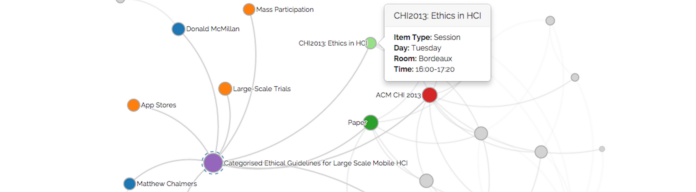
Very relevant to the work we do in our group, was the talk on large networks and associative browsing by Kairam et al (refKairam). They provide guidelines for the user by computing degree-of-interest scores along different paths in the graph. In principle, they simulate random walks to see where each ends up, and then mark the node where that walk ends.
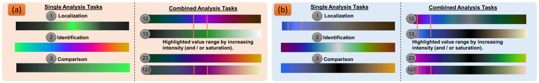
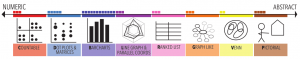
On the last day, Sebastian Mittelstädt (from Daniel Keim’s group) presented ColorCAT (refMittelstadt): a method for choosing colours for visualizing data. Although tools like ColorBrewer exist, they do not cater for the case when different analysis tasks have to be combined. He identified three types of tasks: localize, identify, and compare. Their ColorCAT tool allows you to select what types of analysis you want to combine, and then suggests colours to use. One thing I remember from that talk was Sebastian referring to Colin Ware’s work which indicated that the hue visual channel is much better than black/white when it comes to the just-noticeable difference. We also had an interesting discussion afterwards about the use of white or black background for figures. Although white is often more pleasing, a black background is often preferred because you can play with the value of the color. In contrast, you’re limited to using saturation when using a white one.
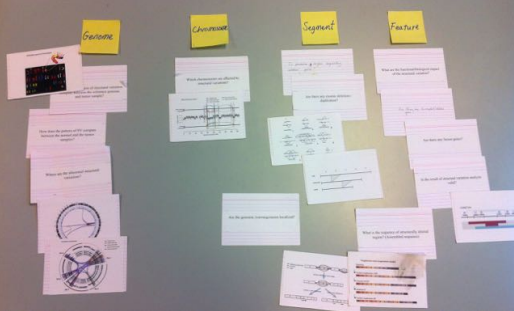
And last but not least, our own work on card sorting (refRyo) was short-listed for the short paper award! We didn’t win the award eventually, but you can’t win everything right? This again shows the good work delivered by Ryo.
References for the papers mentioned:
(refDaSilva) Silva, R. R. O., Rauber, P. E., Martins, R. M., Minghim, R., & Telea, A. C. (2015). Attribute-based Visual Explanation of Multidimensional Projections. In Eurographics Conference on Visualization (EuroVis). http://doi.org/10.2312/eurova.20151100
(refHadlak) Hadlak, S., Schumann, H., & Schulz, H. (2015). A Survey of Multi-faceted Graph Visualization. In Eurographics Conference on Visualization (EuroVis) (pp. 1–20). http://doi.org/10.2312/eurovisstar.20151109
(refVehlow) Vehlow, C., Beck, F., & Weiskopf, D. (2015). The State of the Art in Visualizing Group Structures in Graphs. In Eurographics Conference on Visualization (EuroVis). http://doi.org/10.2312/eurovisstar.20151110
(refWalny) Walny, J., Huron, S., & Carpendale, S. (2015). An Exploratory Study of Data Sketching for Visual Representation. In Eurographics Conference on Visualization (EuroVis) (Vol. 34). http://doi.org/10.1111/cgf.12635
(refLiu) Liu, S., Wang, B., Thiagarajan, J. J., Bremer, P., & Pascucci, V. (2015). Visual Exploration of High-Dimensional Data through Subspace Analysis and Dynamic Projections. In Eurographics Conference on Visualization (EuroVis) (Vol. 34). http://doi.org/10.1111/cgf.12639
(refJoia) Joia, P., Petronetto, F., & Nonato, L. G. (2015). Uncovering Representative Groups in Multidimensional Projections. In Eurographics Conference on Visualization (EuroVis) (Vol. 34). http://doi.org/10.1111/cgf.12640
(refKairam) Kairam, S., Riche, N. H., Drucker, S., Fernandez, R., & Heer, J. (2015). Refinery : Visual Exploration of Large , Heterogeneous Networks through Associative Browsing. In Eurographics Conference on Visualization (EuroVis) (Vol. 34). http://doi.org/10.1111/cgf.12642
(refMittelstadt) Mittelstädt, S., Jäckle, D., Stoffel, F., & Keim, D. A. (2015). ColorCAT : Guided Design of Colormaps for Combined Analysis Tasks. In Eurographics Conference on Visualization (EuroVis). http://doi.org/10.2312/eurovisshort.20151135
(refRyo) Sakai, R., & Aerts, J. (2015). Card Sorting Techniques for Domain Characterization in Problem-driven Visualization Research. In Eurographics Conference on Visualization (EuroVis). http://doi.org/10.2312/eurovisshort.20151136