Get to know the user
In my lectures on data visualization where that topic is only part of another course, I describe the practical part as consisting of 3 stages:
- Get to know the user
- Get to know the data
- Explore visual designs
These are a simplified version of the often-cited process described by Ben Fry or others, which include data acquisition, parsing, etc.
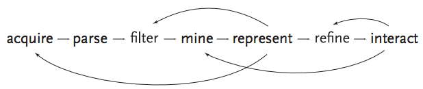
Figure 1 - Ben Fry’s visualization process
As the more involved version, the simplified process also constantly switches between these 3 phases.

Figure 2 - Simplified workflow
In this and the next two blog posts (see Get to know the data and “Explore visual designs” (latter to be written)), I’ll briefly go over each of these. These posts are not a thorough review of the existing literature, but rather the practical advice that I give my MSc students for their little data visualization projects.
Get to know the user
It’s very important to understand the motivating goals of the user. As design space is effectively infinite, the user’s requirements can narrow down that part of the space that you actually need to investigate.
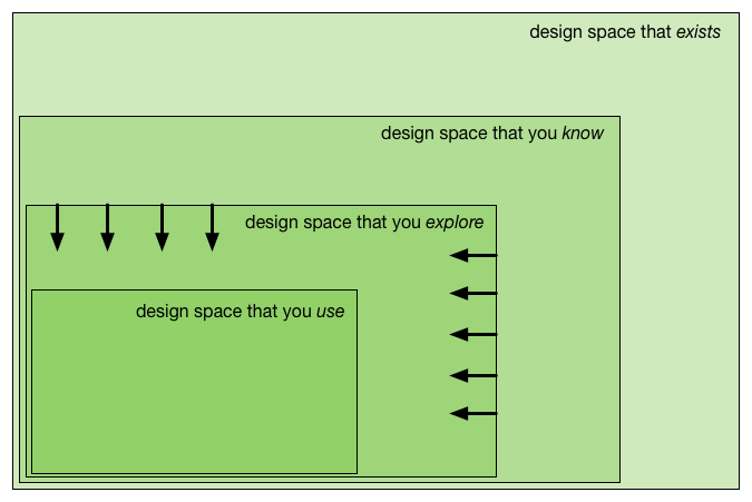
Figure 3 - Trying to limit the design space that you need to explore
In our case, the user is very often an expert in some scientific field who has gathered data. This might be a geneticist, a biologist, … We see 2 phases in getting to know the user: [1] talking to the expert user; [2] analyzing the talk.
Talking to the expert user
So how do you find out what the user (e.g. the PhD student with the data) wants from the data? Naively, you could say “just ask the user what he/she wants”. Unfortunately, what the user says they want is often not what they need. You will get an answer like “I want a scatterplot with this as the x-axis, that as the y-axis, and the colour defined by that variable”. In that case: let them make it themselves. If you really want to help your user to gain insight in their data with data visualization, you have to find out what the underlying goals are that they want to address using the data.
The problem is that the user will naturally phrase their needs within the context of current constraints. Unfortunately, this can result in very limited discussions where you’re basically stuck in the status quo. We try to force them to think further by letting them imagine what might have been possible if some technologies were available that are (still) science fiction (such as mini-robots that roam your body), or even going the fantasy way.
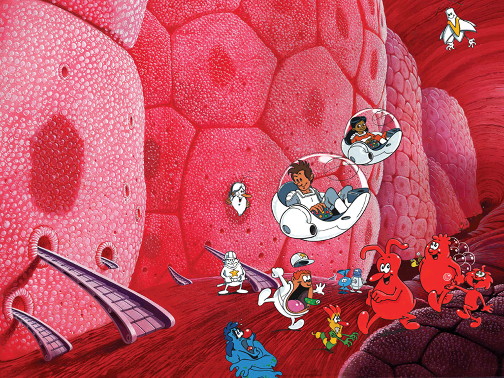
Figure 4 - Il était une fois la vie
Do you remember the cartoon series “Il était une fois la vie”? That cartoon teaches children about biology - how oxygen is carried through the blood, how pathogens are eliminated, how cells take up nutrients - by anthropomorphizing the whole process. The red blood cells, for example, are little creatures that carry oxygen molecules while walking through your veins and arteries. Now imagine that you could communicate with these creatures and ask them if they are OK, or if they encountered something on while traveling through your veins…
This might seem strange, but putting the user in this state of mind can help to let them think more freely and digg deeper into what they really want to achieve. In contrast to when you stick to the (types of) data that currently exists, you won’t be held back because one particular type of data is not available yet. It can help the expert and yourself to think further than what is possible today or tomorrow. One key aspect here is to reveal which assumptions that the expert has on the data.
Analyzing the talk post-hoc
So you’ve talked to the expert, and took ten pages of notes. What do you do now? In the next step, you probably will want to encode this information in a more organized way. One option here is to match the needs from the expert to an taxonomy like the one defined in Tamara Munzner’s book “Visualization Design and Analysis”.
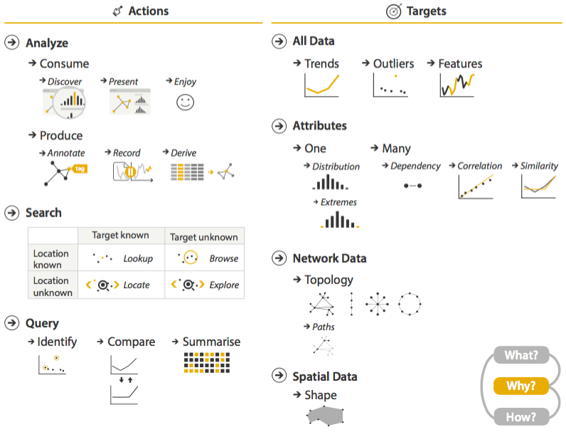
Figure 5 - Taken from the book “Visualization Analysis and Design” by Tamara Munzner available from CRC press
Does the user want to identify certain datapoints? Compare different (sets of) datapoints? Annotate correlations? Etc. Go through the discussion you had with the domain expert, and try to extract a list of these goals. This list will become the basis to work on your visual designs.
Of course, you will want to discuss with the user afterwards if this abstraction makes sense.
Aligning user needs with existing visuals
Up to this point, you have made an effort to actually not talk about visuals. The next step is to find out how existing visuals can be used to address those goals you identified earlier. One strategy to use is (open and closed) card sorting as described in our EuroVis 2015 short paper.
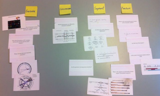
Figure 6 - Sorting cards
In short, you create 2 stacks of cards: one with domain-specific questions that the user could ask the data (e.g. “are there any disrupted genes”, or “which genes have a aberrant expression pattern”), and one with visuals. These visuals can be generic ones, taken from existing software, or mock-ups.
 |
 |
|
| Picture cards with new visual encoding ideas | Picture cards extracted from literature |
Figure 7 - Examples of picture cards
Combining the question and picture cards can help you identify possible hiatuses in the existing visuals.