Vega-Lite tutorial
 (c) Jan Aerts, 2019-2023
- The simplest barchart
- Vega-lite online editor
- Static images
- Transforming our data: aggregate, filter, etc
- Composing plots
- Interacting with the images
- Using widgets for selections
- Further exercises
- Where next?
Let’s first have a look at how to use vega-lite (https://vega.github.io/vega-lite/) for creating data visualisations.
As we move through this part of the tutorial, make sure to have the vega-lite documentation website (https://vega.github.io/vega-lite/docs/) open as well. Actually: make sure to check out these websites:
The simplest barchart
Here’s a very simple barchart defined in vega-lite.
The code to generate it:
{
  "$schema": "https://vega.github.io/schema/vega-lite/v4.json",
  "description": "A simple bar chart with embedded data.",
  "data": {
    "values": [
      {"a": "A", "b": 28},
      {"a": "B", "b": 55},
      {"a": "C", "b": 43},
      {"a": "D", "b": 91}
    ]
  },
  "mark": "bar",
  "encoding": {
    "x": {"field": "b", "type": "quantitative"},
    "y": {"field": "a", "type": "nominal"}
  }
}
What do we see in this code (called the specification for this plot)? The "$schema" key indicates what version of vega-lite (or vega) we are using. Always provide this, but we won’t mention it further in this tutorial.
The keys in the example above are data, mark and encoding. On the documentation website, you see these three in the menu on the left of the screen.
data: either lists the data that will be used, or provides a link to an external sourcemark: tells us what type of visual we want. In this case, we want bars. These can bearea,bar,circle,line,point,rect,rule,square,text,tickandgeoshape.encoding: links marks to data tells us how to link the data to the marks.
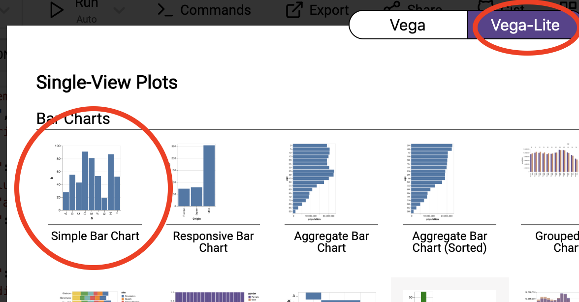
Vega-lite online editor
We’ll use the vega-lite online editor at https://vega.github.io/editor/. From the pull-down menu in the top-left, select “Vega-Lite” if it is not selected. From “Examples”, select “Simple Bar Chart” (make sure that you are in the “Vega-Lite” tab).
You’ll see an editor screen on the left with what is called the vega-lite specification, the output on the top right, and a debugging area in the bottom right. We’ll come back to debugging later. Whenever you change the specification in the editor, the output is automatically updated.
Static images
Exercise - Add an additional bar to the plot with a value of 100.
Exercise - Change the mark type from bar to point.
Exercise - Looking at the vega-lite documentation at https://vega.github.io/vega-lite/docs/, check what other types of mark are available. See which of these actually work with this data.
Exercise - How would you make this an horizontal chart?
The encoding section specifies what is called the “visual encoding”: it links fields in each data object (in this case: fields a and b) to visual channels (in this case: x and y). The field names should correspond to a field in the dataset, and the keys (x and y) depend on the type of mark you choose. Again: the documentation is very helpful.
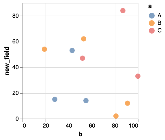
Exercise - Add a new field to the datapoints in the dataset with some integer value, called new_field. Next, change the plot so that you have a scatterplot with this new field on the y-axis and the field b on the x-axis.
Setting colour and shape
All our plots have used steelblue marks, but it’d be nice to use a different colour. We can do this in two ways, either specifying it within the mark, or within the encoding.
To change colour at the mark level, we have to provide the mark with an object, instead of just the string “point”, “circle” or whatever.
...
"mark": {"type": "point", "color": "red"},
...
To change colour at the encoding level, but we cannot just say "color": "red". The color key takes an object as its value. For a fixed value (i.e. “red”), this should be {"value": "red"}.
...
"mark": "point",
"encoding": {
  "x": {"field": "b", "type": "quantitative"},
  "y": {"field": "new_field", "type": "quantitative"},
  "color": {"value": "red"}
}
...
Exercise - Check what happens if you provide a colour both at the mark level and at the encoding level.
One of the cool things when defining colour in the encoding, is that we can let it be dependent upon the data as well. Instead of using {"value": ...}, we can use {"field": ...}.
...
"mark": "point",
"encoding": {
  "x": {"field": "b", "type": "quantitative"},
  "y": {"field": "new_field", "type": "quantitative"},
  "color": {"field": "a", "type": "nominal"}
}
...
You’ll see that the colour now depends on the data as well! Of course, in our data every single object has a different value for a (i.e. A, B, …). Let’s just change our data a bit so that we only have a limited number of classes. Our output might look something like this:
Exercise - Look into the point documentation, and - instead of the different classes getting different colours - make the classes have different shapes.
Exercise - Look into the point documentation, and make the points filled instead of only showing the outline.
Changing the data
If your dataset is a bit bigger than what you see here, it’ll become cumbersome to type this into the specification. It’s often better to load your data from an external source. Looking at the documentation we see that data can be inline, or loaded from a URL. There is also something called “Named data sources”, but we won’t look into that.
What we’ve done above is provide the data inline. In that case, you need the values key, e.g.
"data": {
  "values": [
    {"a": "A", "b": 28},
    {"a": "B", "b": 55}
  ]
}
When loading external data, we’ll need the url key instead:
"data": {
  "url": "https://raw.githubusercontent.com/vega/vega/master/docs/data/cars.json"
}
This cars dataset is one of the standard datasets used for learning data visualisation. The json file at the URL looks like this:
[
   {
      "Name":"chevrolet chevelle malibu",
      "Miles_per_Gallon":18,
      "Cylinders":8,
      "Displacement":307,
      "Horsepower":130,
      "Weight_in_lbs":3504,
      "Acceleration":12,
      "Year":"1970-01-01",
      "Origin":"USA"
   },
   {
      "Name":"buick skylark 320",
      "Miles_per_Gallon":15,
      "Cylinders":8,
      "Displacement":350,
...
So it is an array ([]) of objects ({}) where each object is a car for which we have a name, miles per gallon, cylinders, etc.
Exercise 5: Alter the specification in the vega-lite editor to recreate this image:
Transforming our data: aggregate, filter, etc
Sometimes we’ll want to do some calculations on the data before we actually visualise them. For example, we want to make a barchart that shows the average miles per gallon for each number of cylinders. Basically, we’ll have to add a transform part to our specification:
{
  "data": ...,
  "transform": ...,
  "mark": ...,
  "encoding": ...
}
There is extensive documentation available for these transforms at https://vega.github.io/vega-lite/docs/transform.html. Possible transformations that we can apply are: aggregate, bin, calculate, density, filter, flatten, fold, impute, join aggregate, lookup, pivot, quantile, regression and loess regression, sample, stack, time unit, and window.
In the case of filtering, it is quite clear what will happen: only the objects that match will be displayed. We can for example show a barchart of acceleration only for those cars that have 5 or fewer cylinders. One of the problems that we run into, is that the specification needs to be in JSON format. To say that we only want cars with 5 or fewer cylinders, we’ll use "filter": {"field": "Cylinders", "lte": "5"}. The lte stands for “less than or equal to”. There is also:
equallt(less than)gt(great than)gte(greater than or equal to)rangeoneOf
{
  "$schema": "https://vega.github.io/schema/vega-lite/v4.json",
  "data": {
    "url": "https://raw.githubusercontent.com/vega/vega/master/docs/data/cars.json"
  },
  "transform": [
    {
      "filter": {"field": "Cylinders", "lte": "5"}
    }
  ],
  "mark": "bar",
  "encoding": {
    "x": {"field": "Cylinders", "type": "quantitative"},
    "y": {"field": "Acceleration", "type": "quantitative"},
    "size": {"value": 20}
  }
}
Another option is to use a filter like this: {"filter": "datum.Cylinders <= 5"} where datum stands for a single object, and .Cylinders will get the value for that property.
Both will give the following image:
A filter does not change the data objects itself. This is different for many other transformations. For example, we can calculate as well. For example, the “Year” attribute in each object is now a string, e.g. “1970-01-01”. It’d be good if this would be a number. We’ll need to look into vega expressions on how to do this here. There seem to be date-time functions, we it appears we can extract the year with year(datum.Year).
What does this do? This effectively adds a new field to each object, called yearonly. We can now use this new field as any other.
{
  "$schema": "https://vega.github.io/schema/vega-lite/v4.json",
  "data": {
    "url": "https://raw.githubusercontent.com/vega/vega/master/docs/data/cars.json"
  },
  "transform": [
      {"calculate": "year(datum.Year)", "as": "yearonly"}
  ],
  "mark": "point",
  "encoding": {
    "x": {"field": "Miles_per_Gallon", "type": "quantitative"},
    "y": {"field": "Acceleration", "type": "quantitative"},
    "color": {"field": "yearonly", "type": "ordinal"}
  }
}
Exercise - Create an image that plots the original Year versus the new yearonly.
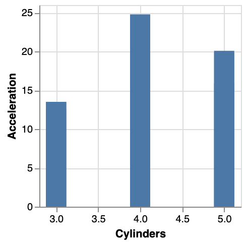
So with calculations, we get an additional field. What if we want to aggregate? Let’s go back to our initial question: we want to have a barchart that shows the average miles per gallon for each number of cylinders. Below is the specification:
{
  "$schema": "https://vega.github.io/schema/vega-lite/v4.json",
  "data": {
    "url": "https://raw.githubusercontent.com/vega/vega/master/docs/data/cars.json"
  },
  "transform": [
    {
      "aggregate": [{
         "op": "mean",
         "field": "Acceleration",
         "as": "mean_acc"
      }],
      "groupby": ["Cylinders"]
    }
  ],
  "mark": "bar",
  "encoding": {
    "x": {"field": "Cylinders", "type": "quantitative"},
    "y": {"field": "mean_acc", "type": "quantitative"}
  }
}
In the documentation, we see that aggregate takes a AggregatedFieldDef[], and groupby takes a String[]. The [] after each of these indicates that they should be arrays, not single values. That is why we use "aggregate": [{...}] instead of "aggregate": {...} and "groupby": ["Cylinders"] instead of "groupby": "Cylinders".

Exercise - See if you can create a plot that shows the mean acceleration per year. So you’ll have to combine two transforms to do this. Your output picture should look like this:
![]()
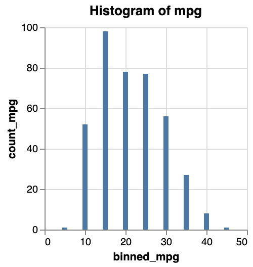
As another example, let’s create a histogram of the miles per gallon. Looking at the documentation at https://vega.github.io/vega-lite/docs/bin.html, it seems that the easiest way to do this is to do this in the encoding section:
{
  "$schema": "https://vega.github.io/schema/vega-lite/v4.json",
  "data": {
    "url": "https://raw.githubusercontent.com/vega/vega/master/docs/data/cars.json"
  },
  "mark": "bar",
  "encoding": {
    "x": {"bin": true, "field": "Miles_per_Gallon", "type": "quantitative"},
    "y": {"aggregate": "count", "type": "quantitative"}
  }
}
The only thing to do was to add "bin": true to the field that you want to bin, and "aggregate": "count" to the other dimension. However, this approach is not very flexible, and for any use that is not this straightforwards you will have to define the binning as a transform instead, like this:
{
  "$schema": "https://vega.github.io/schema/vega-lite/v4.json",
  "data": {
    "url": "https://raw.githubusercontent.com/vega/vega/master/docs/data/cars.json"
  },
  "transform": [
    {"bin": true, "field": "Miles_per_Gallon", "as": "binned_mpg"}
  ],
  "mark": "bar",
  "encoding": {
    "x": {"field": "binned_mpg", "bin": {"binned": true,"step": 1},"type": "quantitative"},
    "x2": {"field": "binned_mpg_end"},
    "y": {"aggregate": "count", "type": "quantitative"}
  }
}
When defining bin in a transform, it will create two new fields for each object: binned_mpg and binned_mpg_end. These indicate the boundaries of the bin that that object fits into. For example, the object
{
   "Name":"chevrolet chevelle malibu",
   "Miles_per_Gallon":18,
   "Cylinders":8,
   "Displacement":307,
   "Horsepower":130,
   "Weight_in_lbs":3504,
   "Acceleration":12,
   "Year":"1970-01-01",
   "Origin":"USA"
}
becomes
{
   "Name":"chevrolet chevelle malibu",
   "Miles_per_Gallon":18,
   "Cylinders":8,
   "Displacement":307,
   "Horsepower":130,
   "Weight_in_lbs":3504,
   "Acceleration":12,
   "Year":"1970-01-01",
   "Origin":"USA",
   "binned_mpg": 15,
   "binned_mpg_end": 20
}
Yet another way of creating a histogram is to work with two transforms: one to bin the data, and one to count the number of elements in the bin. This basically takes the output of the binning transform (i.e. the new binned_mpg field from above) and calculates the count on that. This way, the encoding is simpler to understand and we don’t have to do magic incantations within the definition of x and y.
{
  "$schema": "https://vega.github.io/schema/vega-lite/v4.json",
  "data": {
    "url": "https://raw.githubusercontent.com/vega/vega/master/docs/data/cars.json"
  },
  "transform": [
    {"bin": true, "field": "Miles_per_Gallon", "as": "binned_mpg"},
    {
      "aggregate": [{
         "op": "count",
         "field": "binned_mpg",
         "as": "count_mpg"
      }],
      "groupby": ["binned_mpg"]
    }
  ],
  "mark": "bar",
  "encoding": {
    "x": {"field": "binned_mpg","type": "quantitative"},
    "y": {"field": "count_mpg", "type": "quantitative"}
  }
}
Exercise - Create a plot showing the mean acceleration per bin of miles per gallon.
Composing plots
Facetting
We could already look at for example acceleration versus miles per gallon with year as colour to get a feeling of how things change over time. Another option, is to have a single plot per year.
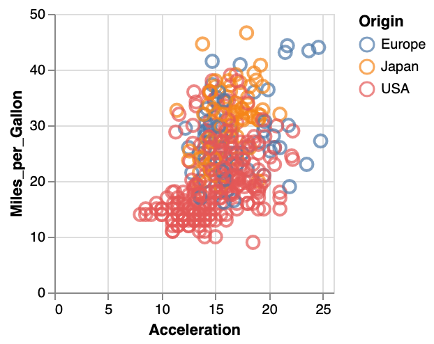
Exercise - Create a scatterplot of acceleration versus miles per gallon, with year defining the colour.
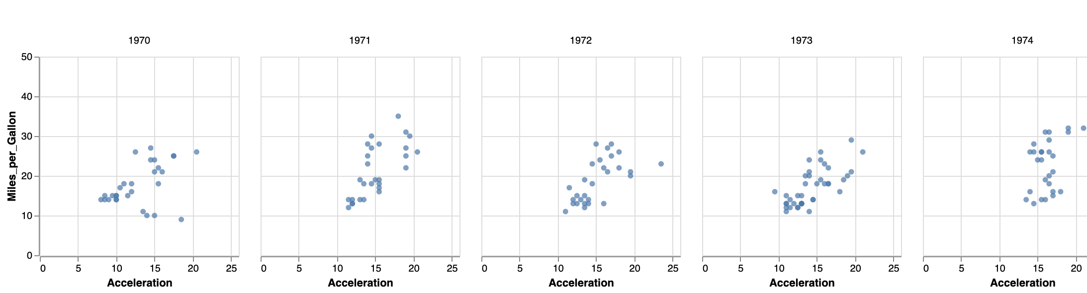
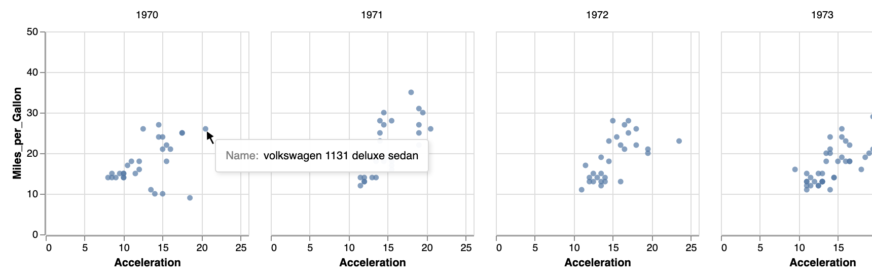
We can make a small-multiples plot with acceleration versus mpg, with a separate plot per year - called facetting by year (see https://vega.github.io/vega-lite/docs/facet.html for the documentation).
Just like with colour and shape described above, these facets can be defined in different places. The easiest will be "column": {"field": "yearonly", "type": "ordinal"} in the encoding section as below.
{
  "$schema": "https://vega.github.io/schema/vega-lite/v4.json",
  "data": {
    "url": "https://raw.githubusercontent.com/vega/vega/master/docs/data/cars.json"
  },
  "transform": [
    { "calculate": "year(datum.Year)", "as": "yearonly" }

  ],
  "mark": "circle",
  "encoding": {
    "x": {"field": "Acceleration", "type": "quantitative"},
    "y": {"field": "Miles_per_Gallon", "type": "quantitative"},
    "column": {"field": "yearonly", "type": "ordinal"}
  }
}
This will give you the following image:
Alternatively, you can define the facet at a higher level. According to the documentation, “to create a faceted view, define how the data should be faceted in facet and how each facet should be displayed in the spec.” This adaptation we need to make is a bit different than what we did before, as we have to wrap the mark and encoding within a separate spec section:
{
"$schema": "https://vega.github.io/schema/vega-lite/v4.json",
"data": {
"url": "https://raw.githubusercontent.com/vega/vega/master/docs/data/cars.json"
},
"transform": [
{ "calculate": "year(datum.Year)", "as": "yearonly" }
],
"facet": {"column": {"field": "yearonly", "type": "nominal"}},
"spec": {
"mark": "circle",
"encoding": {
"x": {"field": "Acceleration", "type": "quantitative"},
"y": {"field": "Miles_per_Gallon", "type": "quantitative"}
}
}
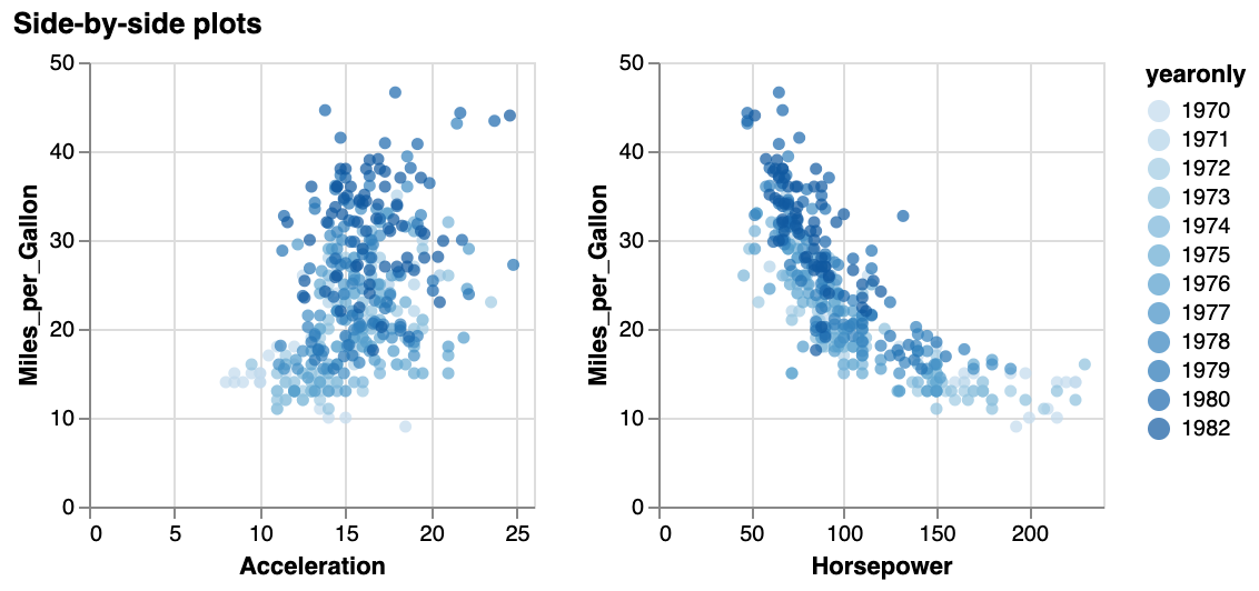
}Placing views side-by-side
You can also take more control of which plots are put side by side, by using concat, hconcat or vconcat. This pragma can contain a list of objects with mark and encoding pairs:
{
  "data": ...,
  "hconcat": [
    {
      "mark": ...,
      "encoding: ...
    },
    {
      "mark": ...,
      "encoding: ...
    },
    {
      "mark": ...,
      "encoding: ...
    }
  ]
}
For example:
{
  "$schema": "https://vega.github.io/schema/vega-lite/v4.json",
  "title": "Side-by-side plots",
  "data": {
    "url": "https://raw.githubusercontent.com/vega/vega/master/docs/data/cars.json"
  },
  "transform": [
    { "calculate": "year(datum.Year)", "as": "yearonly" }

  ],
  "concat": [
    {
      "mark": "circle",
      "encoding": {
        "x": {"field": "Acceleration", "type": "quantitative"},
        "y": {"field": "Miles_per_Gallon", "type": "quantitative"},
        "color": {"field": "yearonly", "type": "ordinal"}
      }
    },
    {
      "mark": "circle",
      "encoding": {
        "x": {"field": "Horsepower", "type": "quantitative"},
        "y": {"field": "Miles_per_Gallon", "type": "quantitative"},
        "color": {"field": "yearonly", "type": "ordinal"}
      }
    }
  ]
}
Do not forget to put each mark - encoding pair within curly brackets! The above specification should give you the following image:
Interacting with the images
Tooltips
The easiest - but still very useful - interaction you can create for a plot is to show a tooltip on hover. This is straightforward, but just adding the tooltip key in the encoding section:
{
  "title": "Showing a tooltip on hover",
  "data": {
    "url": "https://raw.githubusercontent.com/vega/vega/master/docs/data/cars.json"
  },
  "mark": "point",
  "encoding": {
    "x": {"field": "Acceleration", "type": "quantitative"},
    "y": {"field": "Miles_per_Gallon", "type": "quantitative"},
    "color": {"field": "Origin", "type": "nominal"},
    "tooltip": [
      {"field": "Acceleration", "type": "quantitative"},
      {"field": "Year", "type": "nominal"}
    ]
  }
}
This will get you the following behaviour (interactive):
Exercise - Adapt the facetted plot you created before to include a tooltip showing the name of the car, like in the next plot.
Selecting datapoints
In many cases you will want to do something more than just show a tooltip for a single datapoint, but for example select one or multiple datapoints and change their encoding, or use them to filter a different plot.
To create a selection, just add the selection key to your vega-lite specification. This takes an object as argument, with the following keys: type, on, and empty. Only type is mandatory, and can be single, multi, and interval.
The default behaviour for:
single: click on a datapoint to select it.multi: click on a datapoint to select it. Hold down shift to select multiple datapoints.interval: drag the mouse to select a rectangular region
By default, all datapoints are selected. You can change this by setting empty to none.
We’ll add a conditional encoding to make clear which points are selected and which are not. For the documentation on conditional formatting, see https://vega.github.io/vega-lite/docs/condition.html. See the code below how to make the colour conditional on a selection: lightgrey by default, but red if the datapoint is selected.
{
  "title": "Making selections",
  "data": {
    "url": "https://raw.githubusercontent.com/vega/vega/master/docs/data/cars.json"
  },
  "selection": {
    "my_selection": {"type": "interval", "empty": "none"}
  },
  "mark": "circle",
  "encoding": {
    "x": {"field": "Acceleration", "type": "quantitative"},
    "y": {"field": "Miles_per_Gallon", "type": "quantitative"},
    "color": {
      "condition": {
        "selection": "my_selection",
        "value": "red"
      },
      "value": "lightgrey"
    }
  }
}
This will give you the image below. Try dragging your mouse.
Exercise - Adapt the plot above with these requirements: (1) select only a single datapoint instead of an interval, (2) the datapoint should be selected by mouseover, not by click, and (3) in addition to the color changing, the size of the datapoint should be 120 instead of a default of 20.
Zooming and panning
Using the interval selection type, we can actually make a plot zoomable and pannable by binding is to the scales.
A simple example:
{
  "$schema": "https://vega.github.io/schema/vega-lite/v4.json",
  "data": {
    "url": "https://raw.githubusercontent.com/vega/vega/master/docs/data/cars.json"
  },
  "selection": {
    "grid": {
      "type": "interval", "bind": "scales"
    }
  },
  "mark": "point",
  "encoding": {
    "x": {"field": "Horsepower", "type": "quantitative"},
    "y": {"field": "Miles_per_Gallon", "type": "quantitative"},
    "color": { "value": "lightgrey" }
  }
}
Brushing and linking
Knowing how to make selections and how to make side-by-side views, we have all ingredients to create some linked-brushing plots. Below is an example script for one-way brushing: we create 2 plots, and selecting a range in the left plot will highlight plots in the right plot.
Notice that:
- We use
concatto show two plots instead of one. - We define
selectionin the first plot. - We use that selection in both plots.
{
  "$schema": "https://vega.github.io/schema/vega-lite/v4.json",
  "title": "Brushing and linking",
  "data": {
    "url": "https://raw.githubusercontent.com/vega/vega/master/docs/data/cars.json"
  },
  "concat": [
    {
      "selection": {
        "my_selection": {"type": "interval", "empty": "none"}
      },
      "mark": "circle",
      "encoding": {
        "x": {"field": "Weight_in_lbs", "type": "quantitative"},
        "y": {"field": "Miles_per_Gallon", "type": "quantitative"},
        "color": {
          "condition": {
            "selection": "my_selection",
            "value": "red"
          },
          "value": "lightgrey"
        }
      }
    },
    {
      "mark": "circle",
      "encoding": {
        "x": {"field": "Acceleration", "type": "quantitative"},
        "y": {"field": "Horsepower", "type": "quantitative"},
        "color": {
          "condition": {
            "selection": "my_selection",
            "value": "red"
          },
          "value": "lightgrey"
        }
      }
    }
  ]
}
The result:
Exercise - Play with the code above to check what happens if (1) you define the same selection in both plots, (2) you define it only in the first plot, but only use it in the second one, (3) you define a different selection in each plot and let it set the color in the second plot (i.e. selection A in plot A influences the color in plot B, and selection B in plot B sets the color in plot A.)
Focus & context plots
Knowing how we can select/brush part of a dataset, and that we can bind these selections to a scale, we can make focus/context plots.
To do this, we define a selection in the source plot (i.e. in the one in which we will do the selecting). This selection is then used to change the domain of the scale in the target plot.
The example below shows this on the S&P500 data. Try selecting a range in the bottom plot.
{ "$schema": "https://vega.github.io/schema/vega-lite/v4.json",
  "data": {
    "url": "https://raw.githubusercontent.com/vega/vega/master/docs/data/sp500.csv"
  },
  "vconcat": [{
    "width": 480,
    "mark": "area",
    "encoding": {
      "x": {
        "field": "date",
        "type": "temporal",
        "scale": {"domain": {"selection": "brush"}},
        "axis": {"title": ""}
      },
      "y": {"field": "price", "type": "quantitative"}
    }
  }, {
    "width": 480,
    "height": 60,
    "mark": "area",
    "selection": {
      "brush": {"type": "interval", "encodings": ["x"]}
    },
    "encoding": {
      "x": {
        "field": "date",
        "type": "temporal"
      },
      "y": {
        "field": "price",
        "type": "quantitative",
        "axis": {"grid": false}
      }
    }
  }]
}
A scatterplot matrix using repeat
We’ve now seen how to do brushing and linking across different plots. One of the typical use cases is the scatterplot matrix. Based on what we’ve seen above, we can already create this, just by adding specifications to the concat section.
Exercise - Create a scatterplot matrix of the features Weight_in_lbs, Miles_per_Gallon and Acceleration with linking and brushing as we did above.
When doing the exercise, you’ll notice that there is a lot of repetition, as the selection, marks and encoding are repeated for each plot. For this use case, vega-lite provides the repeat keyword. It allows you to extract the variable part of the specification into a separate array. When you do this, you’ll have to put the selection, marks and encoding within a separate spec again.
{
  "$schema": "https://vega.github.io/schema/vega-lite/v4.json",
  "title": "Scatterplot matrix",
  "data": {
    "url": "https://raw.githubusercontent.com/vega/vega/master/docs/data/cars.json"
  },
  "repeat": {
    "column": [ "Weight_in_lbs", "Miles_per_Gallon", "Acceleration" ],
    "row": [ "Weight_in_lbs", "Miles_per_Gallon", "Acceleration" ]
  },
  "spec": {
    "selection": {
      "my_selection": {"type": "interval", "empty": "none"}
    },
    "mark": "circle",
    "encoding": {
      "x": {"field": {"repeat": "column"}, "type": "quantitative"},
      "y": {"field": {"repeat": "row"}, "type": "quantitative"},
      "color": {
        "condition": {
          "selection": "my_selection",
          "value": "red"
        },
        "value": "lightgrey"
      }
    }
  }
}
This will give you this image. Try selecting a group of datapoints.
Using widgets for selections
We can also use HTML widgets to create selections. For this we’ll bind an HTML input element to a data field. In the example below, we create a
{
  "title": "Making selections",
  "data": {
    "url": "https://raw.githubusercontent.com/vega/vega/master/docs/data/cars.json"
  },
  "selection": {
    "my_selection": {
      "type": "single",
      "fields": ["Origin"],
      "bind": {"input": "select", "options": [null, "Europe", "Japan", "USA"]}
    }
  },
  "mark": "circle",
  "encoding": {
    "x": {"field": "Acceleration", "type": "quantitative"},
    "y": {"field": "Miles_per_Gallon", "type": "quantitative"},
    "color": {
      "condition": {
        "selection": "my_selection",
        "value": "red"
      },
      "value": "lightgrey"
    }
  }
}
The result is a selection box that we can use to filter the data:
This code is exactly the same as above in the example for “Selecting datapoints”; only the selection section is replaced from
"selection": {
  "my_selection": {"type": "interval", "empty": "none"}
},
to
"selection": {
  "my_selection": {
    "type": "single",
    "fields": ["Origin"],
    "bind": {"input": "select", "options": [null, "Europe", "Japan", "USA"]}
  }
},
We can also combine different selections, by using the and key and providing an array of selectors.
"color": {
  "condition": {
    "selection": {"and": ["my_first_selection","my_second_selection"]},
    "value": "red"
  },
  "value": "lightgrey"
}
Exercise - Create a plot like the one above, but with 2 dropdown boxes: one for number of cylinders, and one for origin. All points should be lightgrey, unless they comply to both criteria.
Exercise - Create a plot like the one above, but with 2 dropdown boxes: one for number of cylinders, and one for origin. All points should be lightgrey, unless they comply to either one of the criteria.
Another way of combining two filters, is to put them both in the bind section:
"selection": {
  "my_selection": {
    "type": "single",
    "fields": ["Origin","Cylinders"],
    "bind": {
      "Origin": {"input": "select", "options": [null, "Europe", "Japan", "USA"]},
      "Cylinders": {"input": "select", "options": [null, 2,3,4,5,6,7,8]}
  }
},
Types of widgets
There is more than just the dropdown widget. Here are the options:
select: dropdown widget (only one selection possible)range: slider- e.g.
"Cylinders": {"input": "range", "min": 3, "max": 8, "step": 1}
- e.g.
text- e.g.
"Origin": {"input": "text"}
- e.g.
checkbox: a single checkbox- e.g.
"electric": {"input": "checkbox"}
- e.g.
radio: radio buttons- e.g.
"Origin": {"input": "radio", "options": ["Europe", "Japan", "USA"]}
- e.g.
Exercise - Alter the last plot so that you use radio buttons for the origin, and a slider for number of cylinders.
Further exercises
For the exercises below, we will use the New York City citibike data available from https://www.citibikenyc.com/system-data. Some great visuals by Juan Francisco Saldarriaga can inspire you.
We made a (small) part of the data available here. It concerns trip data from November 2011, where the trip started or ended in station nr 336. The fields in each record (with example data) look like this:
{
  "tripduration": 1217,
  "starttime": "2019-11-01 06:03:28.5390",
  "stoptime": "2019-11-01 06:23:45.9810",
  "startstation_id": 3236,
  "startstation_name": "W 42 St & Dyer Ave",
  "startstation_latitude": 40.75898481399634,
  "startstation_longitude": -73.99379968643188,
  "endstation_id": 336,
  "endstation_name": "Sullivan St & Washington Sq",
  "endstation_latitude": 40.73047747,
  "endstation_longitude": -73.99906065,
  "bikeid": 41025,
  "usertype": "Subscriber",
  "birthyear": 1964,
  "gender": 1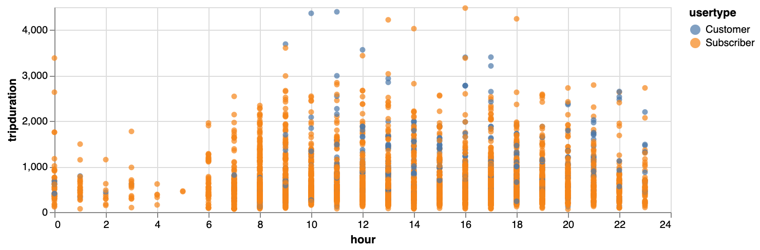
}Exercise: Make a plot showing how the trip duration is related to the hour of the day. You could colour by usertype. You’ll see that your plot will be compressed because of some very long durations, so only use the trips that have a duration of less than 5,000.
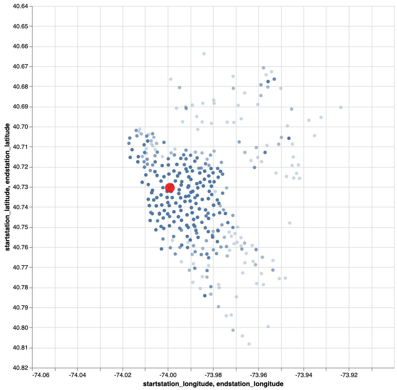
Exercise: Make a plot with the relative positions of the start stations vis-a-vis the end station, when that end station is 336. Show the end station itself as well. Your plot could look like this:
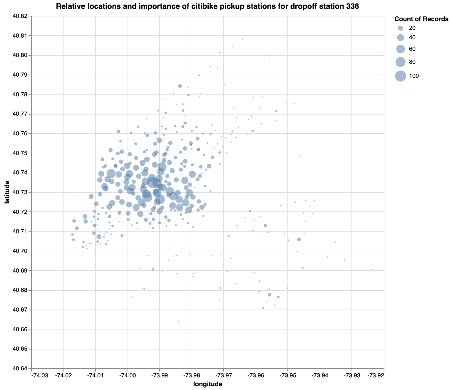
Exercise: Same as the one above, but scale the points based on the number of bikes picked up there. You plot should look like this:
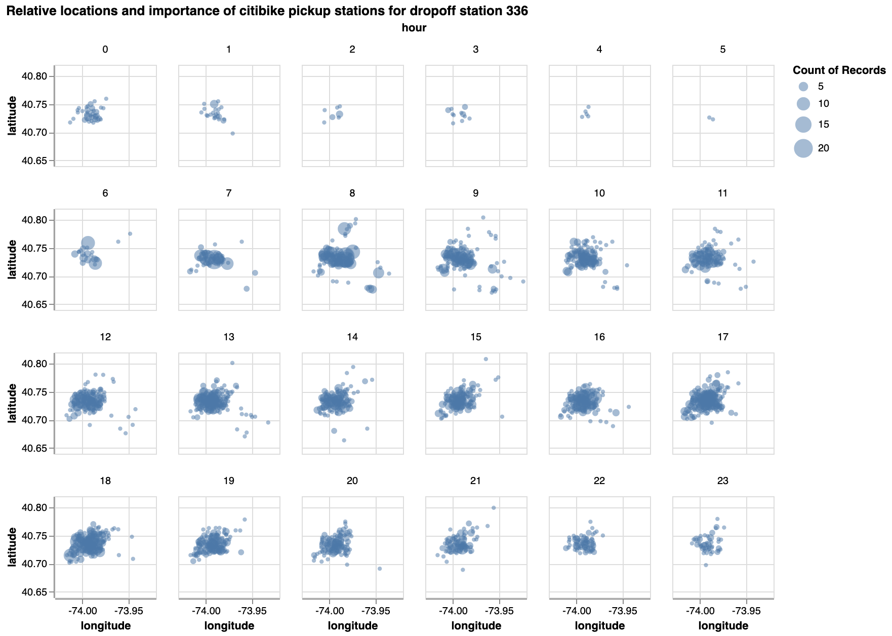
Exercise: Same as the one above, but facetted by hour.
Exercise - What other interesting plots could you make?
Where next?
To dig deeper into vega-lite, I suggest you take some time to explore the documentation. There are many additional things you can do that we didn’t touch upon here.
Also, I recommend having a look at the OpenVis presentation where Vega-Lite 2.0 was introduced.