dendsort - R package for dendrogram leaf ordering
Contribution by Ryo Sakai
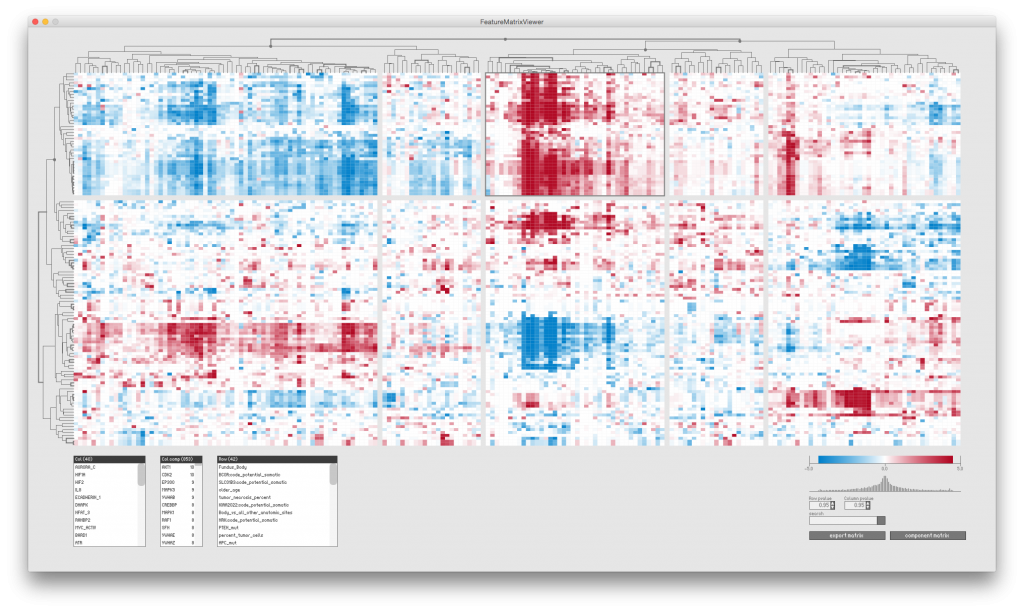
Cluster heatmap is perhaps one of the most popular and frequently used visualization technique in bioinformatics and biological science with a wide range of applications, including visualization of adjacency matrices and gene expression profile from high throughput experiments. It uses agglomerative hierarchical clustering to reorder rows and columns of the input matrix based on the leaf ordering from the dendrogram structures.
Although this method is widely used and accepted as an exploratory visualization technique, we identified a few challenges and shortcomings in the current practice of generating and interpreting cluster heatmaps.
First, we observed that when some users interpret cluster heatmap, they have a tendency to overlook the dendrogram structure and just perceive it as an indication of hierarchical clustering. A dendrogram is a binary tree structure, resulting from agglomerative hierarchical clustering. The clustering process starts with individual elements/nodes as singleton cluster and successively merges a pair of most similar clusters until only one cluster remains. This process results a monotonic hierarchy, represented in the resulting dendrogram. The dissimilarity (or the distance) between two clusters encoded in the height of branch where two cluster merges. The height of branches is very informative but often overlooked.
Second, the existing leaf ordering methods, as well as the utility of dendrogram structure, focus on the linear order derived from the leaf order, not the hierarchical structure. Because the orientation of clusters at each branch can be flipped without changing the underlying hierarchical structure, there are 2^n-1 possible orderings given n input elements. This presents a unique combinatorial / optimisation challenge, and there are a number of leaf reordering methods to maximize the sum of the similarity of any adjacent leaves. These combinatorial approach aims to homogenise the linear order, but this does not guarantee the best linear order either because it is constrained by the hierarchical structure. Instead of focusing on improving the linear order, we developed a leaf ordering methods to simplify the dendrogram structure to represent the monotonic order in which clusters are formed and the nested cluster relationships, which subsequently resulted a leaf ordering that reflects the hierarchy.
For further details, including the implementation, the validation, and case studies, please refer to our publication on F1000.
Design Process / Background story
In the fall of 2013, I had an opportunity to visit the Shmulevich lab at the Institute for Systems Biology in Seattle for 2 months. During this visit, I developed an interactive heatmap viewer working closely with research scientists (Vesteinn Thorsson and Sheila Reynolds). They are a part of the NIH’s The Cancer Genome Atlas (TCGA) and, at that time, they were working on the data on stomach cancer.
One day, I was observing one of the analyst looking a large cluster heatmap on her desk. What really triggered my curiosity was when I saw her holding a piece of blank paper up against the monitor to read the large heatmap. I identified two challenges from this observation. First, the heat map created blobs of areas with strong signals. In order to see the relationship between the dendrogram and the blob, the user need to “cut” the heatmap using a sheet of blank paper. Second, the user was interested in reading the tiny labels to make sense of the blobs or the clusters. The blank paper served as a vertical or horizontal ruler to find the corresponding labels.
After a few meetings with analysts and iterations, I developed an interactive heatmap visualization prototype, as shown below. The dendrogram was interactive, where the user click on the branch to introduce gaps in the heatmap. The data also incorporated the result of multi scale bootstrap resampling. (Check out pvclust) It also integrated a simple pathway enrichment analysis function as well. This prototype helped navigation and exploration of a cluster heatmap interactively.
At that point, even though we understood that any axis of a dendrogram can be rotated without affecting the meaning of the hierarchy, it was hard to imagine what the effect of this rotation is on the heatmap representation. Thus, in the second prototype, we implemented an interactivity where the user could click on the axis and it rotated the matrix along the axis. After “playing” with this prototype rotating along the axis and observing other users “play” with it, we ended up with a cluster heatmap representation that was much clearer than the one we started with. This serendipitous finding led us to wonder, “can we come up with an heuristic to improve the representation of dendrogram and heatmap?”
I am a big fan of prototypes, because it allows us to evaluate the design ideas and come up with new insights. Without the interactivity, we would not have encountered the simpler dendrogram structure, or at least it would have taken much much longer. We knew we could rotate along the axis of a dendrogram, but we could not imagine what it would have looked like in our head, and this would have been extremely tedious to test in Illustrator. Just making the action of rotation a click-away, it allowed us to explore options and eventually lead us to come with an automated solution by developing the heuristics for leaf ordering.
We advocate dendsort for all the cluster heatmap figures for both exploratory data analysis, as well as for publication. For details, see our F1000 paper. The implementation is an R package, and available for download from CRAN. Vignettes of this package are also available.