Visualizing dosage-related drug response for L1000 data - a design exercise
Collaboration with Bang Wong, Broad Institute
The L1000 project (now available through http://clue.io; see this paper for data browser) investigates how small molecules perturb gene expression with the aim to identify novel drug targets. The data basically consists of gene expressions in different types of cells (normal vs cancer) for different dosages of the small molecules.
In an exercise to visualize this large dataset on paper (A0 poster) rather than interactively on a screen, Ryo Sakai developed the Fly Plot. This paper representation allowed for a more engaging and more effective discussion between domain experts.
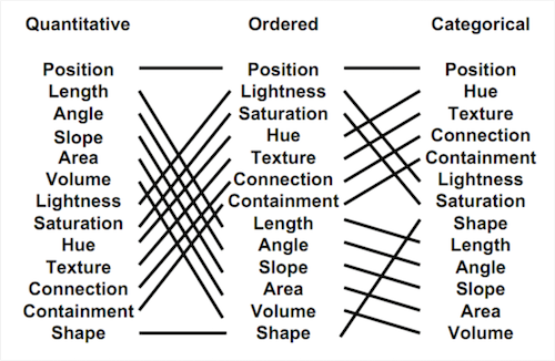
Figure 1 - Effectiveness of visual encoding for quantitative, ordered and categorical data (Mackinlay). Higher in the list corresponds to better.
The initial iterations of this visual followed the effectiveness principle as shown in Figure 1 and were good at representing the data very accurately (see Figure 2-A), especially when skewing the y-axis to reduce the visual noise (Figure 2-B). After some interactions, we adopted a radial plot approach and named this new visual encoding “Fly plot”, since it looked like fly fishing flies. The fly plot allowed to draw more visual emphasis on those responses with stronger effect, especially effects measured at two different doses. These plots were effective to have the researchers look at different expression pattern of dosage effect and find interesting patterns and compare between drugs.

Figure 2 - Different iterations to come to the FlyPlot. Iterations A and B focus on the effectiveness principle (see Figure 1) whereas iteration C prioritized the use of preattentive vision. Orange refers to primary cell line; blue refers to cancer cell lines.
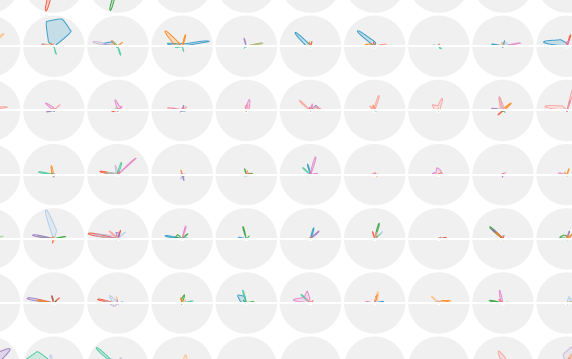
Figure 3 - Portion of final poster showing fly plots for different gene-compound combinations. The combination in the top-left corner immediately draws the attention as it is different from the others.
This visualization exercise is a clear example of the tension between generic versus custom visual designs. Although generic visualizations (scatterplot, barchart, etc) in generic tools (Excel, Tableau, R, but also e.g. generic genome browsers such as the Ensembl Browser) are very useful for a greater user group, these often don’t suffice for specific questions or when the data is very complex (see Figure 4).
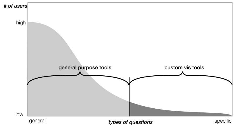
Figure 4 - Whereas a small number of generic tools can have a large user base, custom solutions often have to be found for specific datasets.
In addition, Ryo stepped away from following the effectiveness principle blindly (Figure 2 A and B) but rather focused on maximixing the pop-out effect (i.e. preattentive vision) to quickly draw the attention of the viewer to interesting patterns (see Figure 5).
Focusing on pop-out effect before looking at effectiveness can aid in very quickly identifying patterns.
More on all this is available in Ryo’s PhD thesis.