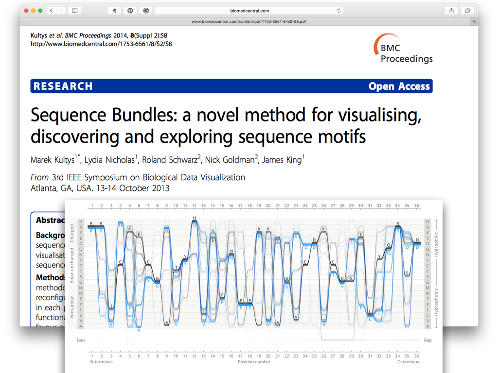
Sequence Diversity Diagram for comparative analysis of multiple sequence alignments
Contribution by Ryo Sakai
The sequence logo has been the long standing convention for visualization of multiple sequence alignments of nucleotides or amino acids for the past few decades. Although it effectively communicates the amount of information / conservation present at every position, this visual encoding falls short when the analysis task is to compare between two or more sets of aligned sequences. This challenge was posed by BioVis 2013 redesign contest.
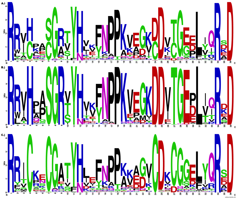
The contest provided a figure of sequence logos and the input data sets. The data included amino acid sequences of the adenylate kinase lid (AKL) domain. The figure compared sequence logos of 1) across all organisms, 2) from gram-negative bacteria and 3) from gram-positive bacteria. The figure legend also provided some context and shed some lights on what the analysts wanted to “see”.
From BioVis Redesign Contest 2013
The first thing I felt was the use of the primary or very saturated color scheme made it very distracting and not at all easy on eyes. The large letters have too much visual emphasis and they were so overpowering that it made it painful, if not impossible, to look for small differences. In order to compare the difference between gram positive and negative samples, your eyes need to travel back and forth between figures and you need the all organism figure to see the scale of each set. For instance, as the legend suggests, “… positions (eg 5, 8, 30, 32) are differentially constrained in each subfamily…” I found it very difficult to compare these positions.
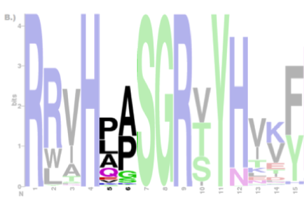
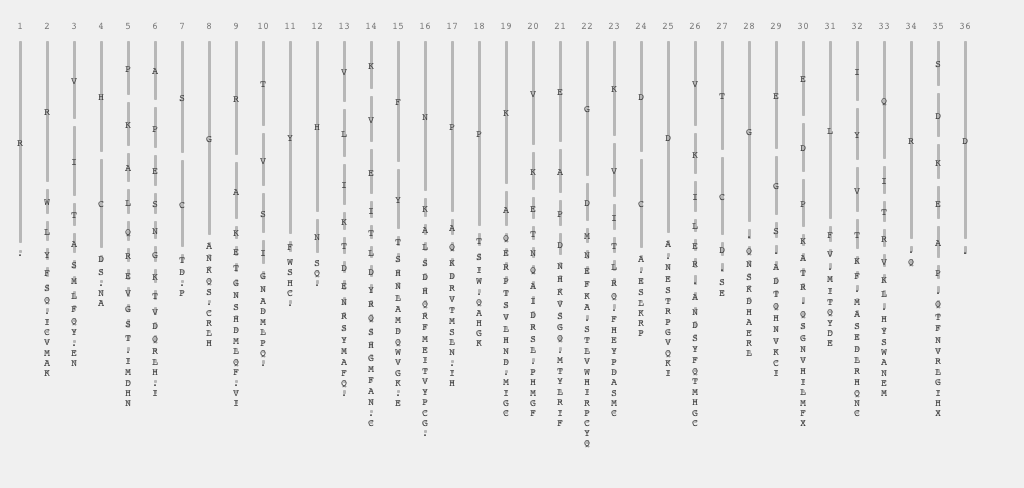
Another motivation came from studying how the information content was calculated to determine the height of each letter. This statistical measure is more sophisticated than just calculating the frequency, and it was strictly position-based statistics. For instance in the figure below, it is not clear whether the Proline (P) at position 5 is followed by the Alanine (A) or another Proline (P) at the subsequent position 6. There may be or may not be such sequential conservation, and this information was absent in the traditional sequence logo representation.
Design Process
My design process started roughly reproducing the sequence logos. This helped to understand the statistics behind the calculation of the sequence logos.
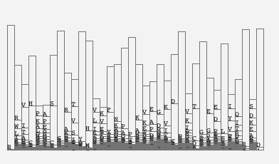
Then, I wanted to explore the concept of the sequential conservation. I started to explore other visual encoding options. I refer to this process as “sketching with data.” First, I started to use the frequency instead of the information content. Each position is represented by a bar and the bar is divided based on the frequency of amino acids. The bars are also sorted based on the frequency. This is similar to the consensus logo representation.
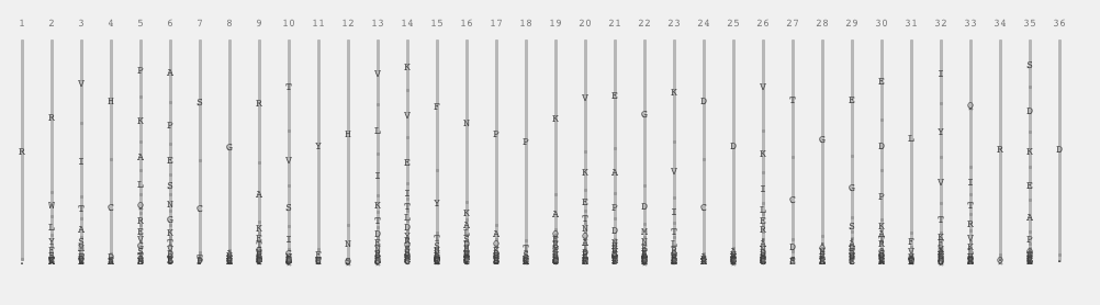
Then, I introduced small gaps of the same size between each division, which resulted in the following image.
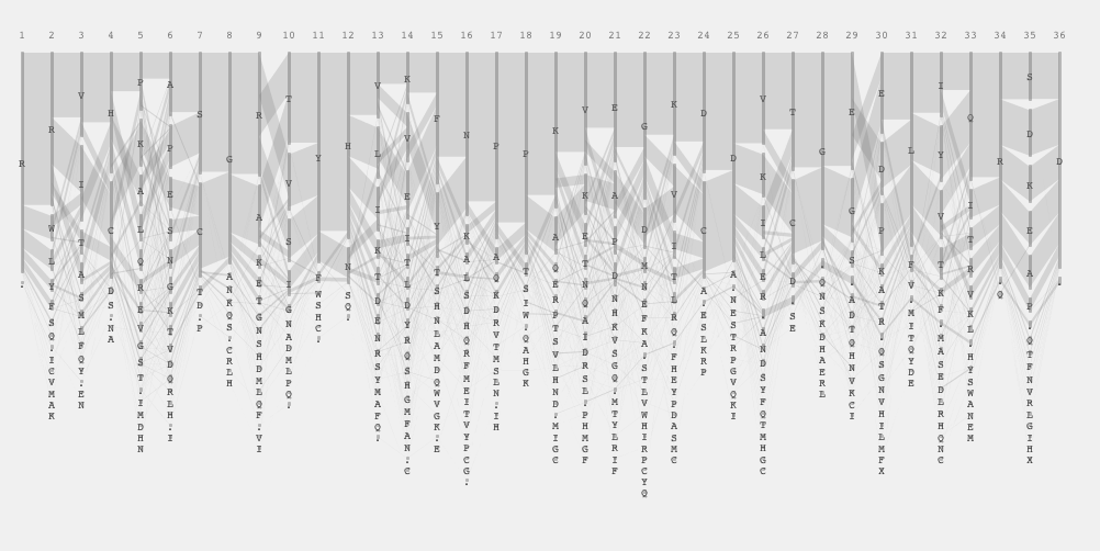
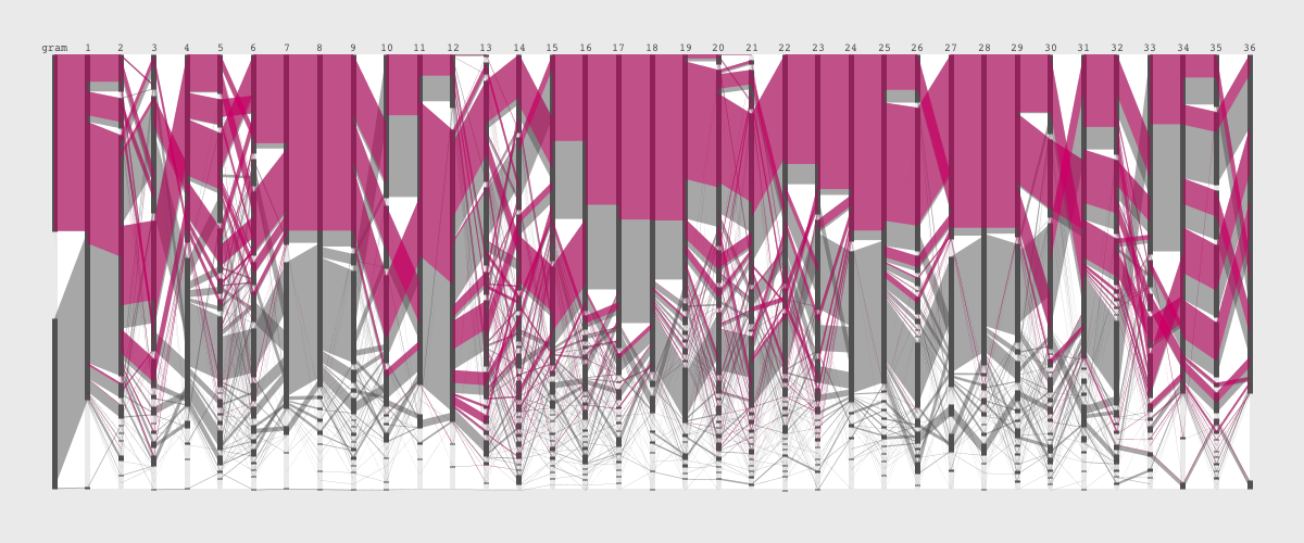
To check if there is any sequential conservation at all, I drew bands / ribbons between each bar segment-based on the sequential conservation. Then, it became quite obvious that there IS sequential conservation and it also indicated that there may be some potential subfamilies within a set.
The view above was already getting interesting when I took away the use of color and letters of varying heights. Then, I looked for other ways to even simplify further. The below is another idea to encode the frequency in the area of a circle, instead of using bar heights.
To compare two sets, then I thought, I could turn each circle into a pie chart. In the view below, I am highlighting one set in green. This view was useful for spotting positions that are different between two sets, for example position 24. And, those relatively large circles with split coloring indicated that both sets shared the same amino acid at the position. However, I didn’t find the split of the circle an intuitive visual encoding for a “common” amino acid.
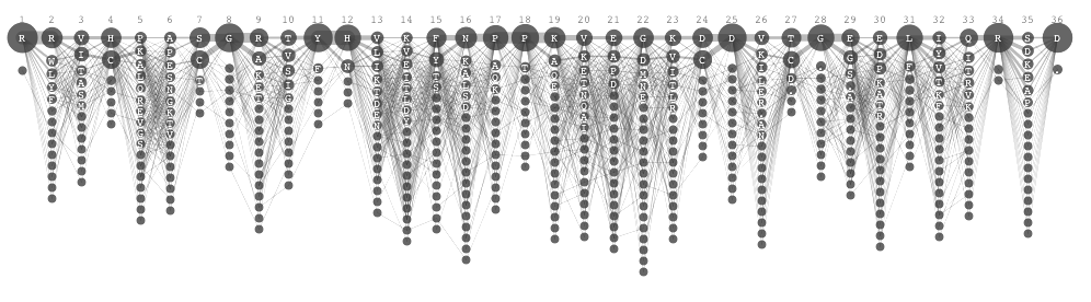
Then, I returned to the previous bar representation, which is basically the Parallel Sets presentation. I introduced a bar at the beginning to indicate that there are two sets to start with: gram positive and negative. I thought it looked nice actually without all the letters shown all the time. If you are looking for the patter of the similarity or difference, the user does not have to know the identity of every single amino acid while comparing two sets.
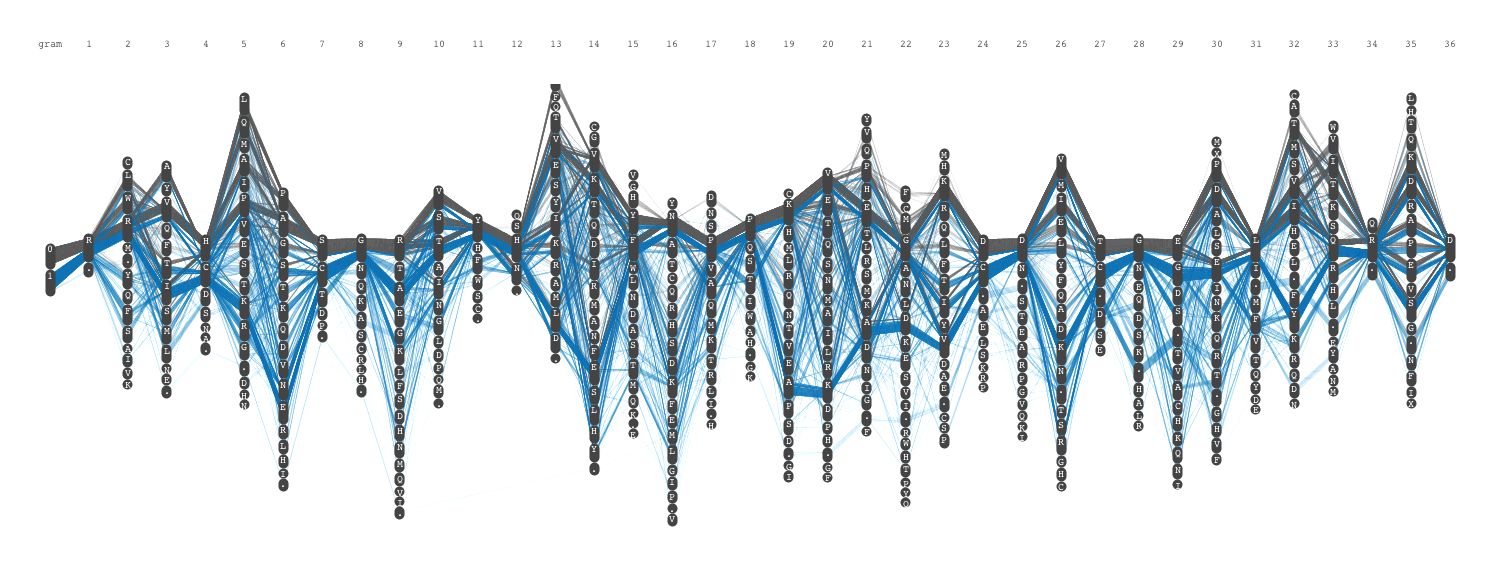
I liked this parallel set representation, but I had to encode which amino acid it is. I came up with the following representation where each bar segment got annotation and when the two sets shared the same amino acid they were put close to the mid line. In other words, the consensus sequence would appear in the middle and the amino acid unique to one particular set were positioned away from the mid line. One of interesting insight in this view was the identification of the subgroup from the position 19 to 24. In this view, positioned each sequence to minimize its overlap and drew each sequence as a very thin hair line. As a result, sequential conservations are shown as bundles.
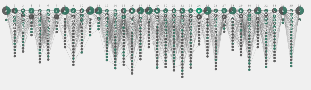
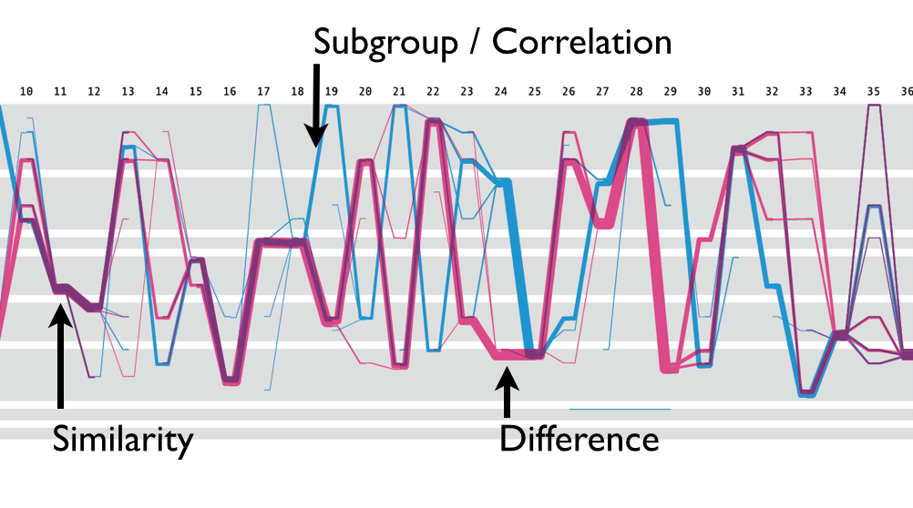
Another challenge was to introduce the grouping of amino acid. In the original sequence logo, the color was used to group amino acids based on its structure and chemical properties. To encode the identity of amino acid and its grouping, I decided to use the vertical position. This resulted in a grid template to draw sequence diversity. This was the final visual encoding, and we call it Sequence Diversity Diagram. After filtering out some very thin lines (in other words, not very conserved positions), the final image looked like the following.
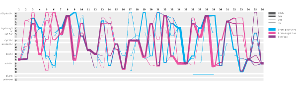
This visual encoding made it easier to compare two sets of samples. When you want to find positions where two sets are similar, you look for the position where blue and magenta lines overlap, creating purple segments. Conversely, the difference is identified by looking for positions where the lines do not overlap. As also mentioned previously, the subgroup of blue line split going zig-zag from the position 19 was observed. This type of pattern were not detectable in the traditional sequence logo representations.
Interestingly, another group from the Science Practice came up with very similar encoding and the grid system, called Sequence Bundle. I think the fact that two designers came up with the similar design solution independently sort of validates the visual encoding.
Further information about Sequence Diversity Diagram and its implementation is available from this git repository. Please note that an error of swapping figures were intruded by the editor of the journal… The editors were unable to edit the original version, but published this Erratum to the original article.
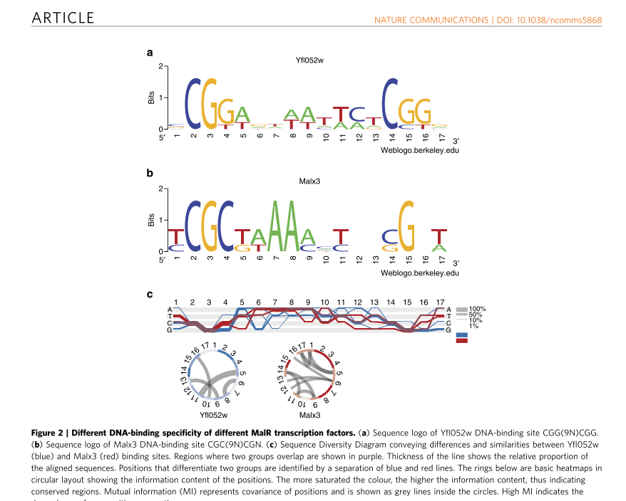
Sequence Diversity Diagram is not limited to amino acid sequence. The visualization technique was used to compare DNA sequences of DNA binding sites.
References:
- Sakai, Ryo, and Jan Aerts. 2014. “Sequence Diversity Diagram for Comparative Analysis of Multiple Sequence Alignments.” BMC Proceedings 8: S9
- Pougach, Ksenia, et al. 2014. “Duplication of a Promiscuous Transcription Factor Drives the Emergence of a New Regulatory Network.” Nature Communications 5 (January): 4868