STAD - Understanding the shape of complex datasets
This is work performed by Daniel Alcaide, unless otherwise mentioned.
The issue
To get your head around complex datasets it is often crucial to resort to reducing the number of dimensions and/or to clustering the datapoints. A host of methods have been created for each over the years, such as PCA, tSNE and UMAP for the first, and k-means and hierarchical clustering for the second. But of course each of these still has its drawbacks. In tSNE, for example, no inference can be made from the resulting plot about the global structure of the data: datapoints close in high dimensional space will be close together in the tSNE plot, but not necessarily the other way around (see the image below). Similarly, the choice of cutoffs or k defines the number of clusters in a dataset. But do you always know this beforehand? And isn’t often the answer “it depends”?
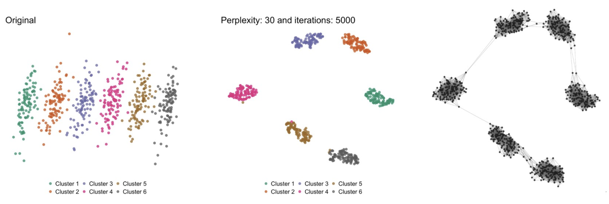
One of the issues with tSNE that we want to solve. [Left] Original dataset in 2D; [middle] tSNE transformation; [right] our approach. tSNE is very good in identifying datapoints that are close together (i.e. the original clusters are clearly found), but is unable to maintain the larger picture. Based on the tSNE image, one might be tempted to think that cluster 1 and cluster 6 are relatively close to each other while, in reality, they are the furthest apart. In the right image, we anchored the datapoints in a similar position as in the tSNE plot in order to compare this to the tSNE plot.
Topological Data Analysis
The topological data analysis (TDA) approach tries to address some of these issues, as it aims to identify the “shape” of the underlying data. In the words of Ayasdi’s Gunnar Carlsson: “Data has shape and shape has meaning.” The strength of this approach is well demonstrated in a Scientific Reports paper by Pek Lum et al from 2013, where they were able to identify subpopulations in breast-cancer patients that had escaped earlier scrutiny of the data.
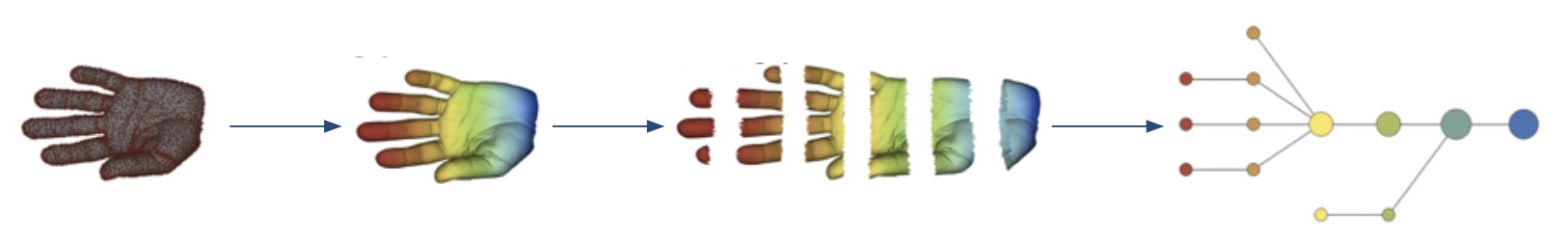
The principle of Ayasdi’s approach to TDA. Adapted from Lum P et al, 2013
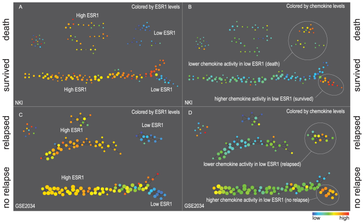
Identifying substructures in data using TDA. Taken from Lum P et al, 2013
One of the big advantages of something like the TDA approach is that the context is provided. But of course, this method also suffers from its own drawbacks just like the general dimensionality reduction and clustering methods do. In the case of Ayasdi’s approach, the resulting network is very sensitive to a host of parameters, such as the choice of the lens, the clustering method, the size of the bins, the overlap between the bins, etc. For an explanation of what a lens is etc, have a look at this excellent Stanford Seminar talk by Anthony Bak.
STAD - Simplified Topological Approximation of Data
To leverage the strength of TDA but in an effort to make it less dependent on prior choices, we devised a new graph-based method to assess the data shape, called STAD: Simplified Topological Approximation of Data. A paper is under review but already available at arXiv.
Our method takes a distance matrix of the datapoints as input. For a regular high-dimensional space with numeric dimensions we typically take the cosine distance as the distance metric. For strings we can for example use the Levenshtein distance. In some cases like, for example, comparing different patients based on their diagnoses we have to devise our own metric.
But OK: we have our distance matrix. Now what? Here are the steps:
- We create a fully-connected graph where each datapoint is a node and the weight of the links is the similarity between those datapoints. The more similar they are (i.e. the less distant they are), the higher the weight of the link.
- From this fully-connected weighted graph we create a minimal spanning tree which takes those weights into account.
- In this graph we calculate a new distance matrix between each two nodes (i.e. datapoints) which represents the length of the shortest path between those nodes.
- We compare the original distance matrix (which was the input to the whole exercise) with the distance matrix based on the graph, and calculate the correlation.
- We add a number of links to the minimal spanning tree. Which links? Those between two nodes that are closer together in the original distance matrix but far apart in the new distance matrix. And we calculate the correlation again.
- Repeat the previous step with increasing number of links.
- From these repetitions we take the network of which the distance matrix was best correlated with the original matrix.
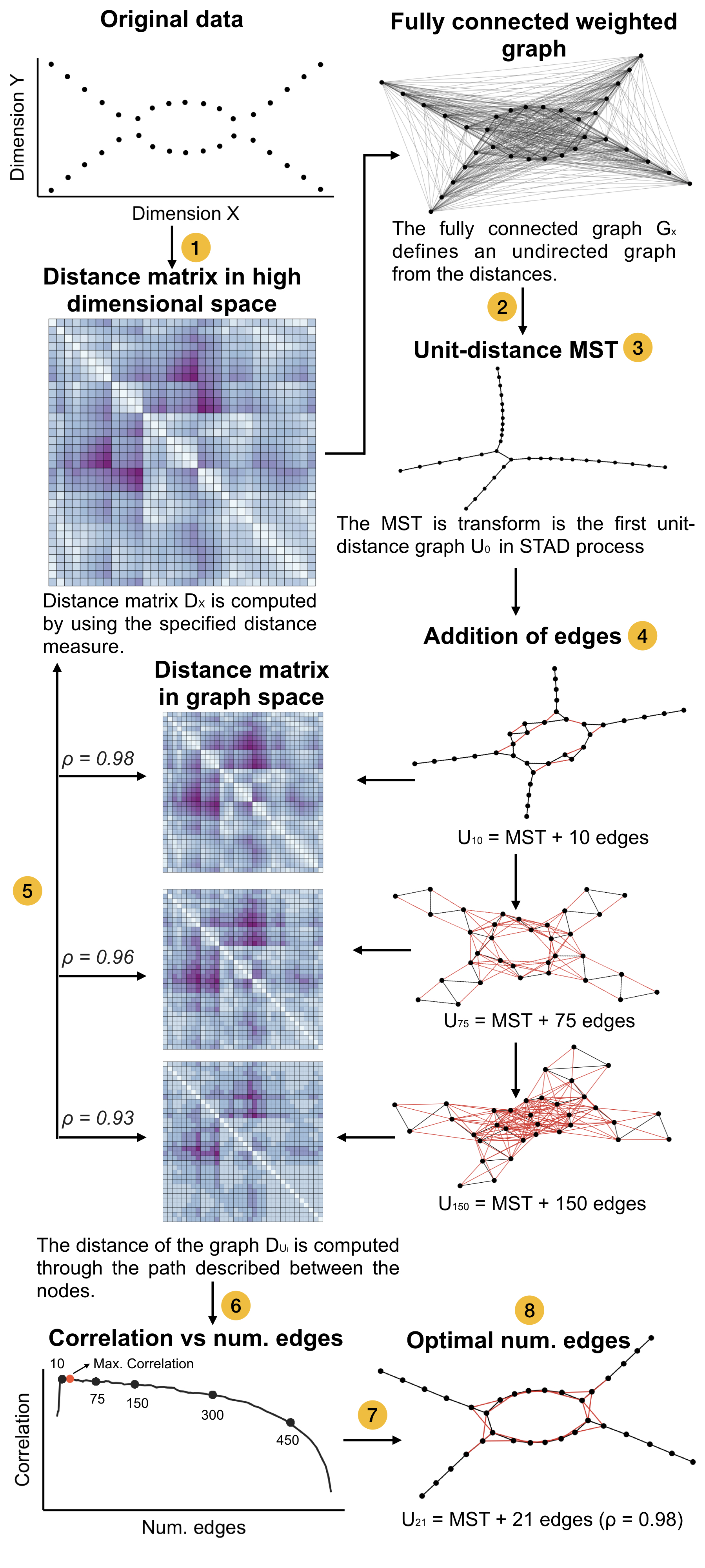
An overview of the STAD methodology. Taken from https://arxiv.org/pdf/1907.05783.pdf.
Examples
We are applying STAD in different applications, including life sciences and archaeology.
1. Time-series data
But first, let’s see what it does on a simulated time-series dataset. The following image is based on a dataset of 600 time series, containing
- 100 series that are relatively stable
- 100 that ascend in a continuous manner
- 100 that are stable then jump up and then are stable again
- 100 that descend in a continuous manner
- 100 that are stable then drop and then are stable again
- 100 that oscillate
In the image, we select a number of nodes in the network and colour the corresponding raw time series in red.
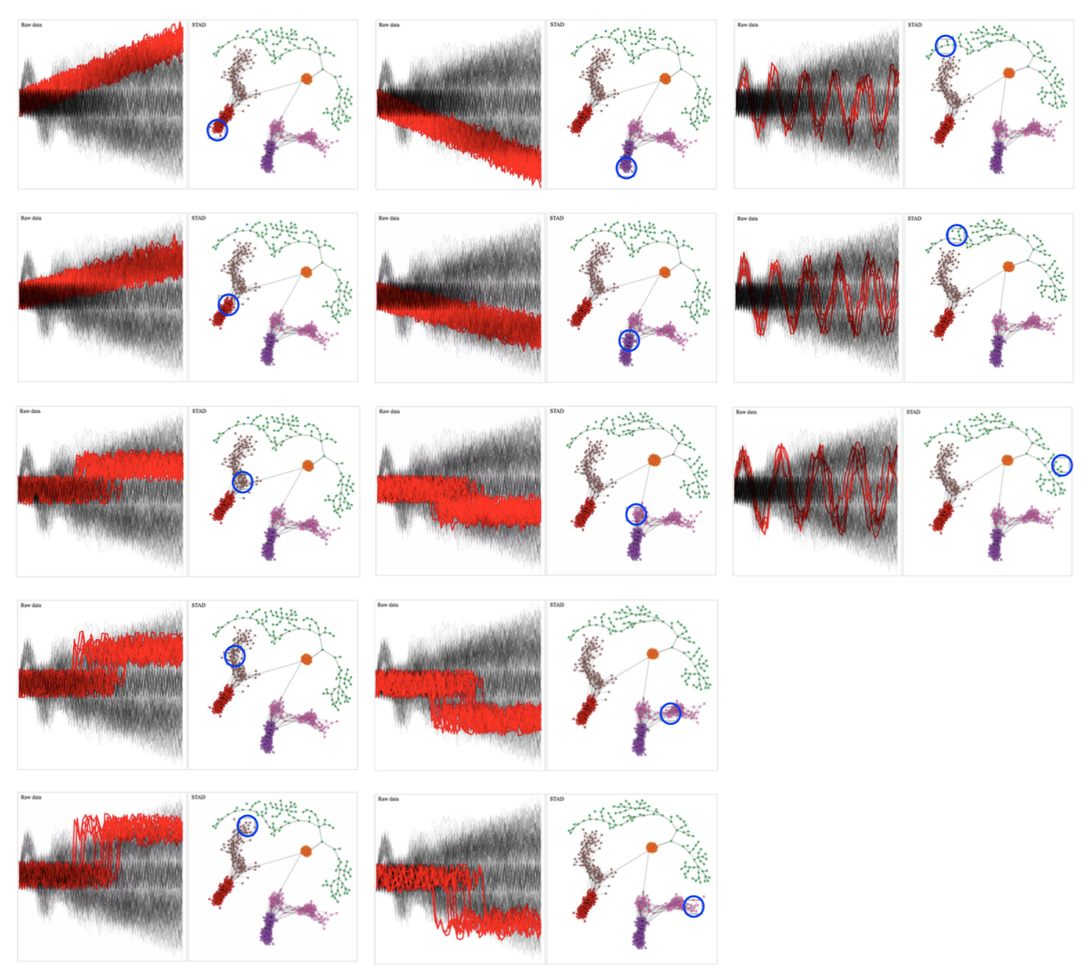
Relationship between network and original time series data. Brushing different parts of the network reveals which time series are selected.
From these images we can clearly see that STAD captures the underlying shape of this dataset very well. By the way: the colours in the networks are automatically generated using community detection; these are not imposed by us.
We can see the following:
- ascending and descending time series are separated (red+brown vs pink+purple)
- within the ascending (and mutatis mutandis in the descending) time series we see a separation between the gradually ascending series vs the ones that are stable and jump to a higher value abruptly
- the nodes at the transition between these two represent those time series where a possible jump can be hidden in the noise of the time series itself (see 1st and 2nd column, both 3rd from the top)
- the oscillating time series are more different from each other than the other types. What we didn’t expect but which is nice: the spectrum from left to right in the green nodes corresponds to time series with shorter to longer periods
2. Traffic in Barcelona
We analysed a public traffic dataset for the city of Barcelona in Spain, collected by 534 traffic sensors across the city. Data was collected every 5 minutes from October 2017 until November 2018. The captured data was a number from 1 to 6, with 1 for no traffic and 6 for traffic gridlock.
There are many myriad of ways in which this data could be sliced and diced; we simply aggregated the data on a per-day basis: a single scalar representing the average traffic across the city for that whole day was calculated. Although this is an immense simplification of the dataset, we are still able to extract insights and questions that are not clear from a dimensionality reduction or clustering.
Barcelona traffic without a lens
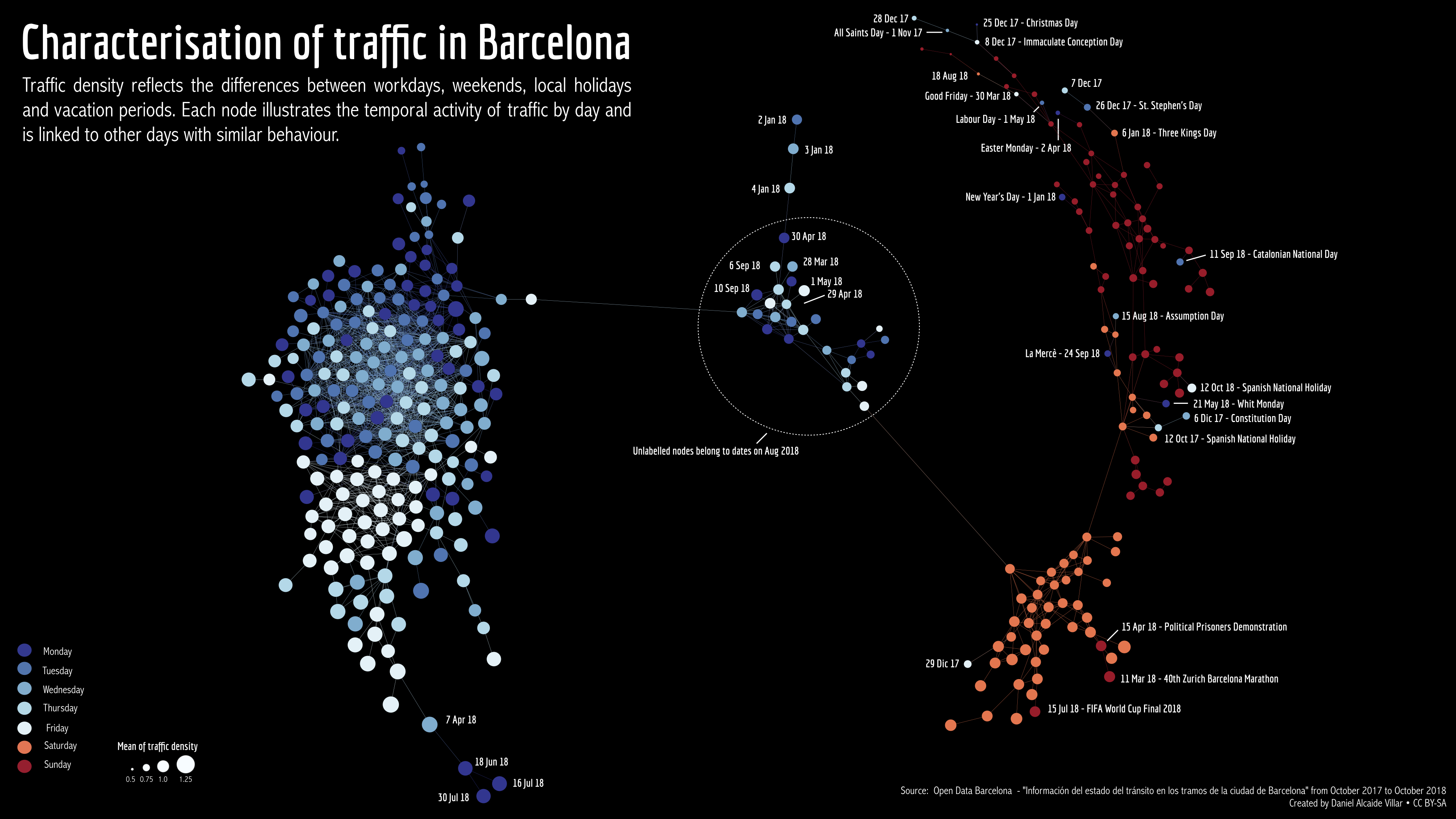
STAD network of Barcelona traffic data. Each node represents a single day between October 2017 and November 2018. Days that are connected in the graph have a similar overall traffic density for that day.
When inspecting the graph, we can extract different insights; some of them expected, others less expected:
- Weekdays (blue) are in general very similar to each other.
- There is more traffic on weekdays than in the weekends, especially on Sundays.
- There are certain days that are “in between” weekdays and weekends. Those days are either around New Year, or during the holiday season.
- Something distinguishes June 18, July 16 and July 30 as days with very high traffic.
- Fridays are more similar to each other than to the other weekdays.
- Weekdays that behave like weekends are similar to Sundays, not Saturdays.
- The weekdays that are most unlike regular weekdays are certain days around Christmas and other Christian holidays.
Barcelona traffic with a lens
When looking at the data a bit closer, we identified that there is a significant separate peak of traffic on Friday afternoons.
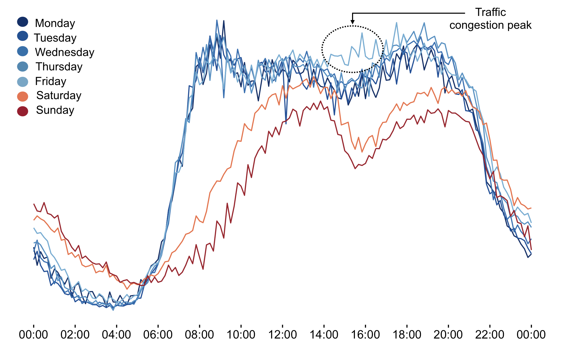
An additional feature of STAD that is mentioned yet, is that it allows to look through a lens. In this case, we can basically say: “Run STAD on all datapoints, but instead of just connecting days with similar average traffic first check if those days are very different for the period between 2pm and 4pm. In that case: don’t connect them.”
When we apply this lens, we get the following network.
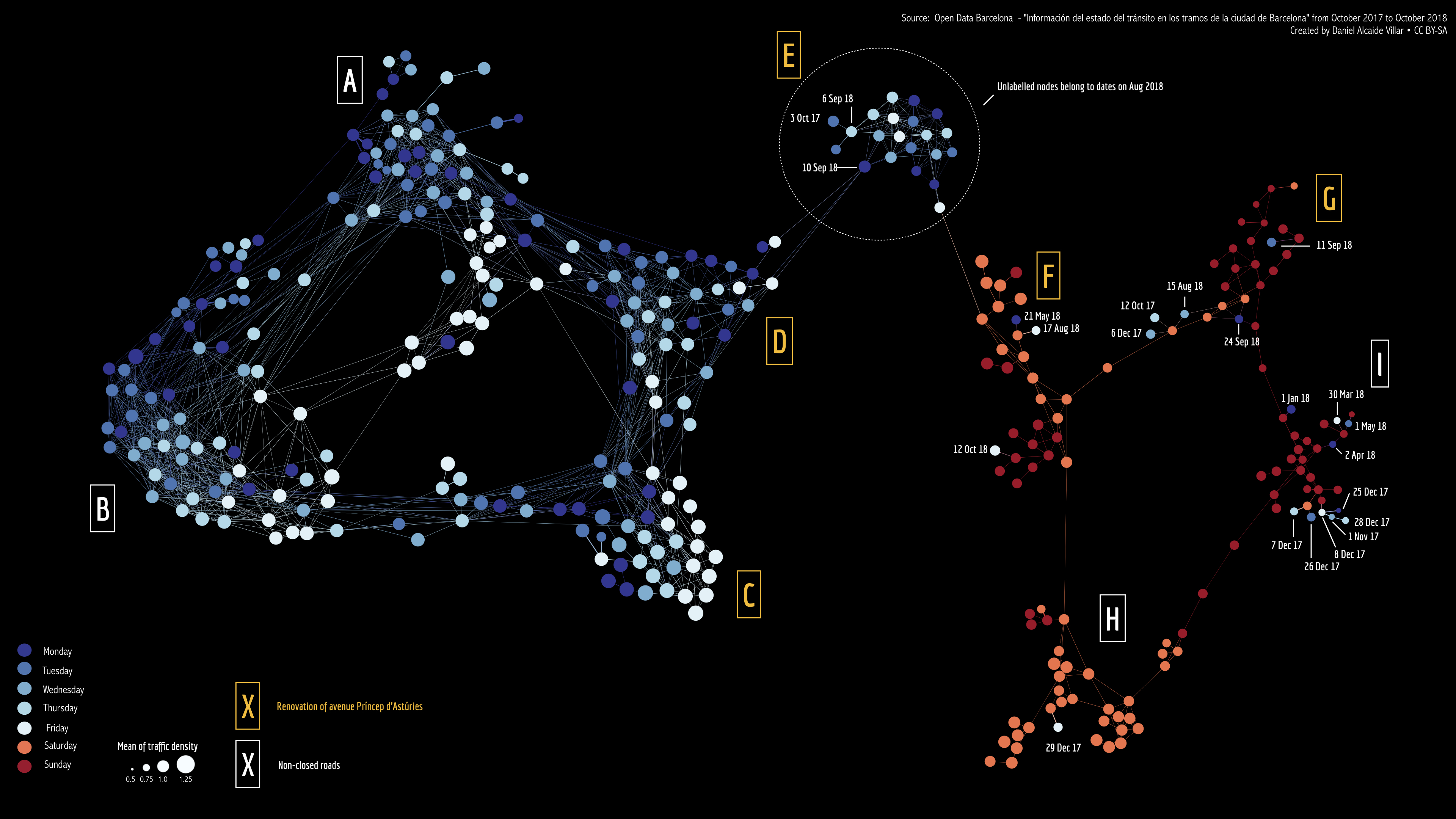
STAD network of Barcelona traffic data, viewed through the lens of Friday afternoon traffic. Each node represents a single day between October 2017 and November 2018. Days that are connected in the graph have a similar overall traffic density for that day.
This is clearly different from what we had before. Both the cluster of weekdays and the cluster of weekend days are torn in two (white labels vs yellow labels). Looking further into why this is, we found out majore roadworks were ongoing on the days with yellow labels.
3. Pottery samples
This is work done by Danai Kafetzaki.
We applied the same methodology on a pottery sherd dataset from the Sagalassos project: a large excavation project in Southern Turkey. What is described here is a very (very!) preliminary analysis.
Interested in assigning types to pottery sherds (i.e. “this sherd is from a cup, but this one is from a bowl”), we collected 9 parameters on each sherd such as size of the rim and height (if the top and bottom were still connected). Running STAD on these sherds gives us the network below.
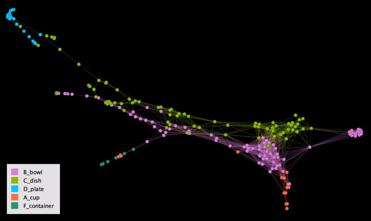
STAD analysis of pottery sherds. Colours are based on the prior labelling done by experts.
When colouring the nodes based on prior labelling done by the experts, it seemed that we identified something strange: bowls and dishes in the graph run next to each other. However, you’d expect the colours to be more clustered… Feedback from the experts however indicated that this does make sense, as there is a large variety in heights in both bowls and dishes, but that their rims etc are quite distinct from each other. So even though this visual did not tell them something new yet, it did help them to identify the general “shape” of their pottery dataset.
Using STAD for your own work
STAD has been developed in R, and is available from https://github.com/vda-lab/stad. A minimal script running a STAD analysis looks like this:
library(stad)
library(ggplot2)

# Circles dataset
data(circles)

ggplot(circles, aes(x,y, color = lens)) +
  geom_point()

circles_distance <- dist(circles[,c("x", "y")])

## STAD without lens
set.seed(10)
circles_nolens <- stad(circles_distance)
plot_graph(circles_nolens, layout = igraph::layout_with_kk )
A python implementation (without lens) was also created and is available from https://github.com/vda-lab/p_stad. But beware: this was written by Jan, so there is no guarantee that it is correct :-)