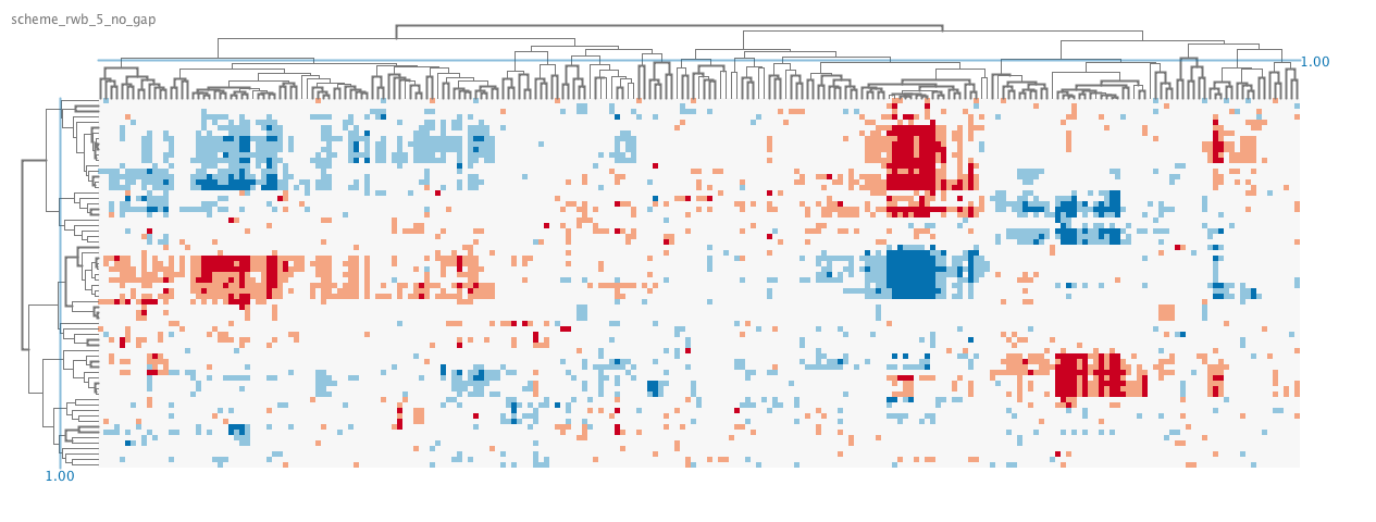
Heatmap dilemma
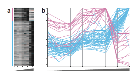
Despite of the limitations of color encoding of quantitative data, heat maps are still popular plots for a two-dimensional matrix of numbers, such as gene expression levels per sample or for a time-series experiment, in life science. For example, the position is a better visual attribute for encoding a numerical value, and an example of gene expression data for two groups of profiles is more accurately represented using the parallel coordinates plot.
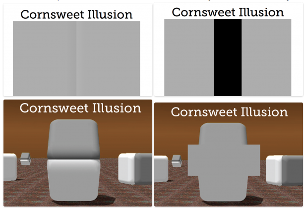
Also, color is a relative medium, meaning the perceived value can be affected by neighboring colors, and it may result in unwanted artifacts or optical illusions. For example, it is possible to make the same color look different, or different colors look the same by changing the background color (Bang 2010). Because of the interaction of color, our ability to read and extract the mapped value from two colored cells in heat maps is limited, or sometimes biased.
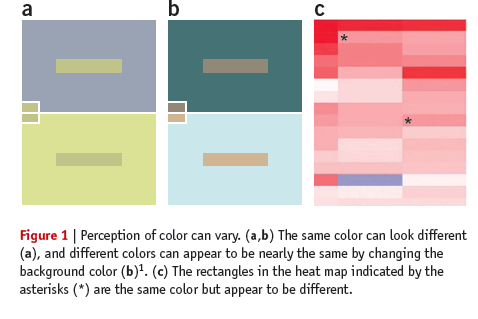
Here are some optical illusions based on color. Some of them, I just came across recently.
Based on these limitations with color coding, it does not make much sense to use heat maps for analysis, but that is only if the task of the user is to compare numerical values of cells. In other words, you cannot compare the values encoded in two individual cells accurately, but heat maps can be a dense, compact and intuitive representation of a large dataset. Because the main domain task is to get the overview of the data and identify clusters, not comparing individual cells, heat maps are still popular and effective in life science.
The utility and effectiveness of heat maps depend on 2 things: the choice of color scheme and the choice of clustering method / distance / linkage.
Color Scheme
As discussed above, the choice of a good color scheme is important to avoid unwanted artifacts and introducing biases. The choice of color scheme also depends on the task at hand. If the task is to represent the matrix as accurately as possible, for example to see the noise in data, it is better to use a color gradient scale to represent the variability in the data.
On the other hand, if the task is to identify clusters, it is better to bin the value ranges and map to discrete color selections instead. By limiting the color or binning the values, you are essentially categorizing data points by their value ranges, or turning it into simple ordinal values. As we know from the Mackeinley’s diagram, the color is actually great for categorical data. The optimal mapping depends on the distribution of values in the matrix, it can simplify the heat maps and clusters are easier to identify.
Algorithm choice
Typically rows and columns of the matrix are reordered by hierarchical clustering. Needless to say, this reordering can have a tremendous effect on our ability to find the clusters, thus crucial to get the preprocessing right. Plus, the dendrogram provides useful information, such as the proximity of clustered samples or groups of samples.
I won’t get too much into the hierarchical clustering, but there are 2 main attributes to consider: the dissimilarity measure and the linkage type. The most common dissimilarity measure between each pair of observations is Euclidean distance. Another type is correlation-based distance, which considers if their features are correlated. The optimal choice depends on the definition of similarity in the dataset as well as what is the pattern we expect. For example, the following figure from James et al. illustrates the difference between Euclidean and correlation-based distance. For the TCGA data, correlation-based distance is used to compare the profiles, rather than similar in magnitude.
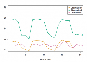
In the figure above, the observation 1 and 3 will have higher similarity in term of Euclidian distance, whereas the observation 1 and 2 will have higher similarity in terms of correlation-based distance.
The choice of linkage affects the result of clustering and the ordering of columns or rows in heat maps. The most common types of linkage are complete, average, single and centroid. The difference is in their definition of dissimilarity between two groups of observations.
Ok, this has become a long introduction to what I want to achieve in biclustering heat map visualization project.
- The tool will focus on identification and characterization of clusters from heat maps.
- Motivations:
- pvalues calculated by multiscale bootstrap resampling are additional information that should be incorporated in interpreting the formation of clusters
- heatmaps are typically static images and some interactivity can enhance data exploration
- TCGA feature matrix data is highly processed data, combining different types of high throughput dataset
- Much of information about selected cluster is hidden in the text labels or underlying data, such as pathways, genes, GO terms. An effective text based visualization and some simple enrichment computation can be tremendously useful for the experts.
- There are 3 main steps in analysis and interactions or visual encodings to help each step:
- identify clusters
- introduce gaps bas on distance/pvalue calculation
- rotate on a dendrogram branch
- adjust/manipulate the color scheme
- export the image, or selected cohort data
- select clusters
- select the cluster of interests
- divide the heat maps
- hide some rows or columns
- interpret clusters
- visualize the labels of selected clusters
- add text visualization to link relevant terms
- link from pathways to genes to GO terms
- maybe, gene network of the selected clusters?
- identify clusters