Scale-stack barchart in paper.js

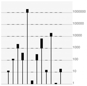
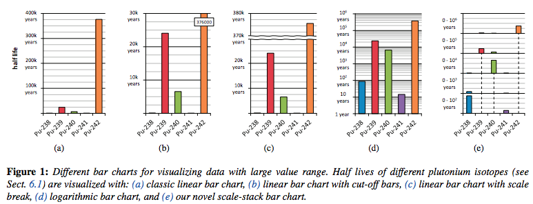
To empty my head after a hard day’s work on grant proposals: another quick graph test in paper.js: the scale-stack barchart (see here for a description of what it is). This type of visual encoding solves the issue of showing data with vastly different orders of magnitude. Although other solutions have been used for a long time (e.g. using a log-scale), these have many issues. The log-scale, for example, does make all bars fit in the same order of magnitude, but is very difficult for the end-user to interpret. From the paper referenced above, comparing cut-off bars, scale breaks, log scales, and scale-stack bar chart.

The key in looking at such graph is to look at one order of magnitude at a time. Just looking at the top of the graph it is clear that the 5th value is much larger than all the other ones. Similarly, at the bottom we can see that the 6th value is 2 to 3 times as high as the 11th one, and that all the others are at least one order of magnitude higher.
var verticalOffset = 700;
var horizontalOffset = 50;
var levelScaling = 5; // number of pixels per unit. If = 5: value of 3 => 15 pixels
var levelHeight = 10*levelScaling;
var data = [13,123,3617,627,2938172,3,509,8261,19,29128,1,28];

var calculateComponents = function(x) {
	var maxPowerOfTen = 0; // 4->0; 15->1; 18272->4
	var currentX = x;
	while ( currentX >= 10 ) {
		maxPowerOfTen += 1;
		currentX = currentX/10;
	}
	var valueAtMaxPowerOfTen = x/Math.pow(10,maxPowerOfTen);
	return {
            orig: x,
            val: valueAtMaxPowerOfTen,
            lvl: maxPowerOfTen};
}

var dataInComponents = [];
for (var i = 0; i < data.length; i++ ) {
	dataInComponents.push(calculateComponents(data[i]));
}
var maxLevel = Math.max.apply(Math,dataInComponents.map(function(o){return o.lvl;}))

for (var i = 0; i <= maxLevel; i++) {
	var line = new Path();
	line.add(new Point(20,verticalOffset-levelHeight*i));
	line.add(new Point(20+data.length*25,verticalOffset-levelHeight*i));
	line.strokeColor = 'lightgrey';
}

for (var i = 0; i < dataInComponents.length; i++ ) {
	// The thin bar in the orders of magnitude smaller than the current number
	var thinBar = new Path();
	thinBar.add(new Point(horizontalOffset + i*20, verticalOffset));
	thinBar.add(new Point(horizontalOffset + i*20, verticalOffset-levelHeight*dataInComponents[i].lvl));
	thinBar.strokeColor = 'grey';
	thinBar.strokeWidth = 2;

	// The thick bar in the order of magnitude of the current number
	var thickBar = new Path();
	thickBar.add(new Point(horizontalOffset + i*20, verticalOffset-levelHeight*dataInComponents[i].lvl));
	thickBar.add(new Point(horizontalOffset + i*20, verticalOffset-levelHeight*dataInComponents[i].lvl-(dataInComponents[i].val*levelScaling)));
	thickBar.strokeColor = 'grey';
	thickBar.strokeWidth = 10;

	// The thick but flat bar in the orders of magnitude larger than the current number
	for (var j = dataInComponents[i].lvl+1; j<=maxLevel; j++) {
		var placeHolder = new Path();
		placeHolder.add(new Point(horizontalOffset + i*20, verticalOffset-levelHeight*j));
		placeHolder.add(new Point(horizontalOffset + i*20, verticalOffset-levelHeight*j-1));
		placeHolder.strokeColor = 'grey';
		placeHolder.strokeWidth = 10;
	}
}