Notes from IEEE VIS 2015 in Chicago
In this blog post, we collect information from different sessions at IEEE VIS 2015 in Chicago.
LDAV keynote by Alan Keahey
Alan Keahey works at IBM Watson on life science data. His blog is holisticsofa.com. His talk “Playing Scales - Bridging the Gap between Visual Perception and Big Data” gave an overview of at what scales data exist, as well as analysis, visualization, and interaction.
Limit of perception
Colin Ware states that the limit of perception is 4k by 4k. This means that the limit of display is 4k by 4k is that screen fills your field of view. Bigger screens either require the user to focus on part of the data (if they want to optimally use their perceptual bandwidth), or stand back. When standing back, the user will not see the individual pixels anymore, but perceive clusters of them with an upper resolution of 4k by 4k.
Framework
Keahey used the Eames “Powers of 10” video as a backdrop to think about different scales of data, analyses, visualizations, and interactions. The problem is that visual encodings (e.g. scatterplot, barchart) live at completely different scales than where the data is (giga- to peta-units). In creating visualizations, you basically have to use methods that can bring that high scale back to one that can be visually encoded. In the picture below, the original large-scale data is brought down using clustering. That converted data is still to large to just plot on the screen (keeping the 4k-by-4k limit in mind). Using pan & zoom, and focus & context, this can be brought down further. So creating a visualization is basically creating a walk through these methods from high to low scale.
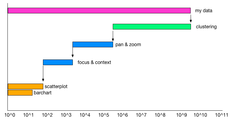
Keahey framework
Interaction scalability
When talking about different types of interaction scalability, Keahey mentioned focus & context, pan & zoom and logical interaction. However, he also pointed out what is very often overlooked, which is available user time. In a research context users can spend time learning how to use a custom information-rich visualization. This is completely different from the clinical environment, where user-time is very limited and simple visualizations are key.
Interesting quote: “When talking about big data, I don’t talk about the 3 Vs; that puts people asleep. 3 Vs are actually 3 Zs.”
VAST Challenge workshop
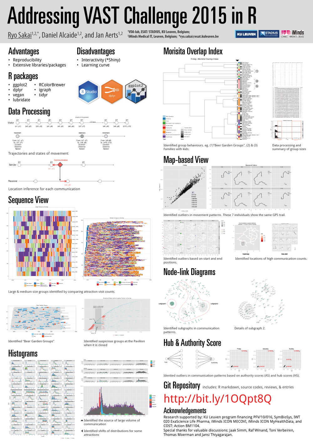
We had a poster at the VAST Challenge workshop and received two awards: the Best Combination of Visualization and Analysis and the VAST Challenge Choice Award in the Open Source category. Just before noon, we also had a twenty minutes presentation and the slides are available from here.
There were 79 submissions (break-down per challenge shown below) this year.
| Number of Entries | |
|---|---|
| Mini Challenge 1 | 32 |
| Mini Challenge 2 | 29 |
| Grand Challenge | 11 |
Here are some notes on the grand truths of the challenge. Some of the patterns are very obscure and require a lot of imagination from the analysis to come up with these stories.
- Friday’s volume of attendees is nearly half of Sat or Sunday.
- Several groups try to attend the second Scott Jones performanc on Sunday only to discover that it has been canceled.
- Closed rides: park visitors will not queue for these rides: The Red Train “Scholtz Express” closed Sat 13:23 - 13:50. The Flying Tyrandrienkos closed Sunday 10:13 - 11:00.
- Glactosaurus Rage has operational problems. Friday 8:00 Ride open but not operating.
- Food poisoning from Granite Slab Pizza. Some people become ill after eating at the stand on Friday. There is a chance that people go to the first aid station after eating there.
- Visitor 1187304 represents a “marathon roller coaster rider.” This person rides roller coaster 1 (the Wrightiraptor Mountain) repeatedly without checking in again. He rides 10 times, goes to the restroom, and rides 7 more times. After that, he goes to location 62 (the Liggament Fix-Me-Up) and exits the park.
- Visitor 258464 and 74766 dare each other to ride one of the scarier rides. They return to the ride frequently on Sat morning but do not actually work up the courage to ride it until 11:30.
- Visitors 657863, 1412235, 103006, 1937834, and 313073 exhibit unusual behaviours. They essentially spend Friday in the beer garden. Then, they ride the train and all but 657863 leave the park. Visitor 657863 spends the night in the park and does not leave until Sat morning. (<- we assumed that he lost his phone.)
- Detailed movements of Scott Jones and his followers may be reported. Scott’s movement is not tracked, but embers of his entourage (bodyguards, assistants, and some close friends) travel through the park on the same path each day with Scott on the way to and from his show. Scott’s entourage is 1080969, 1600469, 1629516, 1781070, 1935406, 521750, and 644885.
- Difficulties with the park app. On Sat, around 15:53, data loss may be reported from some visitors. This happens again on Sunday, around 10:23. There is also a problem with the data reported for visitor 1983765 (this turns out to be the prime suspect). Starting at 20:18 on Saturday, Eddie Smith, tampers with his app in a test of disabling the tracking feature. Instead, this creates spurious duplicate entries of movement placing him at a different park of the park. When he enters the park on Sunday, employees reinitialize the app since it is “acting funny”.
- ID 1278894 is a park-wide trivia game
- ID 839736 is the park’s help desk.
- Group leaders send bulk messages to their groups. For example, visitor 146240 sent messages to a large group at 13:34:26 on Friday. Some of their message recipients respond. The pattern is repeated at other times during the day.
- There is reduced external messaging when Scott Jones shows are in progress.
- There is an increase in messages to the traveler’s group, the help desk, and external contacts when the Scott Jones memorabilia vandalism is discovered. This occurs on Sunday from 11:30-12:00.
- The most likely suspects are 1983765 (representing Eddie Smith, the prime suspect) and his accomplices (1089132, 1723967). The prime suspect and two accomplices performed surveillance of the Creighton Pavilion and the park perimeter and exits on Friday and Saturday.
- The Pavilion closed 9:30-11:30 and 14:30-16:30 everyday during the Scott Jones shows. The park was short on security, so they had to close this exhibit to provide sufficient security for the Scott Jones show. On Sunday, the prime suspect stayed in the Pavilion while it was closed to the public while his accomplices remained on watch outside. Once Security came around to reopen the Pavilion, the prime suspect left the Pavilion and immediately left the park.
- The vandalism in the Pavilion was discovered by some of the first park visitors who went into the Pavilion after 11:30 reopening on Sunday. This is indicated by the increase in communications as the park visitors discover the vandalism, report it, and talk about it among their groups and their friends and family outside the park.
VAST conclusion
We were able to detect most of the strong signals but perhaps most challenging thing about VAST challenges is to infer stories out of these patterns/correlations/relationships. For example, to identify the prime suspect, we would have had to look at his movement one after another and make inference out of his behaviour and “hatred” against Scott Jones. Without a means to validate hunches, it is very challenging to infer any useful insights with confidence.
Symposium on Visualization in Data Science
VDS is a new symposium bringing practitioners and researchers in data science and visualization together to discuss common interests, talk about practical issues and identify open research problems. Two talks that stuck were by Torsten Moeller and Jeff Heer. Torsten discussed that we use 3 types of modeling to understand the “real world”: computational, statistical and empirical modeling. One of the key challenges in Data Science/Visualization is to make data modeling more accessible.
As always, Jeff Heer gave a very interesting talk. In his talk, he quoted Tufte, “show data variation, not design variation.” His presentation revolved around the question of how our tools might spur new questions and prompt skepticism. He argues that visualization design is a combinatorial design space with three components: variable selection, data transformation, and visual encoding design. Some of the ongoing challenges are (1) refining visualization recommendation (What to optimize? How to evaluate?), (2) Scaling interactive visualizations( Large D is harder than large N), and (3) help avoid statistical pitfalls (recognize mix effects, convey uncertainty).
Visualization of dynamic networks
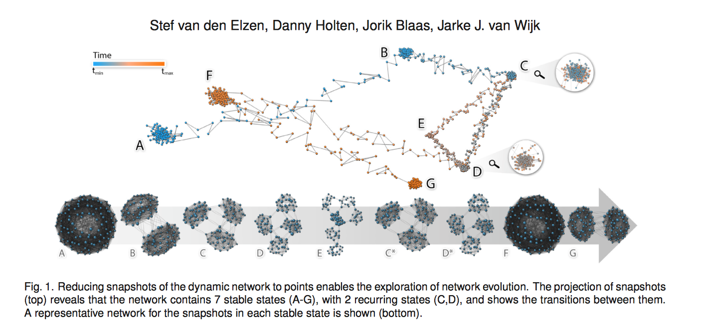
Paper: Reducing Snapshots to Points: Visual Analysis of Mass Mobility Dynamics via Spatio-Temporal Graphs and Clustering (Best Paper)
This work by Stef van den Elzen and his colleagues was beautifully presented, and we were very impressed that Stef live demo-ed his tool. The idea is very straightforward. You make a graph of dynamic graphs. As the size/complexity (dynamic) of graph increases, another abstraction layer of the graph can help understand the data better. In this case, he was able to visualize different states of graph dynamics. video
During the presentation, we asked him about live demo-ing. Apparently this is a Van Wijk’s thing too… and Stef mentioned this analogy… say, you built a bridge. If you refuse to cross the bridge, no one else will cross the bridge either. Although it is scary and something goes wrong at live demo, but we should strive to give a live demo… We were discussing how he started this project. He said he had an idea about this, so he simulated/created a dataset and then built a system to demonstrate that his idea works. He also shared his Ph.D. dissertation on twitter. If you do dynamic networks, this is a must read.
Time Curves
Another example of abstraction is the Time Curves work presented by Bach et al. Time curves are like a scatter plot, and each point is a projection of a multidimensional data sets. Then each point is connected and colored based on its temporal information. It was very well presented and examples presented were quite compelling. However, it seems that the efficacy of the method boils down to coming up with the best distance measure to summarize each data point.
On Parallel Coordinates…
There was a few paper on PCP. They introduced a new interaction technique to select bundles and a novel vis encoding techniques to combine scatter plots and PCP.
VectorLens by Dumas et al.
The video demonstrates the basics of the interaction. This selection method also resonated with an interaction design presented by Roeland Scheepens. Roeland presented a paper called, “Visualization, Selection, and Analysis of Traffic Flows” on Wednesday. The system had very nice particle visualization and the interaction design to sample and selected certain traffic flows to analyze. Although the video does not show the interaction method for selecting the flows of the specific direction, it was similar to Dumas’s method. Traffic Flows also had a very nice transition between two 2D views with 3D transition, switching from XY coordinates to XZ or YZ coordinates, for example, to select routes at a certain altitude.
PCP evaluations
There were a few papers on evaluation of PCP, but I (Ryo) am not sold on them… But this paper by Johansson and Forsell is a good review of the previous study on PCP.
Orientation-Enhanced Parallel Coordinate Plots
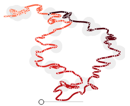
This paper was presented by Renata Raidou, and it was quite interesting. Video and Paper. It takes a while to get your head around how a dot corresponds to a dot on the line, but the enhancement do reveal some hidden patterns that are apparent in the scatterplot. It is a novel effort to combine/embed scatterplots into PCP, but I wonder if it would be better to have both and have them linked. They also introduce the selection method using the enhancement.
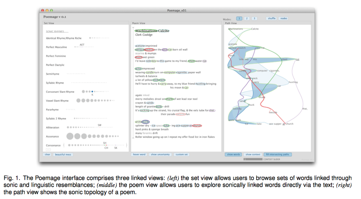
Visualization of Poems
This design study on visualizing the sonic topology of poems was very interesting, presented by McCurdy from Miriah Meyer’s group. The tool is called Poemage and built in Processing. The tool supports close reading (the careful, in-depth analysis of a single text to extract, engage and even generate as much productive meaning as possible) rather than distant reading (collecting and analyzing huge amounts of textual data for synoptic evaluation). It was interesting to hear that insights that scholars get from the visualization are almost always “correct” in the sense that it is subjective and up to the reader. In that sense, there is no “false positive” and any insights are “effective”. The resulting visualization is very expressive and organic.