Hands-on data visualization using svelte
This is a svelte (http://svelte.dev) version of the Processing/p5/vega tutorials that we published earlier. Svelte is a framework for creating web content, and very accessible for creating data visualisations. This tutorial holds numerous code snippets that can by copy/pasted and modified for your own purpose. The contents of this tutorial is available under the CC-BY license.

Table of contents
- Table of contents
- What is Svelte?
- Scalable Vector Graphics
- Styling
- Looping over datapoints
- Running svelte locally
- Loading data
- Recreating the flights visualisation
- Quick exercise: lines
- What we did not go into
- Animations
- Custom visuals
- Overview first, search and filter, and details on demand
- Deploying your visualisations
What is Svelte?
Svelte is a framework for building webpages. It makes it easier to build complexer websites, but is also a very good fit for data visualisation using SVG.
![]()
One of the strong points of Svelte is that it makes creating different components very simple, although we will not use these initially. Nevertheless, just to give you an idea, below is a simple example. The #each and curly brackets will be new to you, but you should get the idea. In the top version of this code we create 2 different scatterplots where we create an svg and write the code to loop over the datapoints two times (once for each dataset). Using Svelte, we can however easily create a Scatterplot HTML element which simplifies the main code a lot.
<h1>My plot</h1>
<svg width=400 height=400 data={dataset1}>
  {#each data as datapoint}
    <circle cx={datapoint.x} cy={datapoint.y} r=20 />
  {/each}
</svg>

<svg width=400 height=400 data={dataset2}>
  {#each data as datapoint}
    <circle cx={datapoint.x} cy={datapoint.y} r=20 />
  {/each}
</svg><h1>My plot</h1>
<Scatterplot data={dataset1} />
<Scatterplot data={dataset2} />The svelte website has a very good tutorial, available at https://svelte.dev/tutorial. We really recommend going through at least sections 1 through 7 (Introduction, Reactivity, Props, Logic, Events, Bindings, and Lifecycle). A lot of what follows below is based on that material, but with an emphasis on data visualisation.
HTML, CSS and javascript
In order to follow this tutorial, you have to understand that:
- HTML: provides the basic structure of the page, which can be enhanced using CSS and javascript. All HTML elements on a webpage together are called the Document Object Model or DOM.
- CSS: is used to control presentation, formatting and layout: what it looks like. The CSS is denoted by the
<style></style>tags. - javascript: is used to control the behaviour of different elements and the page as a whole. The javascript section in a svelte file is surrounded by
<script></script>tags.
You should have at least a little knowledge of what HTML is and how it works for the rest of this tutorial.
A Svelte file can contain the HTML, CSS and javascript together. Here is a very simple App.svelte that includes all three of them:
<script>
  let name = 'World'
</script>

<style>
  h1 {
    color: green;
  }
</style>

<h1>Hello {name}!</h1>
In this example, we get a heading of level 1 (h1) that is green (as defined in the <style> element), and says “Hello World!” where the “World” is defined in the javascript section.
Using the Svelte REPL
Before we start creating files on our own machine and run a local server, we will look at the online svelte REPL (Read-Eval-Print-Loop), available at http://svelte.dev/repl.
On the REPL, you have the code at the left and the result at the right. At the image above there is only one file that you have to change at the moment, called App.svelte.
The first time you open the REPL you will get the following code:
<script>
	let name = 'world';
</script>

<h1>Hello {name}!</h1>
When you open that REPL link for the first time, you’ll be greeted with the following code:
You can clearly see the 3 different sections that can make up a svelte file:
- script: denoted by
<script></script>tags - CSS: denoted by
<style></style>tags - html: the rest (in this case consisting of an
h1and ansvgelement)
The image above shows how these 3 parts work together. Let’s start with the HTML and see where the script and style parts come into play.
So let’s start creating data visualisations.
Scalable Vector Graphics
Scalable Vector Graphics (or SVG for short) are a way to create data visualisation in HTML pages. HTML has default elements such as h1 (header of level 1), ul (unordered list), p (paragraph), etc. Within an svg element you can use elements such as circle, rect (rectangle) and so on. For a full list of elements you can use within svg, see here.
Remove all code in the App.svelte on the REPL, and replace it with the following:
<svg width=400 height=400>
  <circle cx=100 cy=100 r=15 />
  <circle cx=150 cy=75 r=20 />
  <rect x=250 y=300 width=30 height=20 />
</svg>
You should now see a picture with 2 black circles and a rectangle.
Styling
Just black circles and rectangles aren’t that nice. Let’s give them some colour. We can do that using CSS. There are different places where you can define the CSS (inline, in the header, in a separate file), but in svelte this is normally done in a separate <style></style> section. Let’s add this style section to the script that you already have:
<style>
circle {
fill: steelblue;
}
rect {
fill: green;
stroke: red;
stroke-width: 3;
}
svg {
background-color: whitesmoke;
}
</style>
<svg width=400 height=400>
<circle cx=100 cy=100 r=15 />
<circle cx=150 cy=75 r=20 />
<rect x=250 y=300 width=30 height=20 />
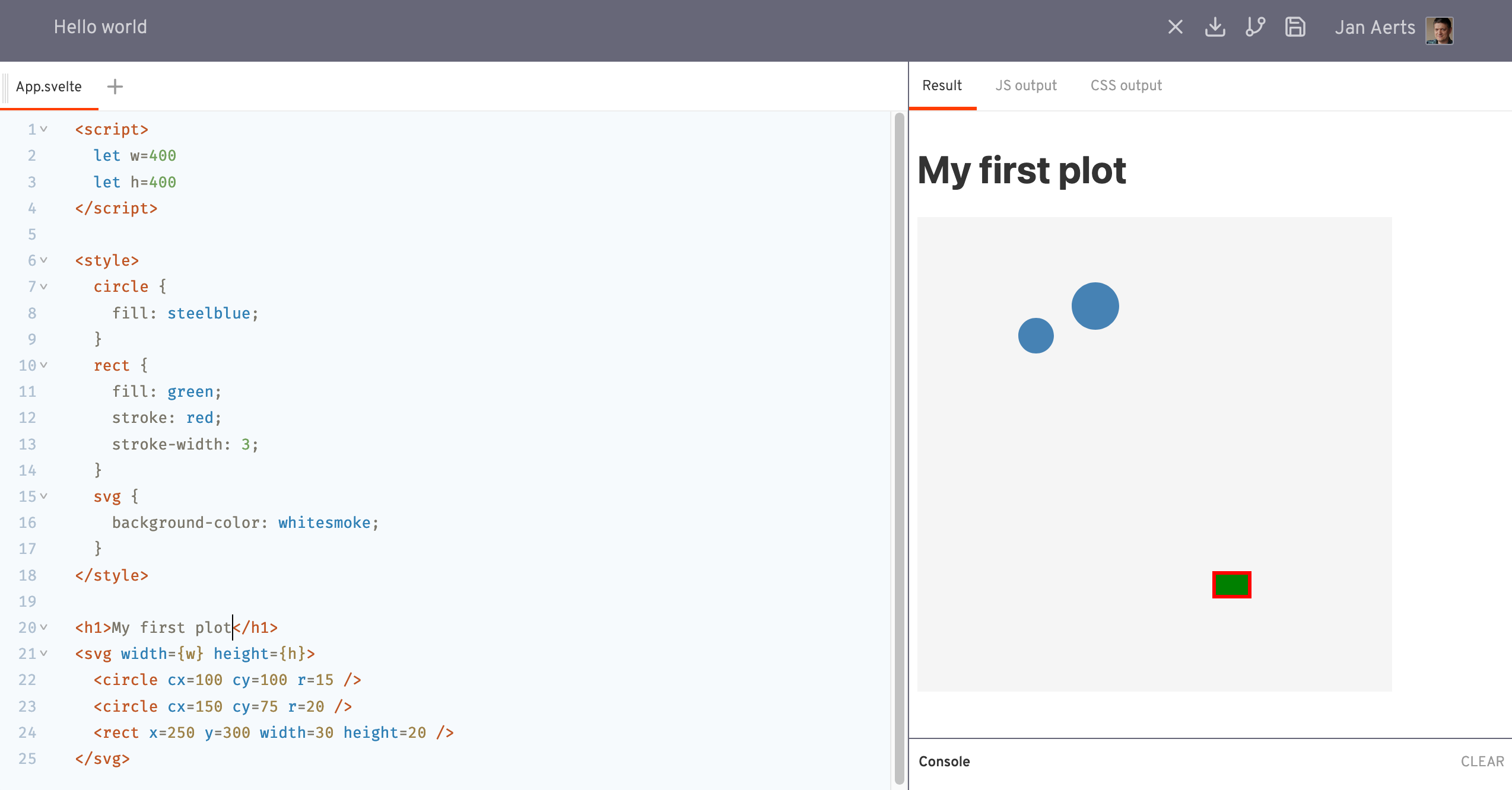
</svg>We now have a slightly nicer picture with blue circles and a green rectangle (with a red border). We’ve also given the SVG element itself a very light background so that we can see how big it is.
This is the image we now have:
CSS Selectors
All the HTML elements we’ve used can have attributes, such as cx and cy for circle elements, and width for svg elements. Each element has a specific list of possible attributes (check their documentation), but you can also add your custom attributes if you want. There are however two special ones: id and class.
id: Theidattributes gives the element a specific - you guessed it - ID. That can be used in yourscriptandstylesections to identify a specific element.class: Theclassattribute assigns that element to a certain class (or group). We can use this to easily select different elements together. We can for example have a todo list where some of the tasks have been completed.
<ul>
  <li id="todo1" class="completed">Go shopping</li>
  <li id="todo2" class="completed">Work out</li>
  <li id="todo3">Read in my book</li>
  <li id="todo4" class="completed">Pay taxes</li>
</ul>
In the style sections that we showed above, we used the element type (i.e. circle, rect and svg) to identify which elements a certain style should be applied to. We can also use the id and class, though.
- To refer to an element with a specific ID, prepend that ID with a hash tag in the CSS.
- To refer to all elements of a certain class, prepend that class with a period in the CSS.
For example:
<style>
  #todo2 {
    color: red;
  }
  .completed {
    opacity: 0.2
  }
</style>

My todo list:
<ul>
  <li id="todo1" class="completed">Go shopping</li>
  <li id="todo2" class="completed">Work out</li>
  <li id="todo3">Read in my book</li>
  <li id="todo4" class="completed">Pay taxes</li>
</ul>
will result in:
As you can see, all items that are completed are greyed out.
You can also combine CSS selectors. For example, to target li elements that have the class completed, but not any other element with that same class, we can use the selector li.completed.
CSS selectors are a very powerful way to select elements in an HTML page. They for example also one of the cornerstones when you want to create data visualisations in D3. For a full list, see here.
Looping over datapoints
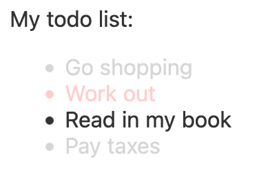
Say we have a dataset of 10 datapoints, and we want to plot them all (like a scatterplot). One way of doing this would be:
<svg width=400 height=400>
  <circle cx=100 cy=100 r=5 />
  <circle cx=150 cy=275 r=5 />
  <circle cx=10 cy=101 r=5 />
  <circle cx=80 cy=183 r=5 />
  <circle cx=350 cy=45 r=5 />
  <circle cx=201 cy=285 r=5 />
  <circle cx=150 cy=306 r=5 />
  <circle cx=90 cy=102 r=5 />
  <circle cx=73 cy=39 r=5 />
  <circle cx=332 cy=269 r=5 />
</svg>
It doesn’t make sense to hard-code the different circles in the HTML itself. It’d be better to define them as an array of data and loop over them.
In the script section, let’s define a variable data:
<script>
  let datapoints = [{x: 100, y: 100},
                    {x: 150, y: 275},
                    {x: 10, y: 101},
                    {x: 80, y: 183},
                    {x: 350, y: 45},
                    {x: 201, y: 285},
                    {x: 150, y: 306},
                    {x: 90, y: 102},
                    {x: 73, y: 39},
                    {x: 332, y: 269}]
</script>
The svg part can now be populated programmatically like this:
<svg width=400 height=400>
  {#each datapoints as datapoint}
    <circle cx={datapoint.x} cy={datapoint.y} r=10 />
  {/each}
</svg>
Conditional logic
Here we see for the first time how we can add logic (like conditionals and loops) in HTML in svelte. Normally, HTML does not allow this but svelte does provide that functionality. To add this logic in the HTML part of a svelte file, we put these commands between curly brackets { and }. Whereas in regular javascript an if conditional looks like this:
if ( value > 10 ) {
	# do something
} else {
	# do something else
}
In svelte this looks like:
{#if value > 10 }
  # show a certain HTML element
{:else}
  # show another HTML element
{/if}
Loop logic
Loops are similar, using the each command. In regular javascript:
datapoints.forEach(function(datapoint) {
  # do something with datapoint
})
In svelte this looks like:
{#each datapoints as datapoint}
  # create HTML element for this datapoint
{/each}
Again: see the svelte tutorial for another explanation of this, including else if, etc.
IMPORTANT: Note that this syntax is for the HTML part of a svelte file, not for the script part which is regular javascript.
Back to the data visualisation we are building. We now get the same picture again, but didn’t have to specify the separate datapoints within the HTML anymore.
Our full script now looks like this:
<script>
  let datapoints = [{x: 100, y: 100},
                    {x: 150, y: 275},
                    {x: 10, y: 101},
                    {x: 80, y: 183},
                    {x: 350, y: 45},
                    {x: 201, y: 285},
                    {x: 150, y: 306},
                    {x: 90, y: 102},
                    {x: 73, y: 39},
                    {x: 332, y: 269}]
</script>

<style>
	svg {
		background-color: whitesmoke;
	}
	circle {
    fill: steelblue;
  }
</style>

<svg width=400 height=400>
  {#each datapoints as datapoint}
    <circle cx={datapoint.x} cy={datapoint.y} r=10 />
  {/each}
</svg>
For argument’s sake, let’s add an if statement as well: we’ll add a value to all these points, and let the visual encoding (circle or rectangle) be dependent on that value.
<script>
  let datapoints = [{x: 100, y: 100, value: 9},
                    {x: 150, y: 275, value: 11},
                    {x: 10, y: 101, value: 72},
                    {x: 80, y: 183, value: 2},
                    {x: 350, y: 45, value: 10},
                    {x: 201, y: 285, value: 109},
                    {x: 150, y: 306, value: 24},
                    {x: 90, y: 102, value: -4},
                    {x: 73, y: 39, value: 88},
                    {x: 332, y: 269, value: 8}]
</script>

<style>
  svg {
    background-color: whitesmoke;
  }
  circle {
    fill: steelblue;
  }
  rect {
    fill: red;
  }
</style>

<svg width=400 height=400>
  {#each datapoints as datapoint}
    {#if datapoint.value > 10}
      <circle cx={datapoint.x} cy={datapoint.y} r=10 />
    {:else}
      <rect x={datapoint.x} y={datapoint.y} width=10 height=10 />
    {/if}
  {/each}
</svg>
In this example, we embedded an if statement within the each loop. This is the picture that we get:
Running svelte locally
Although extremely useful, you will at some point outgrow the REPL that we’ve used up to now. Still, you might go back to it regularly to quickly test something out.
We can also develop svelte applications (i.c. visualisations) locally, on our own machine. See the Getting Started for new developers page on how to get set up.
Although it is out of scope for this tutorial, it comes down to running npx degit sveltejs/template my-new-project, and running npm install in the new my-new-project folder. See here for instructions on how to install npm itself. When that’s finished you can run npm run dev which will make the application available on http://localhost:5000 and automatically reload that page when you make changes to any of the files.
Loading data
Data visualisation relies on data. We can load data in several ways in javascript.
In the script section
We’ve already seen above how to define datapoints within the script section of a svelte file, so we’ll skip that here.
In a separate .js file
You can also create a new file, e.g. called data.js which has the following form:
export default [
  {"name": "Thigpen", "city": "Bay Springs", "state": "MS", "country": "USA", "lat": 31.95376472, "long": -89.23450472, "vip": false},
  {"name": "Livingston Municipal", "city": "Livingston", "state": "TX", "country": "USA", "lat": 30.68586111, "long": -95.01792778, "vip": false},
  {"name": "Meadow Lake", "city": "Colorado Springs", "state": "CO", "country": "USA", "lat": 38.94574889, "long": -104.5698933, "vip": false},
  ...
]
See this screenshot of the REPL where there is both an App.svelte and the newly-created data.js. To access that data from the svelte file, use
import datapoints from 'data';A full example would be:
<script>
  import datapoints from 'data'
</script>

<h1>Airports in the US</h1>
<ul>
  {#each datapoints as datapoint}
    <li>{datapoint.name} - {datapoint.state}</li>
  {/each}
</ul>
You can also give the data a name in the data.js file. Either:
- use
import datapoints from './data'inApp.svelteandexport default [...]indata.js, or - use
import { flights } from './data'inApp.svelteandexport const flights = [...]indata.js
Notice that in the former case we make the data available through the variable datapoints (defined in App.svelte), versus the variable flights (defined in data.js).
From an online CSV file
To be able to load external data in CSV format, we have to install the PapaParse npm package. To do so:
- Stop the
npm run devserver. - Run
npm install papaparsein the root folder of your svelte application. - Restart
npm run dev.
Here’s a working example using data about Belgian beers.
1
2
3
4
5
6
7
8
9
10
11
12
13
14
15
16
17
18
<script>
  import Papa from 'papaparse';

  let datapoints = [];
  Papa.parse("http://vda-lab.github.io/assets/beers.csv", {
    header: true,
    download: true,
    complete: function(results) {
      datapoints = results.data
    }
  })
</script>

<ul>
  {#each datapoints.slice(1,20) as datapoint}
    <li>{datapoint.Merk} ({datapoint.Soort})</li>
  {/each}
</ul>
Let’s walk over this code:
- line 2: import the
PapaParsepackage - line 4: define a default value (i.e. empty array) for the
datapointsvariable - lines 5-11: this is where we load data into that variable. See the PapaParse documentation documentation about the configuration options you can use. In this case, we take the
resultswhen parsing iscompleteand copy it into thedatapointsvariable in line 9. Try adding aconsole.log(results)just before line 9 to see what theresultsobject looks like in the console.
From an online JSON file
If the remote file you’re trying to read is in JSON format, we don’t need the PapaParse package but can use the Fetch API instead. Here’s the code to load a remote JSON file:
<script>
  let datapoints = [];
  fetch("http://vda-lab.github.io/assets/beers.json")
    .then(res => res.json())
    .then(data => datapoints = data)
</script>

<ul>
  {#each datapoints as datapoint}
    <li>{datapoint.beer}</li>
  {/each}
</ul>
In a local csv or json file
The above CSV and JSON files are on a remote server. But what if we have the data on our own machine? Actually, this is very simple as we are running our own server. If you put the data file in the public directory of your svelte project, you can access it directly, e.g. with
Papa.parse('http://localhost:5000/beers.csv', { ... }), orfetch('http://localhost:5000/beers.json')
You can even just leave the URL itself:
Papa.parse('./beers.csv', { ... }), orfetch('./beers.json')
Recreating the flights visualisation
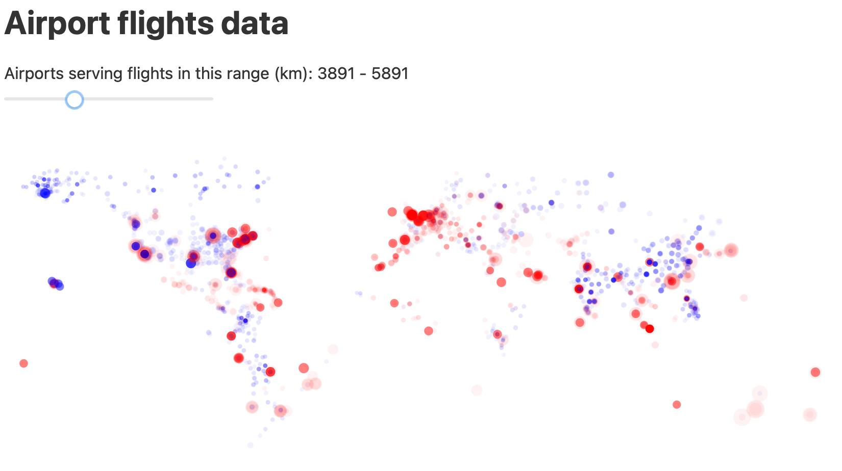
We now have the very basic components to use svelte for data visualisation. Let’s use that to recreate the flights visualisation that we use in the other tutorials. This is what we’ll be building:
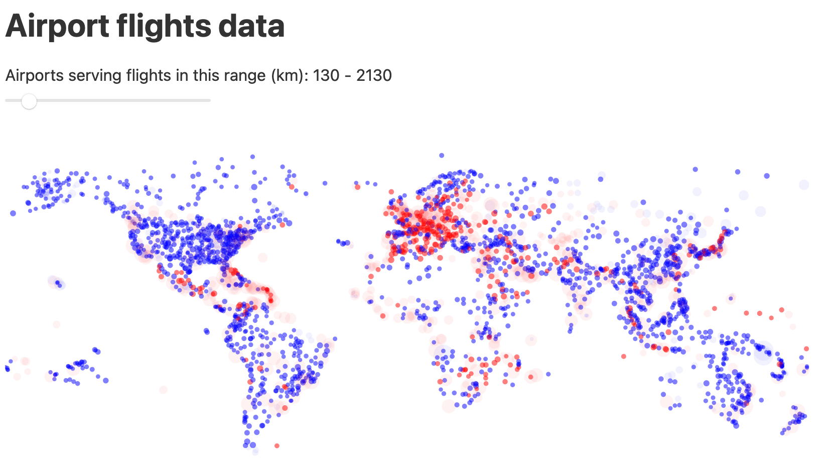
In this visualisation, we see departure airports worldwide. The size of the dot is bigger is the flights are longer distance. Blue dots denote domestic flights; red dots are international flights. With the slider at the top we can filter on flight distance: with the slider at the left we only show short-distance flights; with the slider on the right we only show long-distance flights.
Loading the data
The data for this visualisation is available at http://vda-lab.github.io/assets/svelte-flights.json. However, there are 57,852 records in that file which is too much to visualise using SVG. We’d be generating that many circle elements in the DOM. That’s why we’ll use only the first 3,000 records in that file.
We can check we’re loading the file correctly by just creating a list of the departure airport names:
<script>
  let datapoints = []
  fetch("http://vda-lab.github.io/assets/svelte-flights.json")
    .then(res => res.json())
    .then(data => datapoints = data.slice(1,3000))
</script>

<ul>
  {#each datapoints as datapoint}
    <li>{datapoint.from_airport} to {datapoint.to_airport}</li>
  {/each}
</ul>
This should give you the list:
- Balandino to Kazan
- Balandino to Tolmachevo
- Domododevo to Balandino
- Domododevo to Khrabrovo
- Domododevo to Kazan
- …
First attempt at plotting
The dataset also contains the latitude and longitude of the departure airports, in the variables from_lat and from_long. If we plot these out as a scatterplot we should get the map of the world. We replace the ul in the example above with an svg and add a circle for each datapoint. We’ll also add some style to make sure that we know where the boundaries of the SVG are, and if there is an overlap between datapoints.
<script>
let datapoints = []
fetch("http://vda-lab.github.io/assets/svelte-flights.json")
.then(res => res.json())
.then(data => datapoints = data.slice(1,3000))
</script>
<style>
svg {
background-color: whitesmoke;
}
circle {
opacity: 0.3;
}
</style>
<svg width=800 height=400>
{#each datapoints as datapoint}
<circle cx={datapoint.from_long} cy={datapoint.from_lat} r=3 />
{/each}
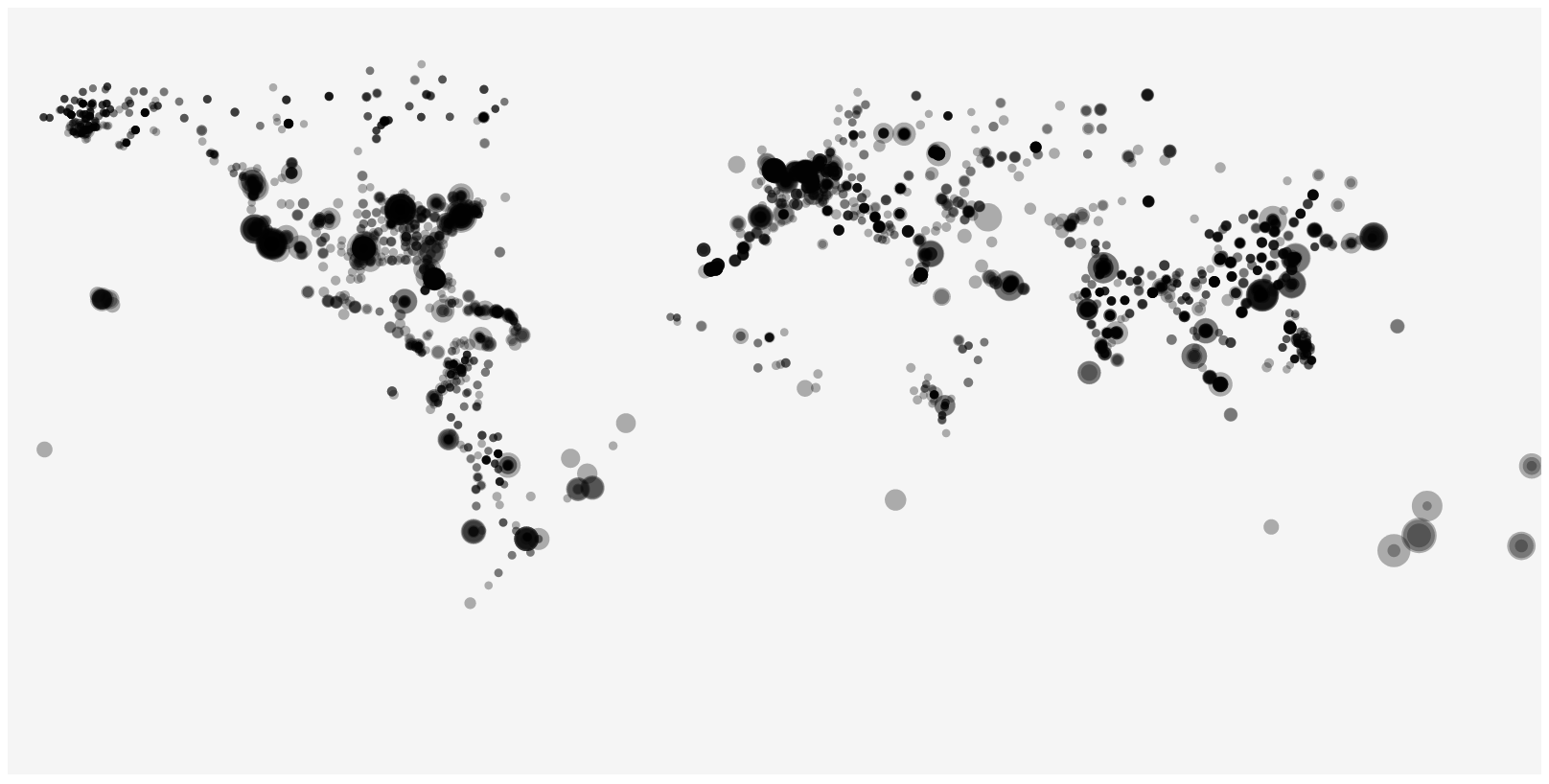
</svg>This is the result:
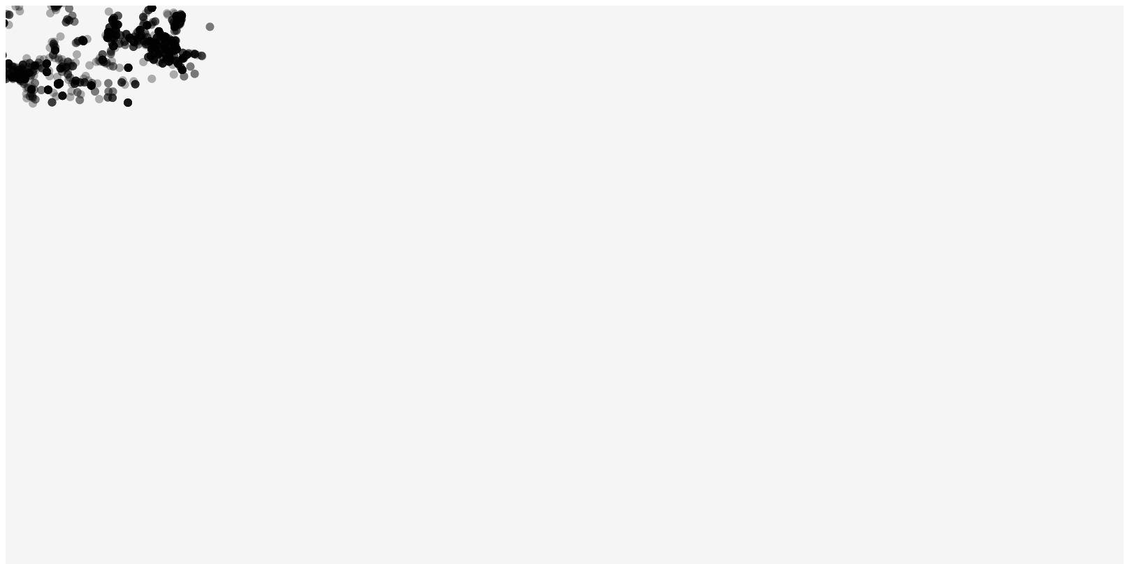
…which is completely different from what we expected.
Actually this is logical: the values for longitude in the file range from -180 to +180, and those for latitude from -90 to +90. On the other hand, the range of pixels that we should use are from 0 to 800 for longitude and from 0 to 400 for latitude. So not only is everything compressed in one corner, but 3/4 of the points are even outside of the picture.
So we will have to rescale these values.
Rescaling longitude and latitude
Instead of using cx={datapoint.from_long} we have to rescale that longitude from its original range (called its domain) to a new range. The formula to do this is:
Let’s put that in a function that we can use. Add the rescale function to the script section of your svelte file, and call it where we need to set cx and cy.
1
2
3
4
5
6
7
8
9
10
11
12
13
14
15
16
17
18
19
20
21
22
23
24
25
26
27
<script>
  let datapoints = []
  fetch("http://vda-lab.github.io/assets/svelte-flights.json")
    .then(res => res.json())
    .then(data => datapoints = data.slice(1,5000))

  const rescale = function(x, domain_min, domain_max, range_min, range_max) {
    return ((range_max - range_min)*(x-domain_min))/(domain_max-domain_min) + range_min
  }
</script>

<style>
  svg {
    background-color: whitesmoke;
  }
  circle {
    opacity: 0.3;
  }
</style>

<svg width=800 height=400>
  {#each datapoints as datapoint}
    <circle cx={rescale(datapoint.from_long, -180, 180, 0, 800)}
            cy={rescale(datapoint.from_lat, -90, 90, 0, 400)}
            r=3 />
  {/each}
</svg>
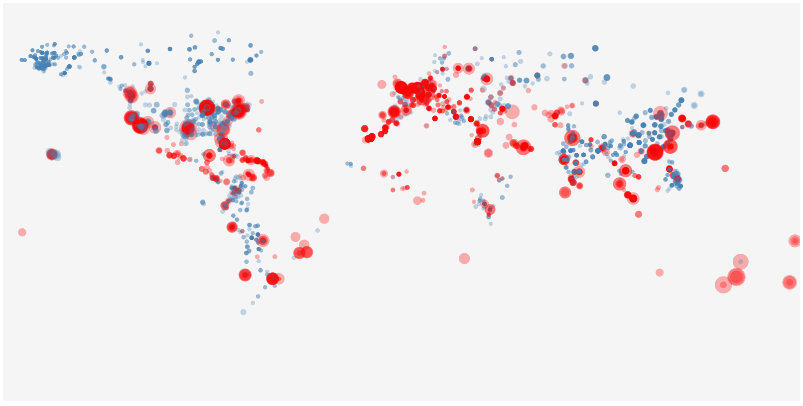
The new function is defined on lines 7 to 9 and used in lines 23 and 24.
Our new image:
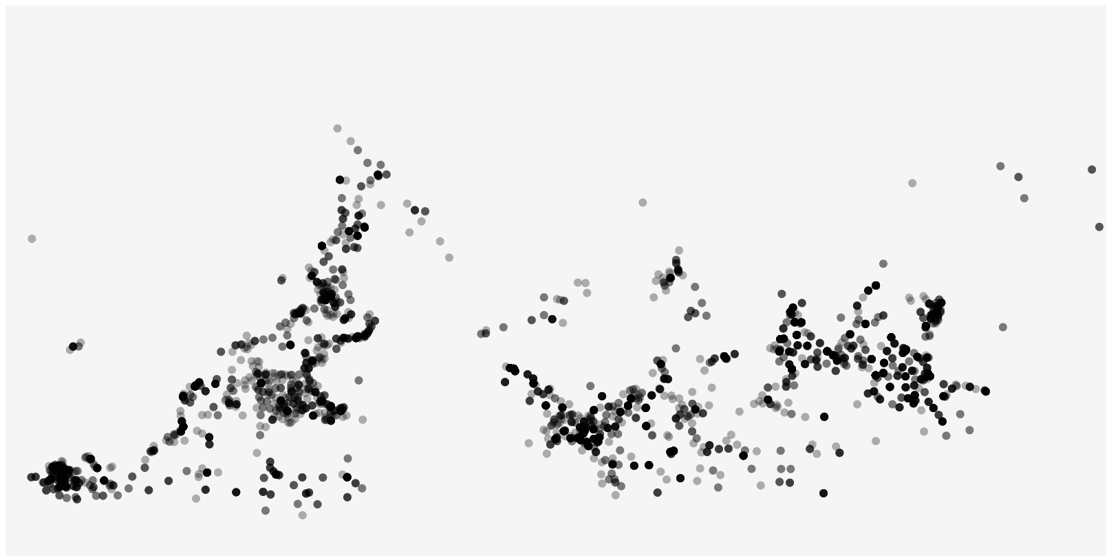
This is better, but the world is upside down. This is because the origin [0,0] in SVG is in the top left, not the bottom left. We therefore have to flip the scale as well, and set the range to 400,0 instead of 0,400 for cy. If we do that we’ll get the world the right side up.
Scaling the size of the circles
We also want to scale the size of the circles: small for short distance flights, and big for long distance flights. To do this we’ll need the minimum and maximum distance in the file, and can find out that this is 1 km and 15406 km. Let’s set the minimum radius of a circle to 2 pixels and the maximum to 10 pixels. This is our new file (remember the switch from 0,400 to 400,0 from above):
<script>
  let datapoints = []
  fetch("http://vda-lab.github.io/assets/svelte-flights.json")
    .then(res => res.json())
    .then(data => datapoints = data.slice(1,5000))

  const rescale = function(x, domain_min, domain_max, range_min, range_max) {
    return ((range_max - range_min)*(x-domain_min))/(domain_max-domain_min) + range_min
  }
</script>

<style>
  svg {
    background-color: whitesmoke;
  }
  circle {
    opacity: 0.3;
  }
</style>

<svg width=800 height=400>
  {#each datapoints as datapoint}
    <circle cx={rescale(datapoint.from_long, -180, 180, 0, 800)}
            cy={rescale(datapoint.from_lat, -90, 90, 400, 0)}
            r={rescale(datapoint.distance, 1, 15406, 2, 10)} />
  {/each}
</svg>
Our new image:
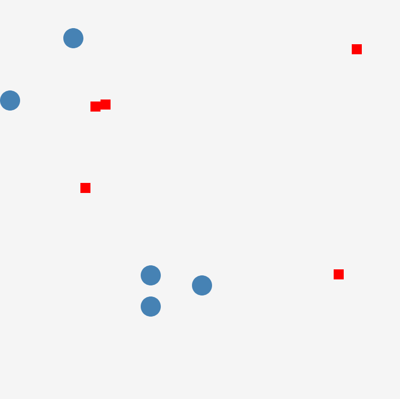
HTML class: setting the colour
Next, we want domestic flights to be blue and international flights to be red. We can do this because each flight has a from_country and a to_country. If these are the same we have a domestic flight, otherwise it is international. Here’s we’ll have to start using classes and CSS selectors (see above). We can for example set the default colour of the circles to blue, but give those flights that are international the class attribute of international. We can then use that class attribute in the CSS to set the colour to red.
Let’s first do the styling bit:
<style>
  svg {
    background-color: whitesmoke;
  }
  circle {
    opacity: 0.3;
    fill: steelblue;
  }
  circle.international {
    fill: red;
  }
</style>
This will set the default color of circles to blue, except when they have the international class.
We’ll have to do that programmatically in some way. A single circle element could look like this:
<circle cx=500 cy=238 r=12 />or
<circle cx=500 cy=238 r=12 class="international" />To add this, we will use an inline javascript expression:
<circle cx={...}
        cy={...}
        r={...}
        class:international={datapoint.from_country != datapoint.to_country} />
Our final code looks like this:
<script>
  let datapoints = []
  fetch("http://vda-lab.github.io/assets/svelte-flights.json")
    .then(res => res.json())
    .then(data => datapoints = data.slice(1,5000))

  const rescale = function(x, domain_min, domain_max, range_min, range_max) {
    return ((range_max - range_min)*(x-domain_min))/(domain_max-domain_min) + range_min
  }
</script>

<style>
  svg {
    background-color: whitesmoke;
  }
  circle {
    opacity: 0.3;
    fill: steelblue;
  }
  circle.international {
    fill: red;
  }
</style>

<svg width=800 height=400>
  {#each datapoints as datapoint}
    <circle cx={rescale(datapoint.from_long, -180, 180, 0, 800)}
            cy={rescale(datapoint.from_lat, -90, 90, 400, 0)}
            r={rescale(datapoint.distance, 1, 15406, 2, 10)}
            class:international={datapoint.from_country != datapoint.to_country} />
  {/each}
</svg>
Which gives the following (final) image:
Making the plot interactive with a slider
Let’s add an additional feature to the plot. We want to add a slider to filter the airports that are shown on the screen. As svelte is regular HTML, we can easily make use of all HTML elements, and there appears to be one for a slider.
<input type="range" min="1" max="15406" value="5000">There is an extensive list of input element types, including color picker, button, radio button, password field, etc. But also range which represents a slider. In the code snippet above, we set the minimum value to 1, the maximum value to 15,406 and the default value to 5,000.
The filtering itself
Let’s use an additional class on the circles: hidden. Circles should be hidden unless their value for distance is less than 1,000 km difference from what is selected with the slider. So if the slider is at 5,000, all flights that are either less than 4,000 or more than 6,000 km should be hidden. It’s good to first define the style. So add the following which will make the “hidden” circles not completely disappear, but makes them very transparent.
circle.hidden {
  opacity: 0.05;
}
We can do the same as we did with international vs domestic flights: class:hidden={compare distance to slider value here}. But how can we access the value of the slider? We can define it in the script section. For example:
<script>
  let slider_value = 5000;
</script>

<input type="range" min="1" max="15406" value={slider_value} />

<svg>
    ...
    class:hidden="{Math.abs(datapoint.distance - slider_value) > 1000}">
</svg>
The full code looks like this:
<script>
  let slider_value = 5000;

  let datapoints = []
  fetch("http://vda-lab.github.io/assets/svelte-flights.json")
    .then(res => res.json())
    .then(data => datapoints = data.slice(1,5000))

  const rescale = function(x, domain_min, domain_max, range_min, range_max) {
    return ((range_max - range_min)*(x-domain_min))/(domain_max-domain_min) + range_min
  }
</script>

<style>
  circle {
    opacity: 0.5;
    fill: blue;
  }
  circle.international {
    fill: red;
  }
  circle.hidden {
    opacity: 0.05;
  }
</style>

<h1>Airport flights data</h1>
Airports serving flights in this range (km): {slider_value - 1000} - {slider_value + 1000} <br/>
<input type="range" min="1" max="15406" bind:value={slider_value} class="slider" id="myRange" />
<svg width=1000 height=500>
  {#each datapoints as datapoint}
    <circle cx={rescale(datapoint.from_long, -180, 180, 0, 800)}
            cy={rescale(datapoint.from_lat, -90, 90, 400, 0)}
            r={rescale(datapoint.distance, 1, 15406, 2,10)}
            class:international="{datapoint.from_country != datapoint.to_country}"
            class:hidden="{Math.abs(datapoint.distance - slider_value) > 1000}">
      <title>{datapoint.from_airport}</title>
    </circle>
  {/each}
</svg>
This gives our final interactive tool (drag the slider: this visual is live):
Here’s a static screenshot:
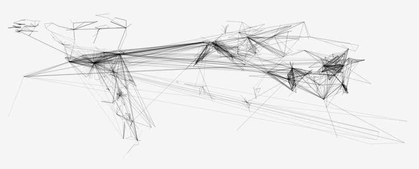
Quick exercise: lines
See if you can adapt the previous script to generate the following image where departure airports are linked to their arrival airports.
What we did not go into
Obviously svelte is much more than what we’ve seen above. Actually, the most important things we have not even looked into. I will explain them very briefly below, but make sure that you have a look at the svelte tutorial at http://svelte.dev/tutorial.
Below is just an idea of some of the important concepts; I will not explain them in detail.
Components
What if we want to create two scatterplots instead of one, e.g. one for departure airports and one for arrival airports? We could duplicate the code for the SVG, like so:
<svg width=1000 height=500>
  {#each datapoints as datapoint}
    <circle cx={rescale(datapoint.from_long, -180, 180, 0, 800)}
            cy={rescale(datapoint.from_lat, -90, 90, 400, 0)}
            r={rescale(datapoint.distance, 1, 15406, 2,10)}
            class:international="{datapoint.from_country != datapoint.to_country}"
            class:hidden="{Math.abs(datapoint.distance - slider_value) > 1000}" />

  {/each}
</svg>

<svg width=1000 height=500>
  {#each datapoints as datapoint}
    <circle cx={rescale(datapoint.to_long, -180, 180, 0, 800)}
            cy={rescale(datapoint.to_lat, -90, 90, 400, 0)}
            r={rescale(datapoint.distance, 1, 15406, 2,10)}
            class:international="{datapoint.from_country != datapoint.to_country}"
            class:hidden="{Math.abs(datapoint.distance - slider_value) > 1000}" />
  {/each}
</svg>
It would be nicer if we could something like this instead:
<Scatterplot />Static image using Scatterplot component
Create a new subfolder of src with the name components, and create a new file named Scatterplot.svelte.
We’ll move everything that is relevant to the scatterplot itself into this new file:
<script>
  export let datapoints = [];

  const rescale = function(x, domain_min, domain_max, range_min, range_max) {
    return ((range_max - range_min)*(x-domain_min))/(domain_max-domain_min) + range_min
  }
</script>

<style>
  circle {
    opacity: 0.5;
    fill: blue;
  }
  circle.international {
    fill: red;
  }
</style>

<svg width=1000 height=500>
  {#each datapoints as datapoint}
    <circle cx={rescale(datapoint.from_long, -180, 180, 0, 800)}
            cy={rescale(datapoint.from_lat, -90, 90, 400, 0)}
            r={rescale(datapoint.distance, 1, 15406, 2,10)}
            class:international="{datapoint.from_country != datapoint.to_country}" />
  {/each}
</svg>
This component defines a datapoints variable. Because of the export let instead of just let we can access this variable from outside. Now how do we do that? We have moved all scatterplot specific code from App.svelte into this new component. App.svelte will now look like this:
<script>
	import Scatterplot from './components/Scatterplot.svelte';
	let datapoints_from_app = []
	fetch("http://vda-lab.github.io/assets/svelte-flights.json")
		.then(res => res.json())
		.then(data => datapoints_from_app = data.slice(1,5000))
</script>

<h1>Airports</h1>
<Scatterplot datapoints={datapoints_from_app}/>
We first import this new Scatterplot element that we created. We still have to load the data using the fetch API, but now we use the Scatterplot element instead of the original SVG. Just to make things a bit more clear, we have renamed the original datapoints to datapoints_from_app. The Scatterplot element takes a datapoints attribute. This attribute exists because we defined the export let datapoints in the component. The value of that datapoints variable is what comes from datapoints_from_app.
In this case, the SVG still always shows the departure airports. How do we change that so that we can also show the arrival airports? We have to replace the from_long and from_lat in the component with a variable. Let’s do that while setting from_long and from_lat as the default:
<script>
  export let datapoints = [];
  export let long = 'from_long';
  export let lat = 'from_lat';

  const rescale = function(x, domain_min, domain_max, range_min, range_max) {
    return ((range_max - range_min)*(x-domain_min))/(domain_max-domain_min) + range_min
  }
</script>

<style>
  circle {
    opacity: 0.5;
    fill: blue;
  }
  circle.international {
    fill: red;
  }
</style>

<svg width=1000 height=500>
  {#each datapoints as datapoint}
    <circle cx={rescale(datapoint[long], -180, 180, 0, 800)}
            cy={rescale(datapoint[lat], -90, 90, 400, 0)}
            r={rescale(datapoint.distance, 1, 15406, 2,10)}
            class:international="{datapoint.from_country != datapoint.to_country}" />
  {/each}
</svg>
Notice that we added 2 new variables (long and lat) and use these in the value for cx and cy instead of the original from_long and from_lat.
Because we export these variables, they are now available in the App.svelte and we can do this:
<script>
  import Scatterplot from './components/Scatterplot.svelte';
  let datapoints_from_app = []
  fetch("http://vda-lab.github.io/assets/svelte-flights.json")
    .then(res => res.json())
    .then(data => datapoints_from_app = data.slice(1,5000))
</script>

<h1>Airports</h1>
<Scatterplot datapoints={datapoints_from_app} long="from_long" lat="from_lat"/>
<Scatterplot datapoints={datapoints_from_app} long="to_long" lat="to_lat"/>
Reactivity
Another strong feature of svelte is its support for reactivity. Reactivity means that when some variable a depends on a variable b, and b is changed, that the value for a is automatically updated as well. This is what makes a tool like Excel so strong as well: if you have a cell in a spreadsheet with a formula =A1*2, it will have the value of cell A1 multiplied by 2. If you change the value of A1, the value in this derived is automatically updated as well. Most programming languages do not have this baked in, but with svelte you do have that functionality.
We do this using the $: pragma. For example:
<script>
  let slider_value = 50;

  $: multiplied_value = slider_value * 2;
</script>

<input type="range" min="0" max="100" bind:value={slider_value}
<p>The value {slider_value} multiplied by 2 is {multiplied_value}.</p>
Notice that we use bind:value in the slider. Sliding left and right will now update the multiplied value as well.
Animations
It isn’t that hard to create animations using svelte and javascript. We’ll use the built-in setInterval function. This function will run something over and over again at specific intervals (in milliseconds). For example, the following code will print “Hello” to the console every 3 seconds: setInterval(function(){ console.log("Hello"); }, 3000);.
Let’s move a little rectangle across the screen:
<script>
  let counter = 0;

  const interval = setInterval(() => {
    counter += 1;
    if ( counter > 400 ) {
      counter = 0
    }
  }, 100)
</script>

<style>
  rect {
    fill: steelblue;
  }
</style>

{counter}<br/>
<svg width=400 height=50>
  <rect x={counter} y=15 width=20 height=20 />
</svg>
In the following example, we rotate a line.
<script>
  let degree = 0;
  let dim = 200;

  $: theta = degree*Math.PI/180
  const x = function(r, theta) {
    return r*Math.cos(theta)
  }
  const y = function(r, theta) {
    return r*Math.sin(theta)
  }

  const interval = setInterval(() => {
    degree += 1;
    if ( degree == 360 ) {
      degree = 0
    }
  }, 10);
</script>

<style>
  line {
    stroke: black;
  }
  circle {
    stroke: black;
    fill: none;
  }
</style>

{degree}<br/>
<svg width={dim+10} height={dim+10}>
  <g transform="translate({dim/2+5},{dim/2+5})">
    <circle cx=0 cy=0 r={dim/2} />
    <line x1=0 y1=0 x2={x(dim/2, theta)} y2={y(dim/2, theta)} />
  </g>
</svg>
Custom visuals
We can actually create quite complex visuals. But let’s just make a pie chart as a proof-of-principle.
App.svelte
<script>
  import Pie from './Pie.svelte';
  let data = [90,50,120,70,30] // sum = 360
</script>

<Pie data={data} />
Pie.svelte
<script>
  import PieSlice from './PieSlice.svelte';
  export let data = []

  let slices = []
  let running_sum = 0
  $: {
    data.forEach(function(d) {
      let new_running_sum = running_sum + d;
      slices.push([running_sum, new_running_sum])
      running_sum = new_running_sum;
    })
  }
</script>

<style>
  svg {
    background-color: whitesmoke;
  }
</style>

<svg width=200 height=200>
  {#each slices as slice}
    <PieSlice cx=100 cy=100
              r=50
              start_degree={slice[0]} stop_degree={slice[1]} />
  {/each}
</svg>
PieSlice.svelte
<script>
  export let cx = 0;
  export let cy = 0;
  export let r = 50;
  export let start_degree = 0;
  export let stop_degree = 0;
  export let colour = 'steelblue';

  const degree2radians = function(degree) {
    return Math.PI*(degree)/180
  }

  const x = function(cx, radius, theta) {
    return Number(cx) + radius*Math.cos(theta)
  }

  const y = function(cy, radius, theta) {
    return Number(cy) + radius*Math.sin(theta)
  }

  const pieslice = function(cx, cy, r, start_degree, stop_degree) {
    let start_theta = degree2radians(start_degree)
    let stop_theta = degree2radians(stop_degree)
    let start_x = x(cx,r,start_theta)
    let start_y = y(cy,r,start_theta)
    let stop_x = x(cy,r,stop_theta)
    let stop_y = y(cx,r,stop_theta)
    return "M " + cx + " " + cy + " " +
           "L " + start_x + " " + start_y + " " +
           "A " + r + " " + r + " 0 0 1 " + stop_x + " " + stop_y + " " +
           "Z"
  }
</script>

<style>
  path {
    stroke: white;
  }
</style>

<path d={pieslice(cx, cy, r, start_degree, stop_degree)}, style="fill:{colour};" />
With this you can start changing colours of the slices, have different radii for different slices, add hover effects, etc.
Overview first, search and filter, and details on demand
Above we have see how to create single visuals using svelte. But what if we want to combine these, for example when you want to show an overview of some dataset, with next to it a more detailed view?
There are many ways of doing this
Let’s use the iris dataset for this.
Conditionally showing content
Consider the following code:
1
2
3
4
5
6
7
8
9
10
11
12
13
14
15
16
17
18
19
20
21
22
23
24
25
26
27
28
29
30
31
32
33
34
35
<script>
import Papa from 'papaparse';
let datapoints = []
Papa.parse("iris.csv", {
header: true,
download: true,
complete: function(results) {
datapoints = results.data
}
})
let selected_datapoint = undefined;
</script>
<style>
circle {
fill: steelblue;
fill-opacity: 0.5;
}
</style>
<svg width=400 height=400>
{#each datapoints as datapoint}
<circle cx={datapoint.sepal_length*50}
cy={datapoint.sepal_width*50}
r=3
on:mouseover={() => {selected_datapoint = datapoint}}
on:mouseout={() => {selected_datapoint = undefined}}/>
{/each}
</svg>
<br/>
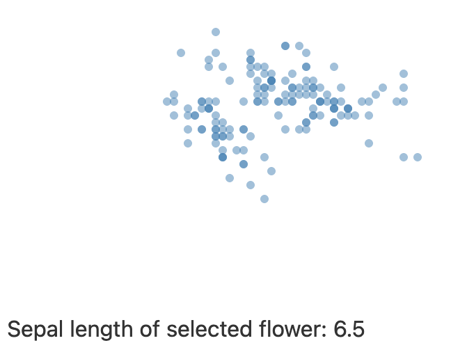
{#if selected_datapoint != undefined}
Sepal length of selected flower: {selected_datapoint.sepal_length}
{/if}
Here is what that looks like if you hover over a datapoint:
(If your don’t have the iris dataset, you can point to this url, but make sure you remove the last empty line.)
So what happens here? We load the data using Papaparse as shown before, but also create a new variable selected_datapoint and set it to undefined. In the SVG element, each datapoint is drawn as a circle on the screen with the cx and cy depending on the sepal length and sepal width of data datapoint. The *50 is a quick hack here to spread the points more on the screen; you should use scaling here.
In the on:mouseover and on:mouseout attributes for the circle, we set or unset the selected_datapoint. We don’t even need to create a separate function for that: in svelte you can include javascript code anywhere you use curley brackets. (Have you read the svelte tutorial yet at svelte.dev/tutorial? Check out the section “Events / Inline handlers”.) So when the mouse hovers over a circle, the variable selected_datapoint is set to equal the datapoint linked to that circle; when the mouse leaves a circle, the selected_datapoint is set to undefined.
Now the magic happens in the last 3 lines: if the selected_datapoint is not undefined, a piece of text is shown with the sepal_length of that datapoint. This is a very simple way of showing details.
A tooltip
In the example above, the piece of text is shown below the image itself. But of course we can put that anywhere we want. So why not let it follow the mouse like what a tooltip would do?
We can do this by giving the div a “fixed” position which is located at the mouse coordinates, like so:
1
2
3
4
5
6
7
8
9
10
11
12
13
14
15
16
17
18
19
20
21
22
23
24
25
26
27
28
29
30
31
32
33
34
35
36
37
38
39
40
41
42
43
44
45
46
47
48
<script>
  import Papa from 'papaparse';

  let datapoints = []
  Papa.parse("iris.csv", {
    header: true,
    download: true,
    complete: function(results) {
      datapoints = results.data
    }
  })
  let selected_datapoint = undefined;
  let mouse_x, mouse_y;

  const setMousePosition = function(event) {
    mouse_x = event.clientX;
    mouse_y = event.clientY;
  }
</script>

<style>
  circle {
    fill: steelblue;
    fill-opacity: 0.5;
  }
  #tooltip {
    position: fixed;
    background-color: white;
  }
</style>

<svg width=400 height=400>
  {#each datapoints as datapoint}
    <circle
      cx={datapoint.sepal_length*50}
      cy={datapoint.sepal_width*50}
      r=3
      on:mouseover={(event) => {selected_datapoint = datapoint; setMousePosition(event)}}
      on:mouseout={() => {selected_datapoint = undefined}}/>
  {/each}
</svg>
<br/>

{#if selected_datapoint != undefined}
<div id="tooltip" style="left: {mouse_x + 10}px; top: {mouse_y - 10}px">
Sepal length of selected flower: {selected_datapoint.sepal_length}
</div>
{/if}
What we get with this code:
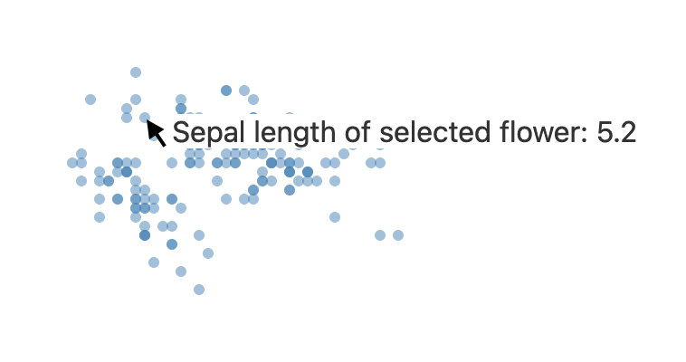
In the on:mouseover event handler, we now update a mouse_x and mouse_y variable which reflect the current mouse position. This mouse_x and mouse_y are then used in the style attribute of the div at the bottom:
<div id="tooltip" style="left: {mouse_x + 10}px; top: {mouse_y - 10}px">Finally in this example, we add CSS in two different ways: part of it (position and background-color) in the style section, and the actual position (left and top in the style attribute of the element itself. We can’t directly use {mouse_x} or similar in the style CSS section.
Add some padding and shadow, and you have a nice-looking tooltip.
#tooltip {
  position: fixed;
  background-color: rgb(242, 241, 241);
  box-shadow: 2px 3px lightgray;
  padding: 5px;
}
An image as tooltip
We now have a div that floats around the screen, but this can be anything, including an SVG. So let’s change that little div with the following:
{#if selected_datapoint != undefined}
<svg width=40 height=40 style="background-color: whitesmoke; border: 1px solid grey;">
	<line x1={selected_datapoint.sepal_length*5} y1={selected_datapoint.sepal_width*5}
	      x2={selected_datapoint.petal_length*5} y2={selected_datapoint.petal_width*5}
		  style="stroke: black;"/>
</svg>
{/if}
This is just a proof-of-principle showing that the line depends on the actual datapoint. So let’s make something a little bit nicer: a small shape that depends on the actual data. INTERACTIVE: Hover your mouse over a datapoint below, and see how for example the tooltips from datapoints on the right are different from those on the left.
(Here’s a screenshot)
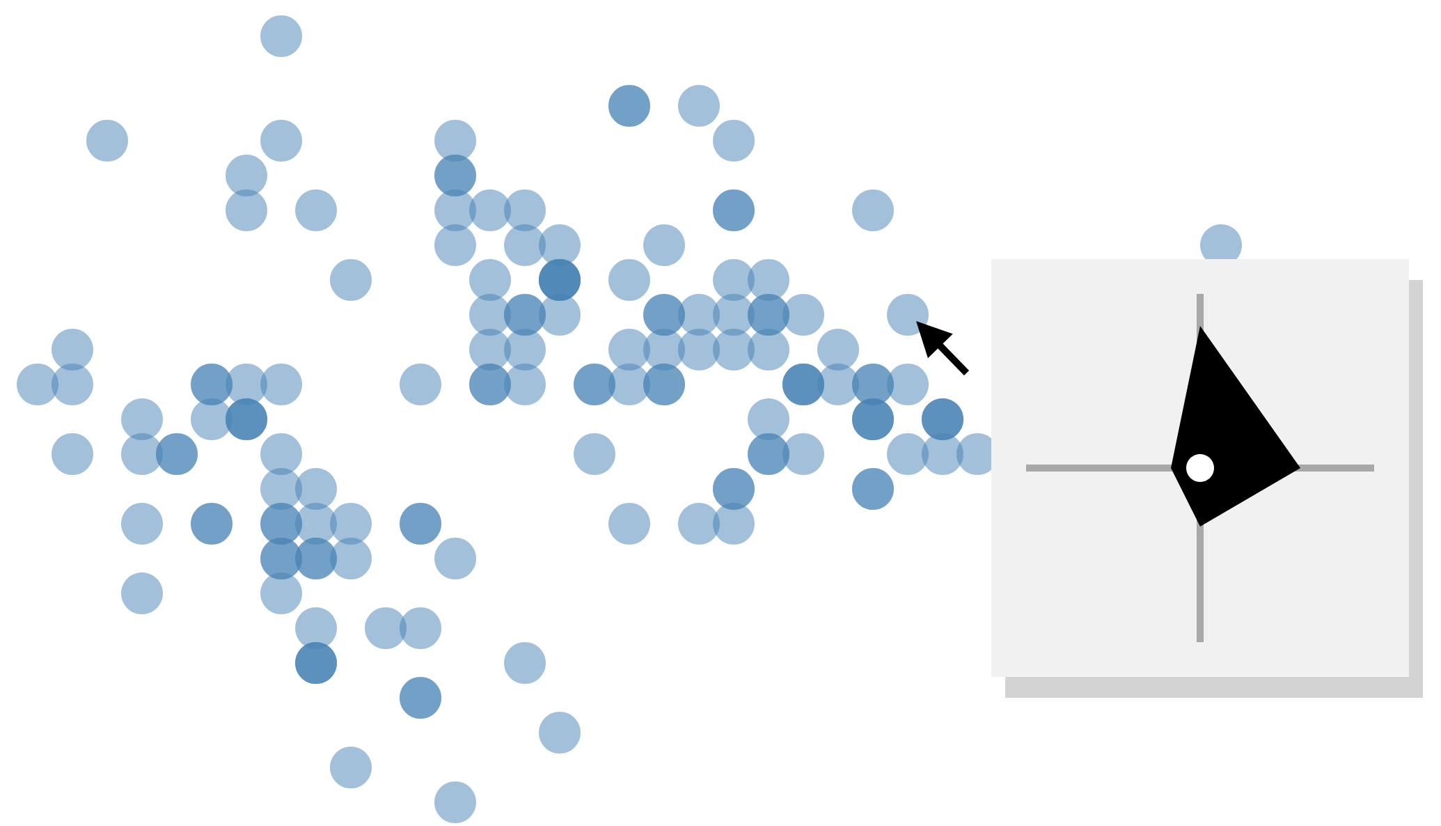
In this little image, the white circle is the center. Up represents sepal length, right petal length, down sepal width, and left petal width. We can create this by changing the line in the svg to a path:
{#if selected_datapoint != undefined}
<svg width=50 height=50
     id="tooltip"
     style="left: {mouse_x + 10}px; top: {mouse_y - 10}px">
  <line class="axis" x1=0 x2=50 y1=25 y2=25 />
  <line class="axis" x1=25 x2=25 y1=0 y2=50 />
  <path d={lineGenerator(selected_datapoint)} />
  <circle cx=25 cy=25 r=2 style="fill: white; fill-opacity: 1;" />
</svg>
{/if}
As we had set the #tooltip to fixed in the CSS, the image will now follow the mouse. We use a lineGenerator function (you can call it whatever you want) to create the actual path:
const lineGenerator = function(d) {
  let sl = +d.sepal_length;
  let pl = +d.petal_length;
  let sw = +d.sepal_width;
  let pw = +d.petal_width
  return "M 25 " + (25-3*sl) +
         " L " + (25+3*pl) + " 25" +
         " L 25 " + (25+3*sw) +
         " L " + (25-3*pw) + " 25 Z"
}
In this last bit of code, we first set e.g. sl to +d.sepal_length. We do this to force sl to be a number, otherwise you’ll notice that the string generated for the return statement will be incorrect. See the path documentation for information on how to interpret the full string. But for example in the second line (" L " + (25+3*pl) + " 25") we draw a line to a certain point with x position 25+3*pl and y position 25. We multiplied the petal length with 3 just to make it scale a bit nicer using trial-and-error. Normally you’d write a little nice scaling function for this.
Merging the tooltip into the scatterplot itself
We can even go further, and actually have the circles that represent iris flowers not be circles but the actual shapes that we use for the tooltip. This is what we’ll create:
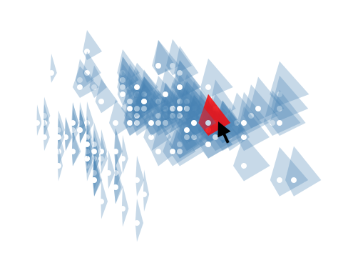
(Note that this is not an ideal visual due to the overlaps, but let’s look at this as a proof-of-principle…)
This is where svelte shines, as we can create custom HTML elements. So instead of circle we can use Flower. The App.svelte can now be much smaller (because we also remove interactivity in this example):
<script>
  import Papa from 'papaparse';
  import Flower from './Flower.svelte';

  let datapoints = []
  Papa.parse("iris.csv", {
    header: true,
    download: true,
    complete: function(results) {
      datapoints = results.data
    }
  })
</script>

<svg width=500 height=500>
  {#each datapoints as datapoint}
    <Flower datapoint={datapoint} />
  {/each}
</svg>
<br/>
Wat is new here, is the second line import Flower from './Flower.svelte';, and the fact that we replace circle with a Flower element. But we need to have the Flower.svelte file for this which describes the Flower component:
<script>
  export let datapoint = {}

  $: sl = datapoint.sepal_length
  $: sw = datapoint.sepal_width
  $: pl = datapoint.petal_length
  $: pw = datapoint.petal_width
  $: path = "M      25 "     +  (25-3*sl) +
           " L " + (25+3*pl) + " 25" +
           " L      25 "     +  (25+3*sw) +
           " L " + (25-3*pw) + " 25 " +
           "Z"
</script>

<style>
  path {
    fill: steelblue;
    fill-opacity: 0.3;
  }
  path:hover {
    fill: red;
    fill-opacity: 0.8;
  }
</style>
<g transform="translate({sl*50}, {sw*50})">
  <path d={path} />
  <circle cx=25 cy=25 r=2 style="fill: white; fill-opacity: 1;" />
</g>
The flower component returns a single group g (see documentation) containing all information to draw a single datapoint. In this case, a path is created and we put a little white circle at its center.
By the way, we don’t need to create those new variables sl, sw, etc. That is just to make the path string easier to read.
This is a nice example of how you can create a visual design for a single datapoint and then combine these into larger plots.
Or we can draw the actual flowers where the size of the sepals and petals of the image correspond to the data.
<script>
  export let datapoint = {}

  let scale = 3;
  $: sl = scale*datapoint.sepal_length
  $: sw = scale*datapoint.sepal_width
  $: pl = scale*datapoint.petal_length
  $: pw = scale*datapoint.petal_width
  $: sepal_path = "M 0,0 " +
                  "C " + sl + ",-" + sw +
                   " " + sl + "," + sw +
                   " 0,0 Z"
  $: petal_path = "M 0,0 " +
                  "C " + pl + ",-" + pw +
                  " " + pl + "," + pw +
                  " 0,0 Z"
</script>

<style>
  .flower {
    fill: steelblue;
    fill-opacity: 0.3;
  }
  .flower:hover {
    fill: red;
    fill-opacity: 0.8;
  }
</style>
<g transform="translate({50*datapoint.sepal_length}, {50*datapoint.sepal_width})"
   class="flower">
    <path style="transform: rotate(270deg)" d={sepal_path} />
    <path style="transform: rotate(30deg)" d={sepal_path} />
    <path style="transform: rotate(150deg)" d={sepal_path} />
    <path style="transform: rotate(325deg)" d={petal_path} />
    <path style="transform: rotate(90deg)" d={petal_path} />
    <path style="transform: rotate(210deg)" d={petal_path} />
</g>
… or to generate a grid of flowers:
{#each datapoints as datapoint}
  <svg width=30 height=30>
    <Flower datapoint={datapoint} />
  </svg>
{/each}
(Note that we have the each outside of the svg instead of inside.)
<g transform="translate({15}, {15})" class="flower">
  <path style="transform: rotate(270deg)" d={sepal_path} />
  <path style="transform: rotate(30deg)" d={sepal_path} />
  <path style="transform: rotate(150deg)" d={sepal_path} />
  <path style="transform: rotate(325deg)" d={petal_path} />
  <path style="transform: rotate(90deg)" d={petal_path} />
  <path style="transform: rotate(210deg)" d={petal_path} />
</g>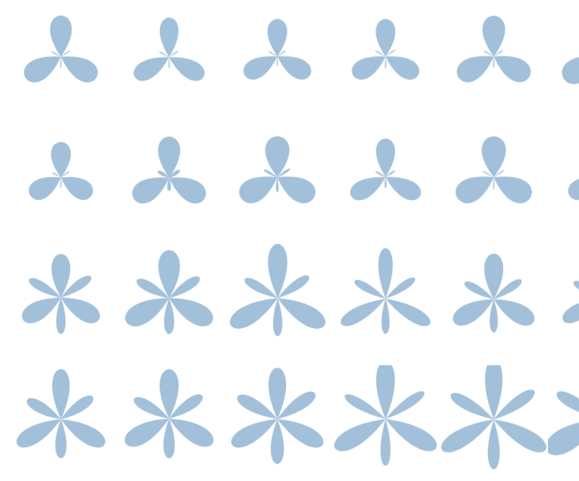
Deploying your visualisations
It’s easy to deploy your app as well, for example using vercel. Create an account on vercel.com, install the vercel NPM module, and run the vercel command:
npm install vercel
vercel
You will have to answer a couple of questions, but these are straightforward. As an example of such deployment, see here.
You can for example find a version of the flight visualisation here and the iris visualisation here.