Hands-on data visualization using vega
This is the vega (http://vega.github.io/) version of the Processing tutorial that I published earlier. There are also py-processing and p5 versions. Vega is a declarative version of the very popular D3 toolkit. This tutorial holds numerous code snippets that can by copy/pasted and modified for your own purpose.
The tutorial is written as much as possible in an incremental way. We start with something simple, and gradually add little bits and pieces that allow us to make more complex visualizations. So make sure to not skip parts of the tutorial: everything depends on everything that precedes it.
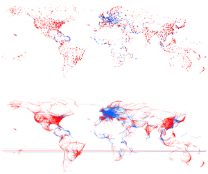
Figure 1 - A pretty picture
Introduction to Vega
Vega is a declarative markup language, which means that you basically describe what you want to see, not how it is done. So you will not find for-loops or declaration of variables.
A “vega spec” is defined as a json file, which describes at least the data, and the marks that should be presented on the screen. Let’s have a look at a minimal spec file:
{
  "width": 400,
  "height": 200,
  "data": [
    {
      "name": "table",
      "values": [
        {"x": 15,  "y": 28},
        {"x": 39,  "y": 83},
        {"x": 126,  "y": 53}
      ]
    }
  ],
  "marks": [
    {
      "type": "symbol",
      "from": {"data": "table"},
      "properties": {
        "enter": {
          "x": {"field": "x"},
          "y": {"field": "y"},
          "size": {"value": 50},
          "fill": {"value": "steelblue"}
        }
      }
    }
  ]
}
You can try this out in the inline vega editor at https://vega.github.io/vega-editor/?mode=vega. You’ll get something like this:
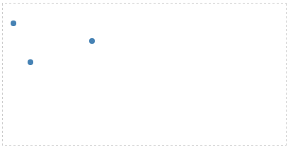
Figure 2 - A simple vega plot
Let’s go through this spec:
widthandheight: define the size of the canvasdata: This is where we define the data. First of all, we give the data anamewhich we can refer to later. The actual values can be hard-coded in this file (as is done here with the keywordvaluesand an array), or can be loaded from a file or url (see later).marks: Define the mark (circle, text, rectangle, line, …) that should be drawn for each datapoint. This object has 3 parts:type: what should be drawn: a rectangle, symbol (default is a circle), line, etcfrom: which data this should be applied to; in this case the dataset with the nametable.properties: describe the specifics of the marks: position and appearance, for example. You see that the value forxandysays{"field": "something"}, whereas that forsizeandfilluses{"value": "something"}. That’s a crucial difference. Whenever you want to use a fixed value, use"value"; if you want to refer to a value that is in the dataset (e.g. as a key in the json object as shown here, or a column name in a csv file) use"field". We’ll see an additional option a bit later:"signal".
Setting things up
Although we used the online vega editor above, we’ll need to use another approach if we want to load data from a file. In our case, we will have a CSV file with flights between airports. We will basically need to have 3 files:
- an
index.htmlwhich we will open in a web browser - the spec file (let’s call is
spec.json) - the datafile (in our case:
flights.csv)
index.html should look like this:
<html>
  <head>
    <title>Flights visualization</title>
    <script src="https://vega.github.io/vega-editor/vendor/d3.min.js"></script>
    <script src="https://vega.github.io/vega-editor/vendor/d3.geo.projection.min.js"></script>
    <script src="https://vega.github.io/vega-editor/vendor/topojson.js"></script>
    <script src="https://vega.github.io/vega-editor/vendor/d3.layout.cloud.js"></script>
    <script src="https://vega.github.io/vega/vega.min.js"></script>
  </head>
  <body>
    <div id="vis"></div>
  </body>
<script type="text/javascript">
// parse a spec and create a visualization view
function parse(spec) {
  vg.parse.spec(spec, function(error, chart) { chart({el:"#vis"}).update(); });
}
parse("spec.json");
</script>
</html>
This will load all dependencies. The crucial part is the line saying parse("spec.json"). That’s the place that indicates what the name of the specification file is.
Do not use Microsoft Word to create these files! Code editors include atom, Sublime Text, TextMate or just Notepad if you’re on Windows.
Running a webserver
So how do you “run” this visualization? You do this by running a local webserver. Depending on your operating system, there are several options for this. Getting these installed is not within the scope of this tutorial. In short, if you have python installed, type in python -m SimpleHTTPServer on the command line in the directory with the index.html, spec.json and data files. When that’s done, open your web browser and go the http://localhost:8000. If your spec.json looks like the one above, you should see the picture with the 3 blue dots.
If you need help setting up the webserver, check out https://github.com/processing/p5.js/wiki/Local-server.
A static image
Getting the data
The data for this exercise can be downloaded here and concerns flight information between different cities. Each entry in the dataset contains the following fields:
- from_airport
- from_city
- from_country
- from_long
- from_lat
- to_airport
- to_city
- to_country
- to_long
- to_lat
- airline
- airline_country
- distance
Alternatively, you can use an external URL as well, as we will do below.
Loading the external data
Let’s create the same visual as above, but draw a circle for every airport in the file.
{
  "width": 800,
  "height": 400,

  "data": [
    {"name": "flights",
     "url": "https://vda-lab.github.io/assets/flights.csv",
     "format": {"type": "csv", "parse": "auto"}}
  ],

  "marks": [
    {
      "type": "symbol",
      "from": {"data":"flights"},
      "properties": {
        "enter": {
          "x": {"field": "from_long"},
          "y": {"field": "from_lat"},
          "size": {"value": 10},
          "fill": {"value":"steelblue"},
          "fillOpacity": {"value": 0.2}
        }
      }
    }
  ]
}
Opening the url http://localhost:8080 will show the visual, which will look like this:
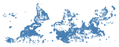
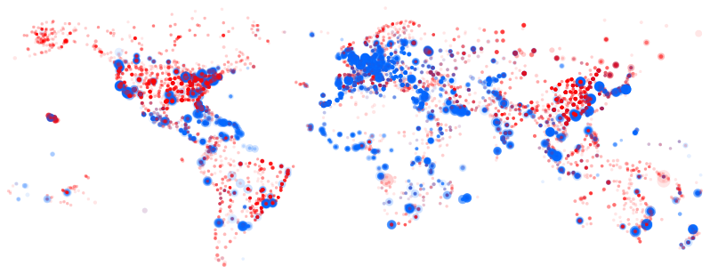
Figure 3 - An upside-down map of the world
In this plot, we load the data using the url tag in data, and let x and y be defined by the from_long and from_lat values for each datapoint. We set the colour to “steelblue” with the fill tag, and let these be transparent (fillOpacity) to make sure that we see overlap if there is one.
Properties are in an enter tag. Just like D3 which it is based upon, vega uses the enter-update-exit pattern.
Good resources to learn about enter-update-exit:
Scales
Plotting the longitude and latitude of all airports, you’d expect to end up with a map of the world (because - in general - airports are built on land rather than on the water). Unfortunately, what we get is not a good map; it’s upside-down.
To solve this, and to scale the plot to use the whole canvas of 800x400 pixels, we will use the scale tag. The values for from_long range from -180 to 180 in the datafile, but the pixels we can use are between 0 and 800. The same goes for the from_lat: values range from -90 to 90, but we would like to use 0 to 400 on the screen.
In the spec.json file, add the scale sections and alter the x and y value in the marks:
{
  "width": 800,
  "height": 400,

  "data": [
    {"name": "flights",
     "url": "https://vda-lab.github.io/assets/flights.csv",
     "format": {"type": "csv", "parse": "auto"}
    }
  ],

  "scales": [
    {
      "name": "scaleLong2X",
      "type": "linear",
      "domain": [-180,180],
      "range": [0,800]
    },
    {
      "name": "scaleLat2Y",
      "type": "linear",
      "domain": [-90,90],
      "range": [400,0]
    }
  ],

  "marks": [
    {
      "type": "symbol",
      "from": {"data":"flights"},
      "properties": {
        "enter": {
          "x": {"scale": "scaleLong2X", "field": "from_long"},
          "y": {"scale": "scaleLat2Y", "field": "from_lat"},
          "size": {"value": 10},
          "fill": {"value":"steelblue"},
          "fillOpacity": {"value": 0.2}
        }
      }
    }
  ]
}
We’ll use quite verbose names for the scales, so that we can tell things apart… Each scale contains both the domain and the range in its name (e.g. scaleLong2X).
Different colours and sizes
What if we want international flights to be coloured blue, and domestic flights coloured red? One way of doing this is to create 2 subsets of the data (one for domestic and one for international flights) using the filter operation. Change the data specification to the following:
"data": [
  {"name": "domestic_flights",
   "url": "https://vda-lab.github.io/assets/flights.csv",
   "format": {"type": "csv", "parse": "auto"},
   "transform": [
     {"type": "filter", "test": "datum.from_country == datum.to_country"}
   ]
  },
  {"name": "international_flights",
   "url": "https://vda-lab.github.io/assets/flights.csv",
   "format": {"type": "csv", "parse": "auto"},
   "transform": [
     {"type": "filter", "test": "datum.from_country != datum.to_country"}
   ]
  }
]
See here for documentation on the filter transform.
As you see, we now have 2 different datasets, even though they originate from the same file. The domestic_flights dataset is filtered so that it contains only those flights where the from_country is the same as the to_country. We do a similar thing for the international_flights. This is not very efficient, though, as we are reading the file twice. It’d be better to use a calculated field.
We now have to change the spec for the marks as well, by drawing these 2 datasets separately.
"marks": [
    {
      "type": "symbol",
      "from": {"data":"domestic_flights"},
      "properties": {
        "enter": {
          "x": {"scale": "scaleLong2X", "field": "from_long"},
          "y": {"scale": "scaleLat2Y", "field": "from_lat"},
          "size": {"value": 10},
          "fill": {"value":"red"},
          "fillOpacity": {"value": 0.1}
        }
      }
    },
    {
      "type": "symbol",
      "from": {"data":"international_flights"},
      "properties": {
        "enter": {
          "x": {"scale": "scaleLong2X", "field": "from_long"},
          "y": {"scale": "scaleLat2Y", "field": "from_lat"},
          "size": {"value": 10},
          "fill": {"value":"blue"},
          "fillOpacity": {"value": 0.1}
        }
      }
    }

  ]
Notice that we now refer to domestic_flights and international_flights as the datasets, instead of flights as before.
Different colours and sizes - take 2
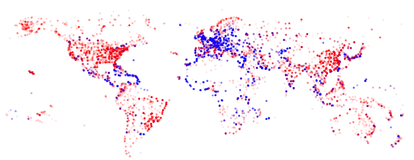
A better way to do colour domestic flights in red and international ones in blue, is to use an additional scale.
In the data section, replace what you have for the flight dataset at the moment with the following:
{"name": "flights",
 "url": "https://vda-lab.github.io/assets/flights.csv",
 "format": {"type": "csv", "parse": "auto"},
 "transform": [
   { "type": "formula", "field": "domestic",
     "expr": "datum.from_country == datum.to_country"}
 ]
}
This uses the formula keyword instead of filter as before, will check for each flight if the departure country is the same as the arrival country, and put that information in a new field called domestic.
In the scales section, add
{
  "name": "scaleColour",
  "type": "ordinal",
  "domain": {"data": "flights", "field": "domestic"},
  "range": ["red","blue"]
}
Finally, replace the fill spec in the marks section with
"fill": {"scale": "scaleColour", "field": "domestic"},
You’ll get this image:
Scaling the size of the marks
We also want to scale the size of the marks according to the distance of the flights. Similar to what we did above, we add the following scale:
{
  "name": "scaleDistance2Radius",
  "type": "linear",
  "domain": [1,15406],
  "range": [3,150]
}
Whereas the size of the marks was {"value": 10}, we now change that to
"size": {"scale": "scaleDistance2Radius", "field": "distance"},
Resulting image:
One final overlapping thing…
As some of the dots can be relatively big, these can hide smaller dots in the background. One possible solution to this is to first draw the large dots (i.e. the long-distance flights), and draw the smaller ones later. This can be done by adding an additional transformation to the dataset: add the following to the transform part of the data section:
{"type": "sort", "by": "-distance"}
Our static image
The final code for this static image:
{
  "width": 800,
  "height": 400,

  "data": [

    {"name": "flights",
     "url": "https://vda-lab.github.io/assets/flights.csv",
     "format": {"type": "csv", "parse": "auto"},
     "transform": [
       {"type": "formula", "field": "domestic",
        "expr": "datum.from_country == datum.to_country"},
       {"type": "sort", "by": "-distance"}
     ]
    }

  ],

  "scales": [
    {
      "name": "scaleLong2X",
      "type": "linear",
      "range": [0,800],
      "domain": [-180,180]
    },
    {
      "name": "scaleLat2Y",
      "type": "linear",
      "range": [400,0],
      "domain": [-90,90]
    },
    {
      "name": "scaleColour",
      "type": "ordinal",
      "domain": {"data": "flights", "field": "domestic"},
      "range": ["red","blue"]
    },
    {
      "name": "scaleDistance2Radius",
      "type": "linear",
      "domain": [1,15406],
      "range": [3,150]
    }
  ],

  "marks": [
    {
      "type": "symbol",
      "from": {"data":"flights"},
      "properties": {
        "enter": {
          "x": {"scale": "scaleLong2X", "field": "from_long"},
          "y": {"scale": "scaleLat2Y", "field": "from_lat"},
          "size": {"scale": "scaleDistance2Radius", "field": "distance"},
          "fill": {"scale": "scaleColour", "field": "domestic"},
          "fillOpacity": {"value": 0.05}
        }
      }
    }
  ]
}
Adding interactivity
Since version 2.0, vega allows for more complex interactivity, using a reactive approach. For a good presentation on this, see this paper by Satyanarajan et al. Definitely check out the vega documentation available at https://github.com/vega/vega/wiki/Documentation.
Detecting the mouse
Let’s say we want to know what the x-position of the mouse is, and display that at the top of the screen. We’ll capture the mousemove signal and use that as input for a new text mark.
"signals": [
  {
    "name": "mouseX",
    "streams": [
      {"type":"*:mousemove", "expr": "event.x"}
    ]
  }
]
This signal is triggered every time that the mouse is moved, and it returns the x-position of the mouse (event.x). To make this position appear as text at the top of the screen, we’ll add a new mark. Crucially, we will set the text to not come from a field, but from this signal.
{
  "type": "text",
  "interactive": false,
  "properties": {
    "enter": {
      "x": {"value": 600},
      "y": {"value": 0},
      "fill": {"value": "black"},
      "fontSize": {"value": 20},
      "align": {"value": "right"}
    },
    "update": {
      "text": {"signal": "mouseX"}
    }
  }
}
You’ll see that the position reported at the top of the screen will extend beyond the initial 800 pixels that we said the picture should be. That’s because we set the type to *:mousemove. If we set this to canvas:mousemove, it will max out at the width of the canvas.
Linking the mouse position to mark properties
All airports have their size determined by the distance ("size": {"scale":"scaleRadius", "field":"distance"}). Let’s try to have this size be determined by the position of the mouse on the screen instead.
As we saw above, we can use "signal": "mouseX" instead of "field": "distance". However, there are 2 additional things we need to take care of. First, we need to add a new scale that scales from the domain “0 -> 800” to the range “3 -> 15”.
{
  "name": "scaleMouse2Radius",
  "type": "linear",
  "domain": [0,800],
  "range": [3,1500]
}
So we will can now use
"size": {"scale":"scaleMouse2Radius", "signal":"mouseX"}
When we refresh our browser, we will however see no points at all… Why is this? This has to do with the enter-update-exit pattern as defined in D3. The enter part of the marks section is applied to all datapoints only once; to be able to change this (and therefore to have interactivity), we need to put the size inside an update section. This is exactly what we did with the text example above as well: the text at the top of the screen is not static, so needs to be put in an update section.
What airport are we looking at?
Now let’s change the text example above to list the name of the airport that the mouse is hovering over, instead of the mouse position itself.
"signals": [
  {
    "name": "hover",
    "init": null,
    "streams": [
      {"type": "symbol:mouseover", "expr": "datum"},
      {"type": "symbol:mouseout", "expr": "null"}
    ]
  },
  {
    "name": "title",
    "init": "Departure airports",
    "streams": [{
      "type": "hover",
      "expr": "hover ? hover.from_city : 'Departure airports'"
    }]
  }
]
As you can see, signals can be used as streams within other signals. The hover signal registers events every time the mouse enters or leaves (“hovers”) a mark. If it is on a mark, it will return that datum; otherwise it will return null. The title signal takes this hover stream as input ("type": "hover"). Every time this changes, it will return the from_city of the datum that the mouse is hovering over, or the text “Departure airports” if the mouse is not hovering over a datapoint.
We use the text mark exactly the same as above.
{
  "type": "text",
  "interactive": false,
  "properties": {
    "enter": {
      "x": {"value": 600},
      "y": {"value": 0},
      "fill": {"value": "black"},
      "fontSize": {"value": 20},
      "align": {"value": "right"}
    },
    "update": {
      "text": {"signal": "title"}
    }
  }
}
Filtering airports based on mouse position
We can adapt the above to filter airports based on our mouse position. Suppose that we want to draw only short-distance flights when the mouse is on the left, and long-distance flights when the mouse is on the right. We can do this by defining some additional signals:
{
  "name": "minDistance",
  "streams": [
    {"type":"mouseX", "expr": "(mouseX-10)*(15406/800)"}
  ]
},
{
  "name": "maxDistance",
  "streams": [
    {"type":"mouseX", "expr": "(mouseX+10)*(15406/800)"}
  ]
}
We then use these signals to set the size of the marks: set it to 20 if the distance of the flight is in this range, otherwise to zero.
"marks": [
  {
    "type": "symbol",
    "from": {"data":"flights"},
    "properties": {
      "enter": {
        "x": {"scale": "scaleLong2X", "field": "from_long"},
        "y": {"scale": "scaleLat2Y", "field": "from_lat"},
        "fill": {"scale": "scaleColour", "field": "domestic"},
        "fillOpacity": {"value": 0.2}
      },
      "update": {
        "size": [
          {
            "test": "inrange(datum.distance, minDistance, maxDistance)",
            "value": "20"
          },
          {"value": "0"}
        ]
      }
    }
  }
]
You’ll see that this works, but is very slow. It’d be better to filter the dataset based on this distance, and only draw those instead of all datapoints most of which we draw with a size zero…
{
  "width": 800,
  "height": 400,

  "data": [

    {"name": "flights",
     "url": "https://vda-lab.github.io/assets/flights.csv",
     "format": {"type": "csv", "parse": "auto"},
     "transform": [
       { "type": "formula",
         "field": "domestic",
         "expr": "datum.from_country == datum.to_country"},
       { "type": "sort", "by": "-distance"}
     ]
    }

  ],

  "scales": [
    {
      "name": "scaleLong2X",
      "type": "linear",
      "range": [0,800],
      "domain": [-180,180]
    },
    {
      "name": "scaleLat2Y",
      "type": "linear",
      "range": [400,0],
      "domain": [-90,90]
    },
    {
      "name": "scaleMouse2Distance",
      "type": "linear",
      "domain": [0,800],
      "range": [1,15406]
    },
    {
      "name": "scaleColour",
      "type": "ordinal",
      "domain": {"data": "flights", "field": "domestic"},
      "range": ["red","blue"]
    }
  ],

  "signals": [
    {
      "name": "mouseX",
      "streams": [
        {"type":"canvas:mousemove", "expr": "event.x"}
      ]
    },
    {
      "name": "minDistance",
      "streams": [
        {"type":"mouseX", "expr": "(mouseX-25)*(15406/800)"}
      ]
    },
    {
      "name": "maxDistance",
      "streams": [
        { "type":"mouseX",
          "scale": "scaleMouse2Distance",
          "expr": "(mouseX+25)" }
      ]
    }
  ],

  "marks": [
    {
      "type": "symbol",
      "from": {
        "data":"flights",
        "transform": [
          { "type":"filter",
            "test": "inrange(datum.distance, minDistance, maxDistance)" }
        ]
      },
      "properties": {
        "enter": {
          "x": {"scale": "scaleLong2X", "field": "from_long"},
          "y": {"scale": "scaleLat2Y", "field": "from_lat"},
          "size": {"value": 20},
          "fill": {"scale": "scaleColour", "field": "domestic"},
          "fillOpacity": {"value": 0.1}
        }
      }
    }
  ]
}
Creating histograms
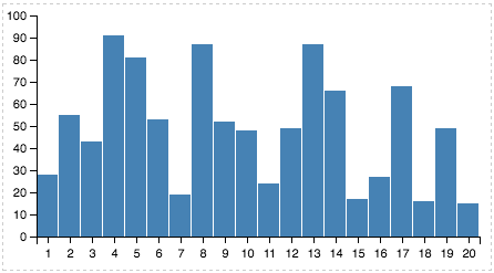
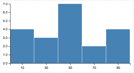
Let’s try something else and create some histograms. In vega, we can do that using the bin transform (again: see https://github.com/vega/vega/wiki/Documentation)
{
  "width": 400,
  "height": 200,
  "padding": {"top": 10, "left": 30, "bottom": 30, "right": 10},
  "data": [
    {
      "name": "table",
      "values": [
        {"x": 1,  "y": 28}, {"x": 2,  "y": 55},
        {"x": 3,  "y": 43}, {"x": 4,  "y": 91},
        {"x": 5,  "y": 81}, {"x": 6,  "y": 53},
        {"x": 7,  "y": 19}, {"x": 8,  "y": 87},
        {"x": 9,  "y": 52}, {"x": 10, "y": 48},
        {"x": 11, "y": 24}, {"x": 12, "y": 49},
        {"x": 13, "y": 87}, {"x": 14, "y": 66},
        {"x": 15, "y": 17}, {"x": 16, "y": 27},
        {"x": 17, "y": 68}, {"x": 18, "y": 16},
        {"x": 19, "y": 49}, {"x": 20, "y": 15}
      ],
      "transform": [
        {
          "type":"bin",
          "field":"y",
          "maxbins":5
        },
        {
          "type":"aggregate",
          "groupby":["bin_mid"],
          "summarize":{"bin_mid":"count"}
        }
      ]
    }
  ],
  "scales": [
    {
      "name": "x",
      "type": "ordinal",
      "range": "width",
      "domain": {"data": "table", "field": "bin_mid"}
    },
    {
      "name": "y",
      "type": "linear",
      "range": "height",
      "domain": {"data": "table", "field": "count_bin_mid"},
      "nice": true
    }
  ],
  "axes": [
    {"type": "x", "scale": "x"},
    {"type": "y", "scale": "y"}
  ],
  "marks": [
    {
      "type": "rect",
      "from": {"data": "table"},
      "properties": {
        "enter": {
          "x": {"scale": "x", "field": "bin_mid"},
          "width": {"scale": "x", "band": true, "offset": -1},
          "y": {"scale": "y", "field": "count_bin_mid"},
          "y2": {"scale": "y", "value": 0}
        },
        "update": {
          "fill": {"value": "steelblue"}
        },
        "hover": {
          "fill": {"value": "red"}
        }
      }
    }
  ]
}
The key here is the transform that is applied to the data. Before this transformation, the data looks like this:
| x | y |
|---|---|
| 1 | 28 |
| 2 | 55 |
| 3 | 43 |
| … | … |
The data before transformation looks like this:
We’re applying two different transformations, and their order is important here. Switching the two will not give you the plot you saw above.
The first transformation (bin) basically adds some new columns to the data: bin_start, bin_end and bin_mid. The intermediate data therefore looks like this.
| x | y | bin_start | bin_end | bin_mid |
|---|---|---|---|---|
| 1 | 28 | 20 | 40 | 30 |
| 2 | 55 | 40 | 60 | 50 |
| 3 | 43 | 40 | 60 | 50 |
| … | … | … | … | … |
The second transformation (aggregate) takes this new bin_mid column and performs a count. The transformed data now looks like this:
| bin_mid | count_bin_mid |
|---|---|
| 10 | 4 |
| 30 | 3 |
| … | … |
We can then use this count_bin_mid in the definition of the marks to set the value for y. The picture you get:
Further information
Hopefully this gives you some indication of how vega works and what you can do with it. The data transformation aspect of vega is actually quite powerful. Dig into the data transform documentation to try more things out. The expressions documents also gives some more information on how to reference mouse events, the canvas, etc.
Debugging
Vega recently added a very cool interface for debugging your specification. See http://vega.github.io/vega-tutorials/debugging/.