A D3 visualization from Spark as a Service
In a previous post, we installed and tested the Spark job server, turning Spark into a REST API. We now want to actually do something with this component.
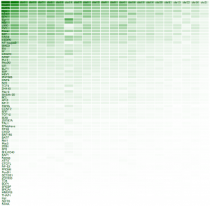
We will use the same BED file data that we have used previously, which contains information on transcription factors bindings on different chromosomes. The more binding sites have been registered, the more dense the colour is in the result on the right.
D3.js
I will not introduce D3.js at length here, as many people have done this before me and most probably in a much better way. For the sake of this post, I want to mention that D3 is a Javascript framework (and thus runs in the browser) that allows one to turn data into something visible. Visual is not necessarily graphical, but in many cases it will be.
The thing to know with D3 is, first that is uses existing web standards (DOM, CSS, …) and second that its way of dealing with data is not obvious but very powerful.
The Target
The aim of this exercise draws on the result of the previous post. We now want a heat map of the frequencies of Transcription Factor occurrences in the different chromosomes.
The implementation
I will not go into the details of the implementation, but just highlight a few points. First, doing thePOST request to the Spark job server and reading the data can be done using a method that d3 provides:
var url = 'http://127.0.0.1:8090/jobs?appName=test&classPath=spark.jobserver.TransFactors&sync=true';

// Send a post request to the server, without options for the moment
d3.json(url,function(json) {
  dataset = json.result.sort(function(a,b){return b[2]-a[2];});
  // <... the handling of the data goes here ...>

}).send('POST');
From this point onwards, dataset contains the data that is returned from the Spark service. The content is in JSON format and remember from the earlier post, it contains two fields. The result field is the effective data.
Making the colors depend on the value in the cell can easily be done using D3 scales:
z_scale = d3.scale.linear().domain([0,max_z]).range(["white", "green"]);and later, this scale can be used as a function:
entry.attr("fill",function(d){
  return z_scale(d[2]);
});
A very nice property of the way D3 deals with data can be seen in the latter code snippet. We provide a function to the attr method. This function will be called for every entry in the dataset, passing the current value as a parameter d. Also the index of the entry in the dataset can be passed as a parameter to the function.
Please note that this approach fits nicely with the rest of the architecture because we like to stick to a functional way of programming whenever possible.
The result
I do not claim to be a D3 expert, of a Javascript guru for that matter. Quite the contrary. We did prove, however, that a relatively simple visualisation can be built from data delivered by Spark with minimal effort. The result is shown above.
Extensions and todo’s are clear at this point: include the locustree in the architecture, interactive zooming and panning through the data, different datasets, etc.