Advanced exercise 1
A first more involved exercise is to create a map of flight routes for all airports. The data (which you can use in the url part) is available here: https://gist.githubusercontent.com/jandot/93963d2f7f80baae925c35d44f5c1fd1/raw/ca66d98561d9ab1dcca90e55b1ac6782e71bf3a6/flight_routes.csv.
What we want you to plot is:
- the location of the departure airport for each route
- in blue if flights are domestic, in red if they are international
- the size of the dot should depend on the distance of the flight: the longer the flight, the larger the dot
Extra point if you add the slider as well: sliding to the left only shows the short distance flights, sliding to the right only the long distance ones.
Or even add a histogram:
Advanced exercise 2
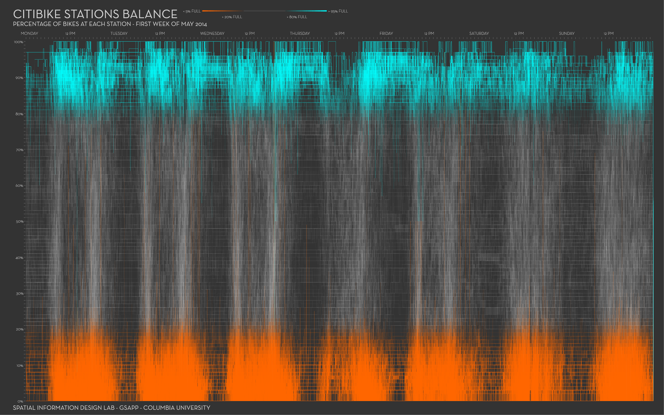
For the exercises below, we will use the New York City citibike data available from https://www.citibikenyc.com/system-data. Some great visuals by Juan Francisco Saldarriaga can inspire you.
We made a (small) part of the data available here. It concerns trip data from November 2011, where the trip started or ended in station nr 336. The fields in each record (with example data) look like this:
{
  "tripduration": 1217,
  "starttime": "2019-11-01 06:03:28.5390",
  "stoptime": "2019-11-01 06:23:45.9810",
  "startstation_id": 3236,
  "startstation_name": "W 42 St & Dyer Ave",
  "startstation_latitude": 40.75898481399634,
  "startstation_longitude": -73.99379968643188,
  "endstation_id": 336,
  "endstation_name": "Sullivan St & Washington Sq",
  "endstation_latitude": 40.73047747,
  "endstation_longitude": -73.99906065,
  "bikeid": 41025,
  "usertype": "Subscriber",
  "birthyear": 1964,
  "gender": 1
}
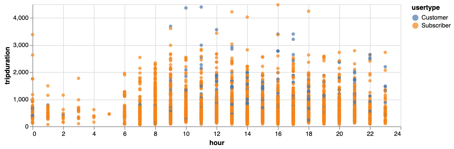
Exercise: Make a plot showing how the trip duration is related to the hour of the day. You could colour by usertype. You’ll see that your plot will be compressed because of some very long durations, so only use the trips that have a duration of less than 5,000.
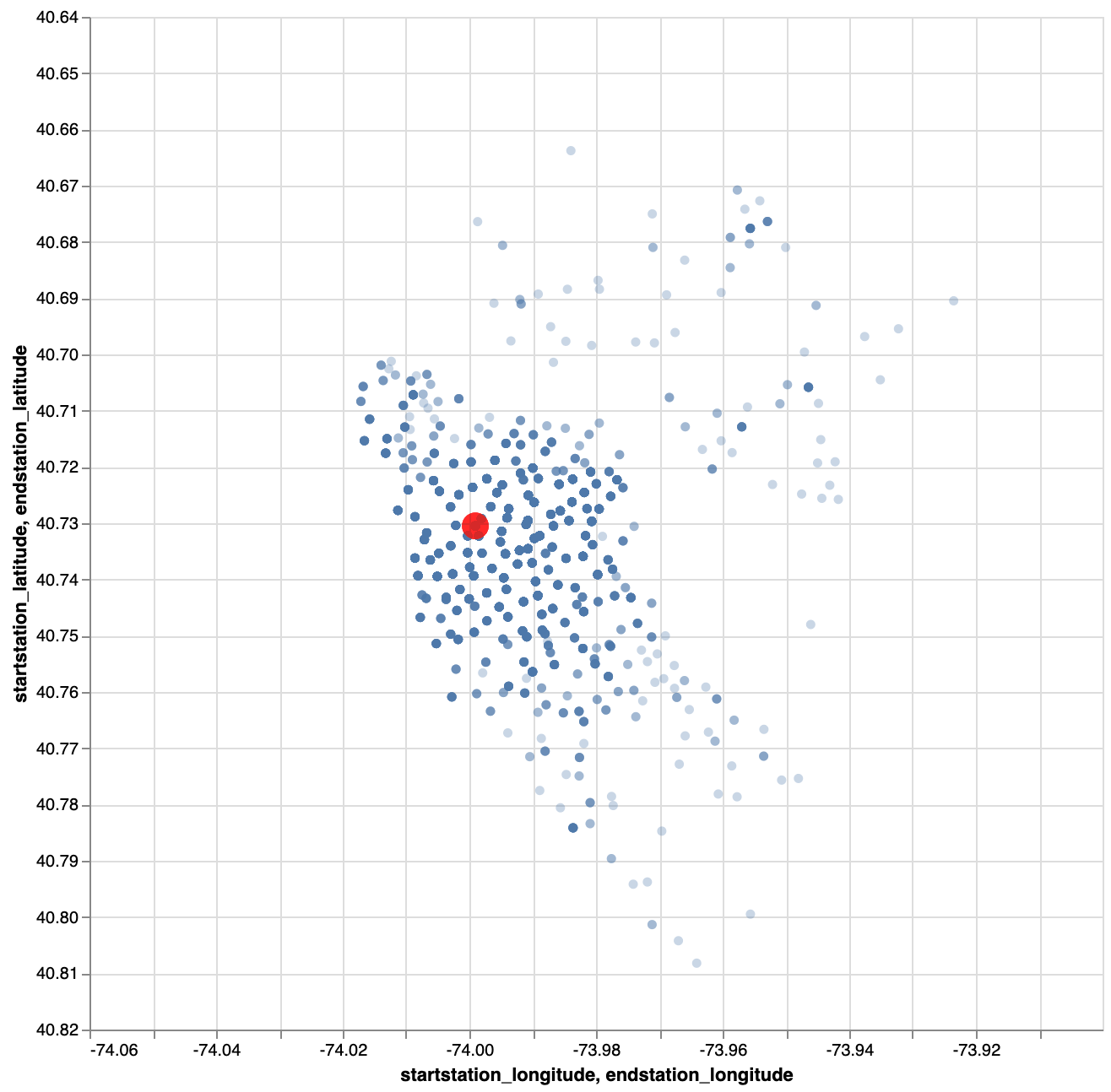
Exercise: Make a plot with the relative positions of the start stations vis-a-vis the end station, when that end station is 336. Show the end station itself as well. Your plot could look like this:
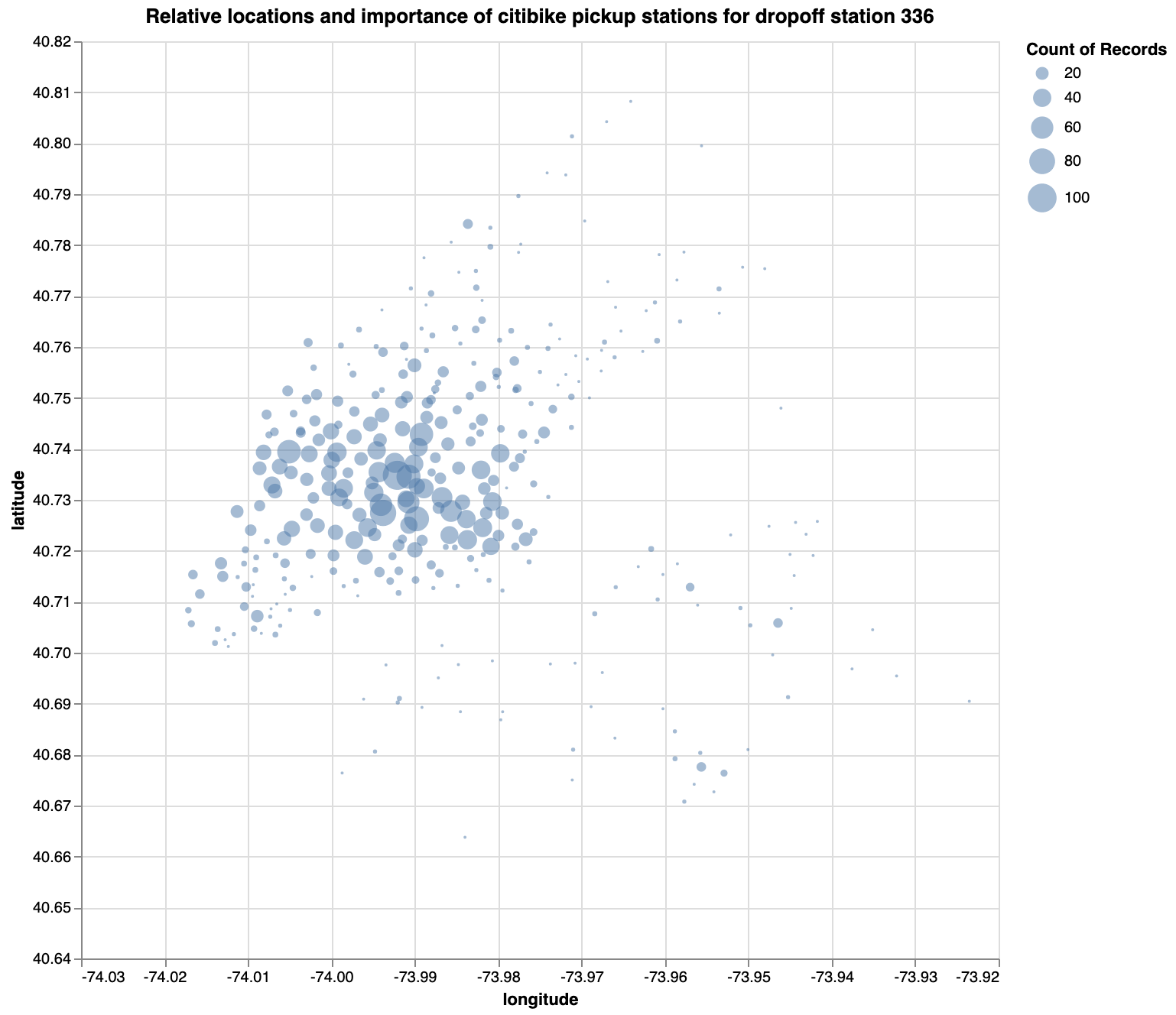
Exercise: Same as the one above, but scale the points based on the number of bikes picked up there. You plot should look like this:
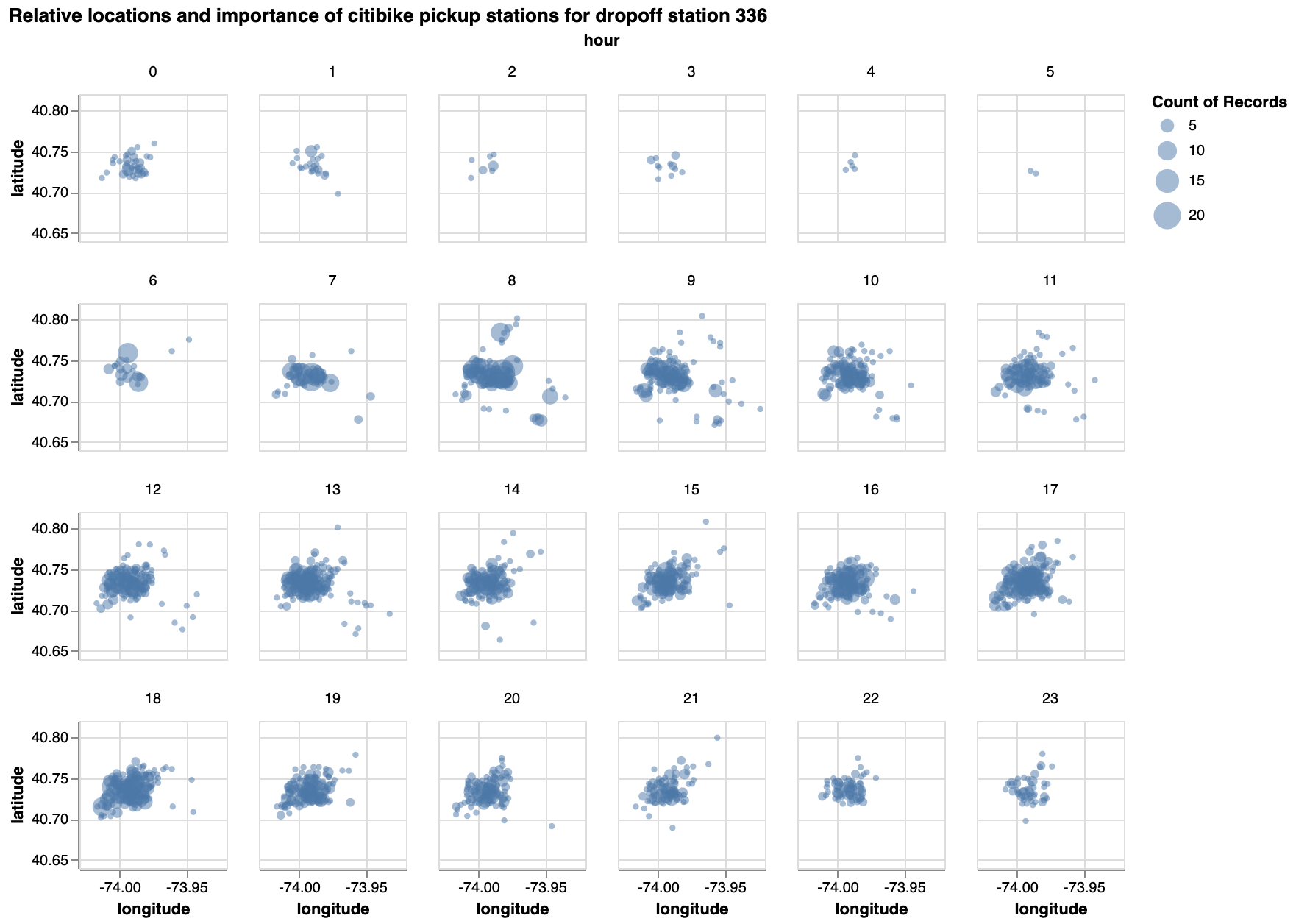
Exercise: Same as the one above, but facetted by hour.
Exercise - What other interesting plots could you make?