In all our plots the marks had a steelblue colour, but it’d be nice to use a different colour. We can do this in two ways, either specifying it within the mark, or within the encoding.
To change colour at the mark level, we have to provide the mark with an object, instead of just the string “point”, “circle” or whatever.
...
"mark": {"type": "point", "color": "red"},
...
Changing the colour at the mark level means that all marks will have the same colour and we won’t make the colour dependent on the data.
To change colour at the encoding level, we cannot just say "color": "red". The color key takes an object as its value. For a fixed value (i.e. “red”), this should be {"value": "red"}.
...
"mark": "point",
"encoding": {
  "x": {"field": "b", "type": "quantitative"},
  "y": {"field": "new_field", "type": "quantitative"},
  "color": {"value": "red"}
}
...
Exercise - Check what happens if you provide a colour both at the mark level and at the encoding level.
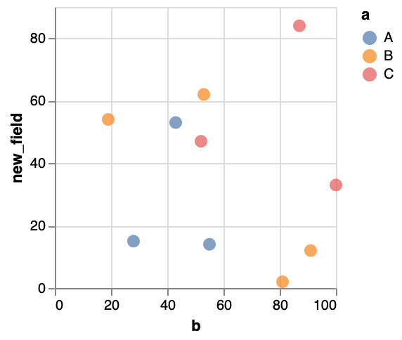
One of the cool things when defining colour in the encoding, is that we can let it be dependent upon the data as well. Instead of using {"value": ...}, we can use {"field": ...}.
...
"mark": "point",
"encoding": {
  "x": {"field": "b", "type": "quantitative"},
  "y": {"field": "new_field", "type": "quantitative"},
  "color": {"field": "a", "type": "nominal"}
}
...
You’ll see that the colour now depends on the data as well! Of course, in our data every single object has a different value for a (i.e. A, B, …). Let’s just change our data a bit so that we only have a limited number of classes. Our output might look something like this:
Exercise - Look into the point documentation, and - instead of the different classes getting different colours - make the classes have different shapes.
Exercise - Look into the point documentation, and make the points filled instead of only showing the outline.