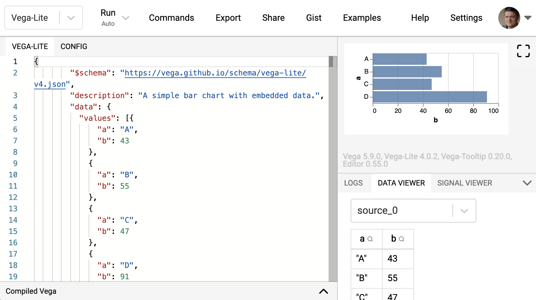
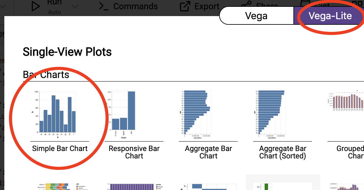
We’ll use the vega-lite online editor at https://vega.github.io/editor/. From the pull-down menu in the top-left, select “Vega-Lite” if it is not selected. From “Examples”, select “Simple Bar Chart” (make sure that you are in the “Vega-Lite” tab).
You’ll see an editor screen on the left with what is called the vega-lite specification, the output on the top right, and a debugging area in the bottom right. We’ll come back to debugging later. Whenever you change the specification in the editor, the output is automatically updated.
The encoding section specifies what is called the “visual encoding”: it links fields in each data object (in this case: fields a and b) to visual channels (in this case: x and y). The field names should correspond to a field in the dataset, and the keys (x and y) depend on the type of mark you choose. Again: the documentation is very helpful.
In this specification, you see that y gets a value of {"field": "b", "type": "quantitative"}. This means that to the height of the bar is determined by the field with key b. This is the typical case where the things in the plot depend on the data. We can also hardcode some things by using value instead of field. For example, changing {"field": "b", "type": "quantitative"} to {"value": 17} all bars will get a height of 17.
Exercise - Add an additional bar to the plot with a value of 100.
Exercise - Change the mark type from bar to point.
Exercise - Looking at the vega-lite documentation at https://vega.github.io/vega-lite/docs/, check what other types of mark are available. See which of these actually work with this data.
Exercise - How would you make this an horizontal chart?
Exercise - Can you make this into a diamond chart? Tip: check the point documentation.
Exercise - Add a new field to the datapoints in the dataset with some integer value, called new_field. Next, change the plot so that you have a scatterplot with this new field on the y-axis and the field b on the x-axis.