Whereas brushing and linking in vega-lite is very simple to do, it is very hard in vega. Although it is possible, you’ll have to play with signals, data, and some non-documented functions within the vega code. Hopefully, brushing/linking will be easier in one of the next versions.
The idea with brushing linking is that you create a signal that captures if a mark is selected, and then letting the encoding of a mark in another plot be dependent on that signal.
For example, let’s create a minimal example: we take 3 datapoints and create two plots with them. At first, we won’t include any brushing/linking yet.
{
"$schema": "https://vega.github.io/schema/vega/v5.json",
"padding": 0,
"autosize": "none",
"width": 400,
"height": 220,
"data": [
{
"name": "table",
"values": [
{"name": "point A", "a": 2, "b": 7, "c": 4},
{"name": "point B", "a": 4, "b": 5, "c": 6},
{"name": "point C", "a": 5, "b": 3, "c": 5}
]
}
],
"scales": [
{ "name": "xscale",
"type": "linear",
"domain": [0,10],
"range": [0,200]
},
{ "name": "yscale",
"type": "linear",
"domain": [0,10],
"range": [0,200]
}
],
"layout": {"padding": 20},
"marks": [
{ "name": "plot1",
"type": "group",
"axes": [
{"orient": "bottom", "scale": "xscale"},
{"orient": "right", "scale": "yscale"}
],
"marks": [
{
"type": "symbol",
"from": {"data": "table"},
"encode": {
"enter": {
"x": {"field": "a", "scale": "xscale"},
"y": {"field": "b", "scale": "yscale"},
"tooltip": {"field": "name"},
"size": {"value": 200}
},
"update": {
"fill": {"value": "lightgrey"}
}
}
}
]
},
{ "name": "plot2",
"type": "group",
"axes": [
{"orient": "bottom", "scale": "xscale"},
{"orient": "right", "scale": "yscale"}
],
"marks": [
{
"type": "symbol",
"from": {"data": "table"},
"encode": {
"enter": {
"x": {"field": "a", "scale": "xscale"},
"y": {"field": "c", "scale": "yscale"},
"size": {"value": 200},
"tooltip": {"field": "name"}
},
"update": {
"fill": {"value": "lightgrey"}
}
}
}
]
}
]
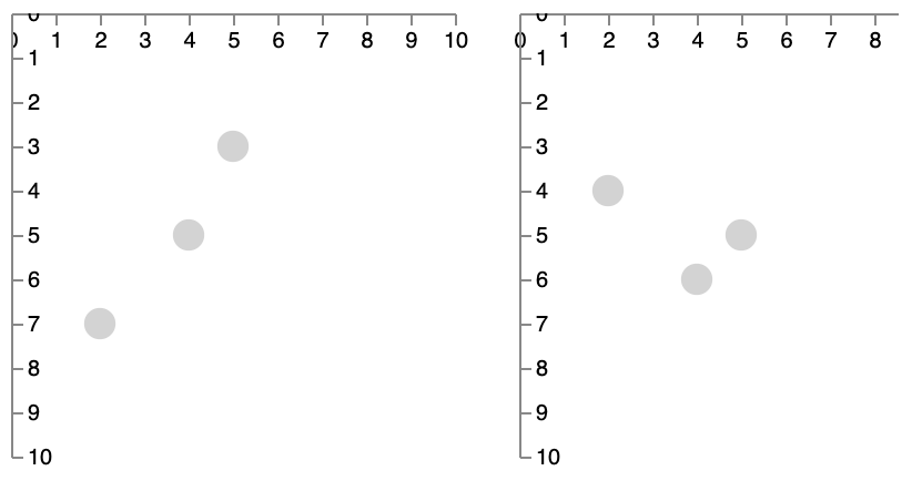
}This creates two scatterplots, where the x-value is defined by feature a in both, and the y-value either by b (left) or c (right). The points in both plots are (from right to left): point A, point B and point C.
The colour of the datapoints in both plots is hard-coded as lightgrey. We will now make this plot interactive with brushing and linking: when hovering over point A in either of the plots, that same point A should be coloured red in both of them.
We can change this using the following steps, as inspired by the force-directed example from above:
- Create two signals: one for checking if you’re hovering over a datapoint, and another to capture which datapoint that is.
...
"signals": [
  { "description": "Any datapoint is activated",
    "name": "datapoint_is_activated", "value": false,
    "on": [
      {
        "events": "symbol:mouseover",
        "update": "true"
      },
      {
        "events": "symbol:mouseout",
        "update": "false"
      }
    ]
  },
  { "description": "Active datapoint",
    "name": "activated_datapoint", "value": null,
    "on": [
      {
        "events": "symbol:mouseover",
        "update": "item()"
      },
      {
        "events": "symbol:mouseout",
        "update": "null"
      }
    ]
  }
],
...- Change the
fillto test for these signals:
...
"fill": [
  {"test": "datapoint_is_activated && datum === activated_datapoint.datum",
  "value": "red"},
  {"value": "lightgrey"}
]
...
Everything put together:
{
  "$schema": "https://vega.github.io/schema/vega/v5.json",
  "padding": 0,
  "autosize": "none",
  "width": 400,
  "height": 220,

  "signals": [
    { "description": "Any datapoint is activated",
      "name": "datapoint_is_activated", "value": false,
      "on": [
        {
          "events": "symbol:mouseover",
          "update": "true"
        },
        {
          "events": "symbol:mouseout",
          "update": "false"
        }
      ]
    },
    { "description": "Active datapoint",
      "name": "activated_datapoint", "value": null,
      "on": [
        {
          "events": "symbol:mouseover",
          "update": "item()"
        },
        {
          "events": "symbol:mouseout",
          "update": "null"
        }
      ]
    }
  ],

  "data": [
    {
      "name": "table",
      "values": [
        {"name": "point A", "a": 2, "b": 7, "c": 4},
        {"name": "point B", "a": 4, "b": 5, "c": 6},
        {"name": "point C", "a": 5, "b": 3, "c": 5}
      ]
    }
  ],

  "scales": [
    { "name": "xscale",
      "type": "linear",
      "domain": [0,10],
      "range": [0,200]
    },
    { "name": "yscale",
      "type": "linear",
      "domain": [0,10],
      "range": [0,200]
    }
  ],

  "layout": {"padding": 20},

  "marks": [
    { "name": "plot1",
      "type": "group",
      "axes": [
        {"orient": "bottom", "scale": "xscale"},
        {"orient": "right", "scale": "yscale"}
      ],
      "marks": [
        {
          "type": "symbol",
          "from": {"data": "table"},
          "encode": {
            "enter": {
              "x": {"field": "a", "scale": "xscale"},
              "y": {"field": "b", "scale": "yscale"},
              "tooltip": {"field": "name"},
              "size": {"value": 200}
            },
              "update": {
              "fill": [
                {"test": "datapoint_is_activated && datum === activated_datapoint.datum",
                "value": "red"},
                {"value": "lightgrey"}
              ]

            }
          }
        }
      ]
    },
    { "name": "plot2",
      "type": "group",
      "axes": [
        {"orient": "bottom", "scale": "xscale"},
        {"orient": "right", "scale": "yscale"}
      ],
      "marks": [
        {
          "type": "symbol",

          "from": {"data": "table"},

          "encode": {
            "enter": {
              "x": {"field": "a", "scale": "xscale"},
              "y": {"field": "c", "scale": "yscale"},
              "size": {"value": 200},
              "tooltip": {"field": "name"}
            },
            "update": {
              "fill": [
                {"test": "datapoint_is_activated && datum === activated_datapoint.datum",
                "value": "red"},
                {"value": "lightgrey"}
              ]

            }
          }
        }
      ]
    }
  ]
}
The result (hover over the datapoints):
Some observations:
- All events in the signals refer to
symbol:-something. This is because the mark that we use is asymbol. If it were a rectangle we’d have to userect. - The signal
datapoint_is_activatedonly captures whether any datapoint is activated (true/false). - The signal
activated_datapointcaptures which datapoint your mouse is on: that is contained initem()(see here). - The
fillis now an array instead of the simple{"value": "lightgrey"}. The first element of the array is a test with an associated value; the last element is the default value (i.e. when the test fails). - In the test, we check that both a datapoint is activated, and that the datapoint which the mark refers to (
datum) is the same as the datum of the activated datapoint.
Exercise - Using the data at https://vda-lab.github.io/assets/stad_2910.json, create two linked plots: one with the network, and a scatterplot with community on the x-axis and hadm_id on the y-axis. Your result should be similar to the visualisation below, and highlight points between the two plots on hover (check by hovering over the points below).