In the vega-lite tutorial, we saw how we can use transforms to preprocess the data before it gets plotted. We can filter the data, aggregate it, compute a formula, sample, etc. For a full list of possible transformations, see the transform documentation at https://vega.github.io/vega/docs/transforms/.
Aggregating and filtering
As we can define different datasets in vega (which is not possible in vega-lite), we can independently define different subsets of the data, or aggregations.
Creating a subset of the data just for the European cars, we can do the following:
"data": [
  {
    "name": "cars",
    "url": "https://raw.githubusercontent.com/vega/vega/master/docs/data/cars.json"
  },
  {
    "name": "euro-cars",
    "source": "cars",
    "transform": [
      {"type": "filter", "expr": "datum.Origin == 'Europe'"}
    ]
  }
]
This creates the cars dataset as we had before, but also a subset of European cars.
Exercise - How would we now use this filtered dataset for the marks? Make an acceleration versus mpg plot for only the european cars.
We can do the same for aggregation to create a histogram. Whereas the original data is not available anymore in vega-lite, it can still be in vega.
...
"data": [
  {
    "name": "cars",
    "url": "https://raw.githubusercontent.com/vega/vega/master/docs/data/cars.json"
  },
  {
    "name": "binned",
    "source": "cars",
    "transform": [
      {"type": "bin", "field": "Acceleration", "extent": [0,25]}
    ]
  },
  {
    "name": "aggregated",
    "source": "binned",
    "transform": [
      {"type": "aggregate",
        "key": "bin0", "groupby": ["bin0", "bin1"],
        "fields": ["bin0"], "ops": ["count"], "as": ["count"]}
    ]
  }
],
...
There are now three different datasets available: cars, binned and aggregated. We can have each separate like this, or - as we don’t expect to ever use the binned dataset by itself - merge binned and aggregated like we had to do in vega-lite anyway:
...
"data": [
  {
    "name": "cars",
    "url": "https://raw.githubusercontent.com/vega/vega/master/docs/data/cars.json"
  },
  {
    "name": "aggregated",
    "source": "cars",
    "transform": [
      {"type": "aggregate",
        "key": "bin0", "groupby": ["bin0", "bin1"],
        "fields": ["bin0"], "ops": ["count"], "as": ["count"]},
      {"type": "bin", "field": "Acceleration", "extent": [0,25]}
    ]
  }
],
...
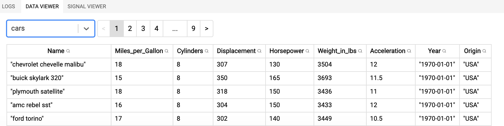
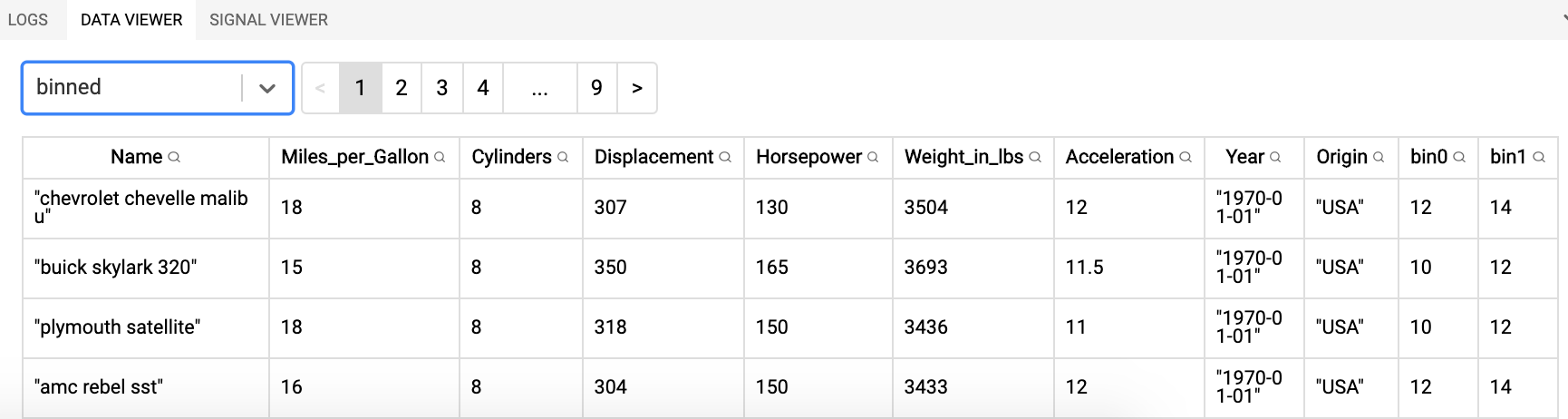
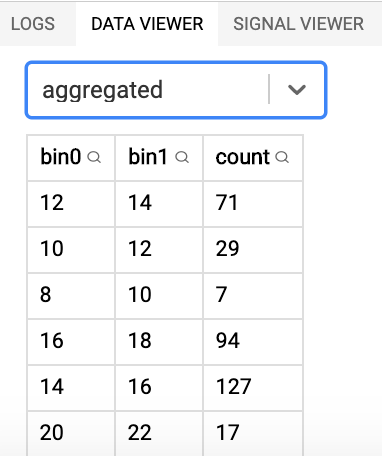
Important tip: when using the vega editor at https://vega.github.io/editor, have a look at the data viewer in the lower-right corner: it shows you what each of the datasets looks like.
The original dataset:
The binned dataset (note the two additional columns at the end):
The aggregated dataset:
Kernel density estimation
Another good example of a transform is the kernel density estimation kde2d (for full documentation, see https://vega.github.io/vega/docs/transforms/kde2d/). This is very useful if you for example want to create a scatterplot but there are so many points that a simple lowering of the opacity does not cut it anymore.
Consider this plot of miles per gallon by horsepower, which suffers from overplotting:
By using the kernel density estimation we can solve this and generate a heatmap instead:
Here’s the code for generating this plot:
{
  "$schema": "https://vega.github.io/schema/vega/v5.json",
  "width": 300,
  "height": 300,
  "padding": 5,
  "data": [
    {
      "name": "source",
      "url": "https://raw.githubusercontent.com/vega/vega/master/docs/data/cars.json"
    },
    {
      "name": "density",
      "source": "source",
      "transform": [
        {
          "type": "kde2d",
          "size": [{"signal": "width"}, {"signal": "height"}],
          "x": {"expr": "scale('xScale', datum.Horsepower)"},
          "y": {"expr": "scale('yScale', datum.Miles_per_Gallon)"}
        },
        {
          "type": "heatmap",
          "field": "grid",
          "color": {"expr": "scale('densityScale', datum.$value / datum.$max)"},
          "opacity": 1
        }
      ]
    }
  ],
  "scales": [
    {
      "name": "xScale",
      "type": "linear",
      "domain": {"data": "source", "field": "Horsepower"},
      "range": "width"
    },
    {
      "name": "yScale",
      "type": "linear",
      "domain": {"data": "source", "field": "Miles_per_Gallon"},
      "range": "height"
    },
    {
      "name": "densityScale",
      "type": "linear",
      "domain": [0, 1],
      "range": {"scheme": "viridis"}
    }
  ],
  "axes": [
    {
      "scale": "xScale",
      "orient": "bottom",
      "tickCount": 5,
      "title": "Horsepower"
    },
    {
      "scale": "yScale",
      "orient": "left",
      "titlePadding": 5,
      "title": "Miles_per_Gallon"
    }
  ],
  "marks": [
    {
      "name": "marks",
      "type": "image",
      "from": {"data": "density"},
      "encode": {
        "enter": {
          "image": {"field": "image"},
          "width": {"signal": "width"},
          "height": {"signal": "height"}
        }
      }
    }
  ]
}
So what are the most important changes in this specification?
- We first create a new dataset based on the original cars dataset (“source”), but doing the actual transform.
- This transform is a
kde2dfollowed by aheatmap:- For the
kde2dtransform, the pragmassize,xandyare mandatory. Here’s a nice example of how you can use a scale within anexprrather than for a mark as we did before. - The
kde2dtransform creates agridfield which is the input for theheatmap.
- For the
- The mark is of type
image. Contrary to what we’ve seen before, we don’t need anxand aybecause the whole plot is just a single image:"image": {"field": "image"}(which is generated by theheatmaptransform).
By playing with the kde2d transform parameters, we can for example make it more detailed. For the plot below, this transform is:
...
{
  "type": "kde2d",
  "size": [{"signal": "width"}, {"signal": "height"}],
  "x": {"expr": "scale('xScale', datum.Horsepower)"},
  "y": {"expr": "scale('yScale', datum.Miles_per_Gallon)"},
  "bandwidth": [5, 5],
  "cellSize": 4
},
...