As much as it’s easy, it can become unwieldy to have the actual dataset entered into the vega specification itself. As with vega-lite, we can let vega load data from an external URL. There are some differences with vega-lite, though:
- In vega-lite, the
datapragma takes an object ({}) as its value; in vega, it is an array ([]). - In vega, we need to give a dataset a
name.
To re-iterate, here’s the data section that we have been using thus far:
"data": [
  {
    "name": "table",
    "values": [
      {"x": 15, "y": 8, "category": "A"},
      {"x": 72, "y": 25, "category": "B"},
      {"x": 35, "y": 44, "category": "C"},
      {"x": 44, "y": 29, "category": "A"},
      {"x": 24, "y": 20, "category": "B"}
    ]
  }
],
We can load data from a URL like this:
"data": [
  {
    "name": "cars",
    "url": "https://raw.githubusercontent.com/vega/vega/master/docs/data/cars.json"
  }
],
Here is a minimal scatterplot using this car data:
{
  "$schema": "https://vega.github.io/schema/vega/v5.json",
  "width": 400,
  "height": 200,
  "padding": 5,

  "data": [
    {
      "name": "cars",
      "url": "https://raw.githubusercontent.com/vega/vega/master/docs/data/cars.json"
    }
  ],

  "scales": [
    {
      "name": "xscale",
      "domain": {"data": "cars", "field": "Acceleration"},
      "range": "width"
    },
    {
      "name": "yscale",
      "domain": {"data": "cars", "field": "Miles_per_Gallon"},
      "range": "height"
    }
  ],
  "axes": [
    {"orient": "bottom", "scale": "xscale", "grid": true},
    {"orient": "left", "scale": "yscale", "grid": true}
  ],
  "marks": [
    {
      "type": "symbol",
      "from": {"data":"cars"},
      "encode": {
        "enter": {
          "x": {"scale": "xscale", "field": "Acceleration"},
          "y": {"scale": "yscale", "field": "Miles_per_Gallon"}
        }
      }
    }
  ]
}
The result:
Exercise - Add a plot title, legend and axis titles to this plot, and make the dots more transparent so that we can see where points are plotted on top of each other. It should look like this: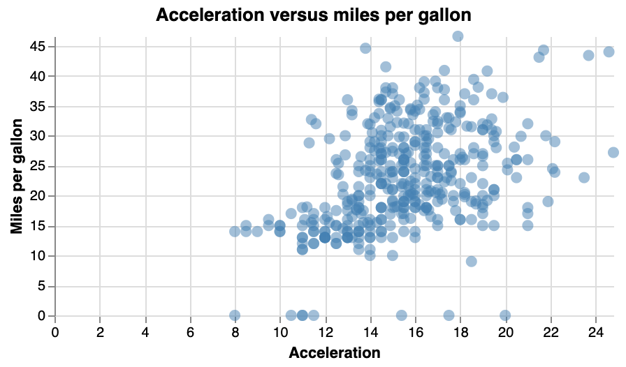
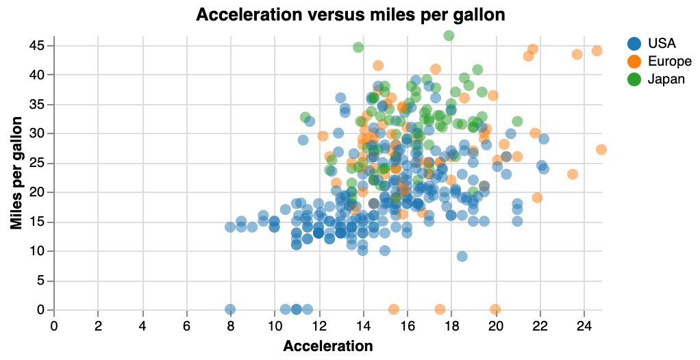
Exercise - Take the previous plot, and colour the points based on “Origin” (i.e. continent). Add a legend to show which colour corresponds to which origin. (First take a look at the data itself at the URL to know what it looks like.) The plot should look like this: